
There are some things you can google 'til the cows come home but you'll never find an answer to. Or if you find an answer it will be buried within pages and pages of google results before you find it.
For example, how to make a good black an white image. Sure there are TONS of "techniques" and processes online that will aid you in creating a good B&W but no one ever tells you what to "look for". You can have all the controls in the world but if you don't know what you're looking for, you'll never be able to utilize those controls to the fullest degree.
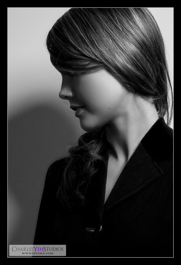
Let me cut to the chase: A good black and white shows dynamic tonal ranges across the subject matter.
See? Now if only someone had TOLD me that when I started shooting/retouching. I had to go figure that out for myself. Before you get upset at me for "stating the obvious" let me give you some examples of how this should influence your B&W decision-making.
I shoot people. So for me the model is the subject. More specifically it's the model's face and thus her skin that's the subject. It's rarely the wardrobe or the background or the set. It's the skin. That being said, we need to exaggerate the tonal ranges of the skin. Does that make sense? That means there needs to be dynamic range across the skin. Contrast. Highlights and shadows. So when you're doing your B&W you need to try and exaggerate this expression of tones across the skin. The transition shouldn't be "bright-highlights to not-so-bright-highlight". It should be "highlight-to-shadow". You could go really extreme and go with "white point to black point" but I find that going too far. It has to be "believable" and still natural. If you go from white point to black point, then everything else in the frame is likely to get pushed to black or blown highlights.
If your subject is the sky, then you need to express the dynamic range of the sky from highlight to shadows. Don't keep it one constant shade of grey. Give it range. Give it dynamic tonal range. The decision-making process when considering your subject will assist you in mapping the B&W tones to the proper color ones.
In Photoshop, I always use the Image>Adjustment>Black and White conversion. The red and yellow tones are the most important ones because skin is comprised of yellow and red tones. Everything else is there to help you bring out the subject and create punch. Now ironically, I don't push the red and yellows to the max. Instead, I leave them pretty low (somewhere between 0 and 30) where they can express range without being pushed to the extreme. It's natural. It's "believable".
Then I typically run the resulting image through a Gradient Map. This is another "secret" that creates punch that I wish more people would talk about. Running it through a B&W gradient map makes the picture "pop". Selecting a good percentage for the blend is key.
When everything is said and done you should have a punchy B&W image that expresses great tone across the subject, in my case the model's skin.
No comments:
Post a Comment