Thursday, October 29, 2009

Tricia Jo: Ambient


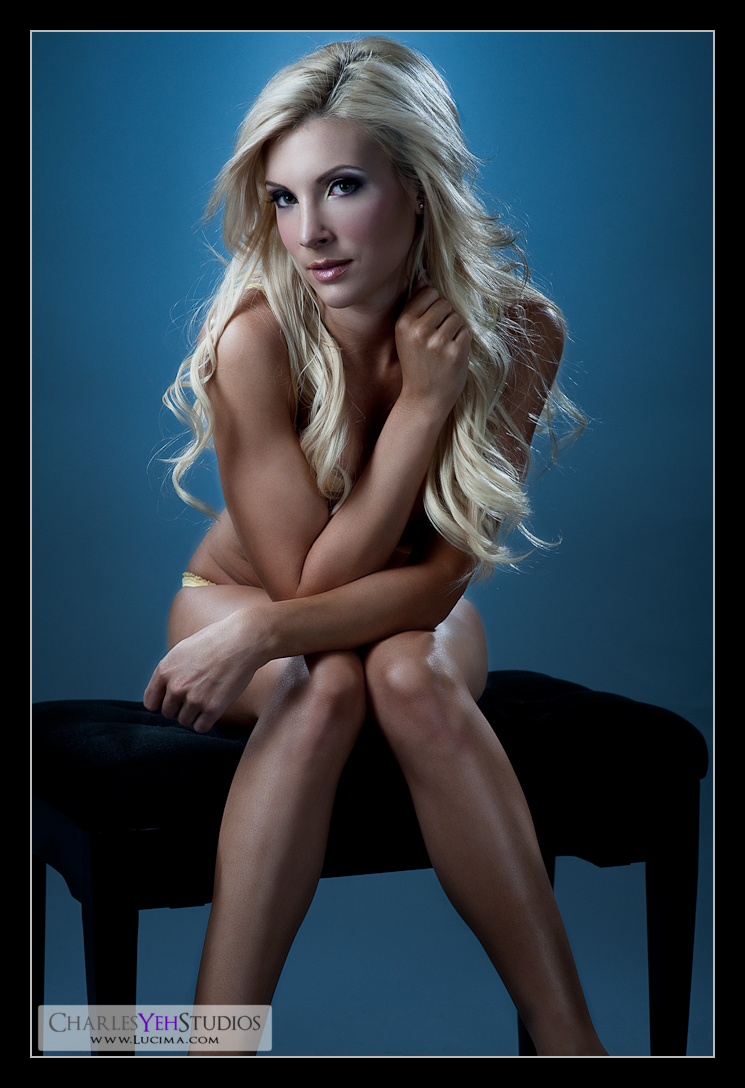
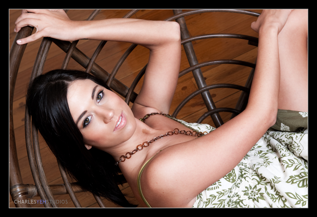
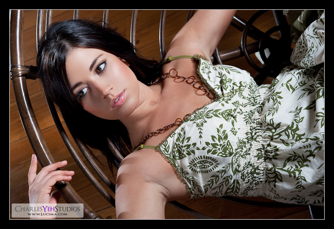
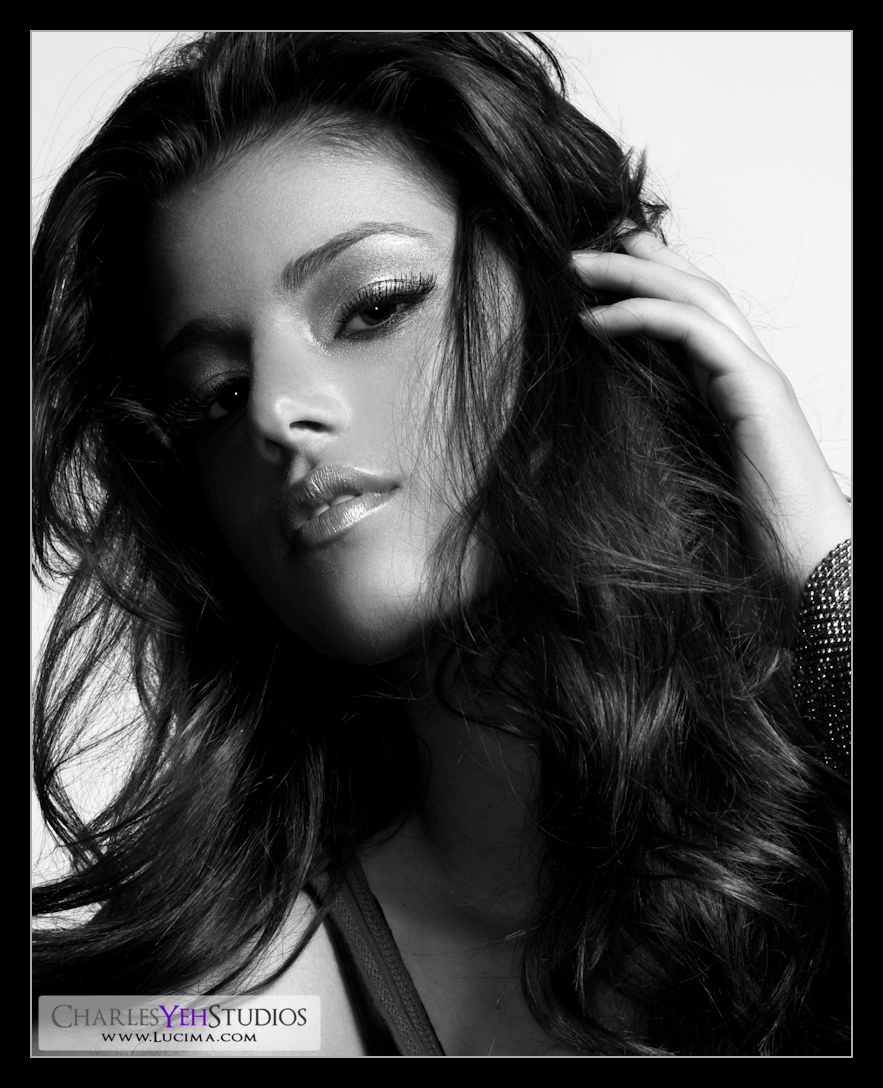
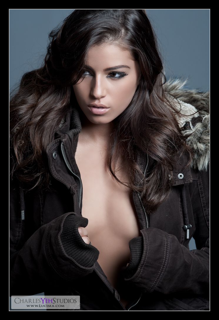
Truth is, we should really shoot Tricia Jo in more ambient light. Her naturally good looks would can be softened with the right lighting as I discovered.

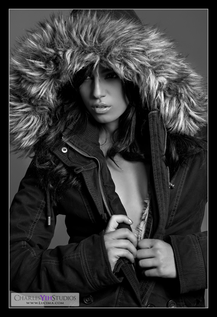
Truth is, this shot wasn't done with all ambient light.

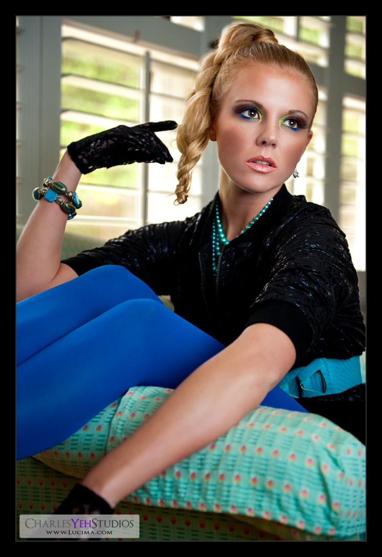
In fact, this is the same set as
Ambient Bear with the only difference being the makeup, model, post-processing.

Okay, so the only things that are the same are the couch and the lighting.

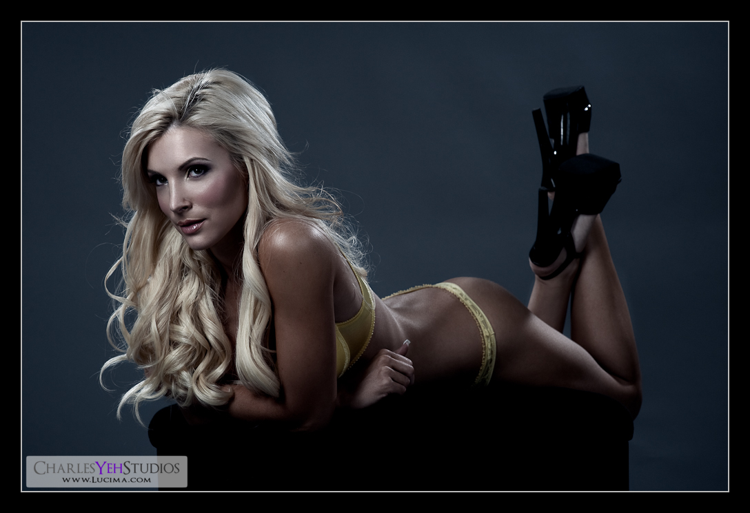
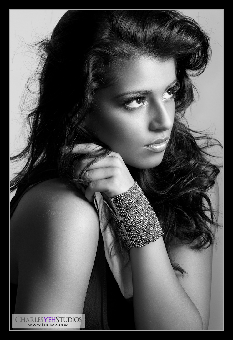
This is one of the most unique sets that I have shot in a long time. As you can tell from my pictures, I don't venture far from the traditional studio stuff. But that's all about to chance. You can't always do the same thing over and over again without variation. This is also one of the most challenging sets that I've had to retouch. Balancing the ambient with the flash when shooting was one thing, the challenge there being to let enough window light in without blowing details on the face, couch, and the outdoors. The challenge in retouching was to further balance the fill-flash with the ambient and to bring out TJ's face... and all the while trying to make it look natural and unnatural at the same time.

Conceptually it's unnatural to have such a heavily made-up model on such a homely looking piece of furniture. That's juxtaposition. Then it's also completely unnatural to light her ambiently when her style demands a harder type of light. That part I'm not so sure I succeeded on. However in retouching we saturated the colors. Really focused on drawing attention to the face while distracting the viewer with the wardrobe in a "casino-like" effect. The balance of soft with hard was truly unique and may be lost on the viewer. Hell maybe it doesn't exist and I don't know what I'm talking about? :)

Nevertheless, this one was challenging and fun to retouch. Perhaps I'll post the original up sometime?

Anything else extraordinary about this shot? TJ really nailed the poses. She brings an actress mentality to each set and produces a feeling that is unique to the set. A very method-modeling approach that I quite enjoy. Maybe my picture choice will be in question. Maybe some will say that her face isn't hard enough. But I feel that this shot captures both the hardness and the softness. Of course some will balk at the hand positioning. But it's supposed to be odd and a little weird. Look what's she's wearing. Look where she is... I dunno. I like it though. Then again, I kinda have to don't I? I mean, what would that say if I were like, "I don't like it" LOL :)

Camera info: D3/24-70mm f/2.8G @60mm, 1/60th, f/2.8, ISO500 (booyeah, so little noise!)

Strobist info: SB-800 with diffusion dome in 50" Apollo Westcott softbox camera left. See here.

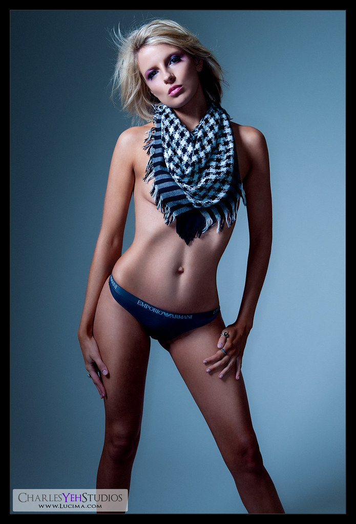
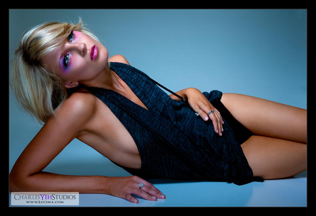
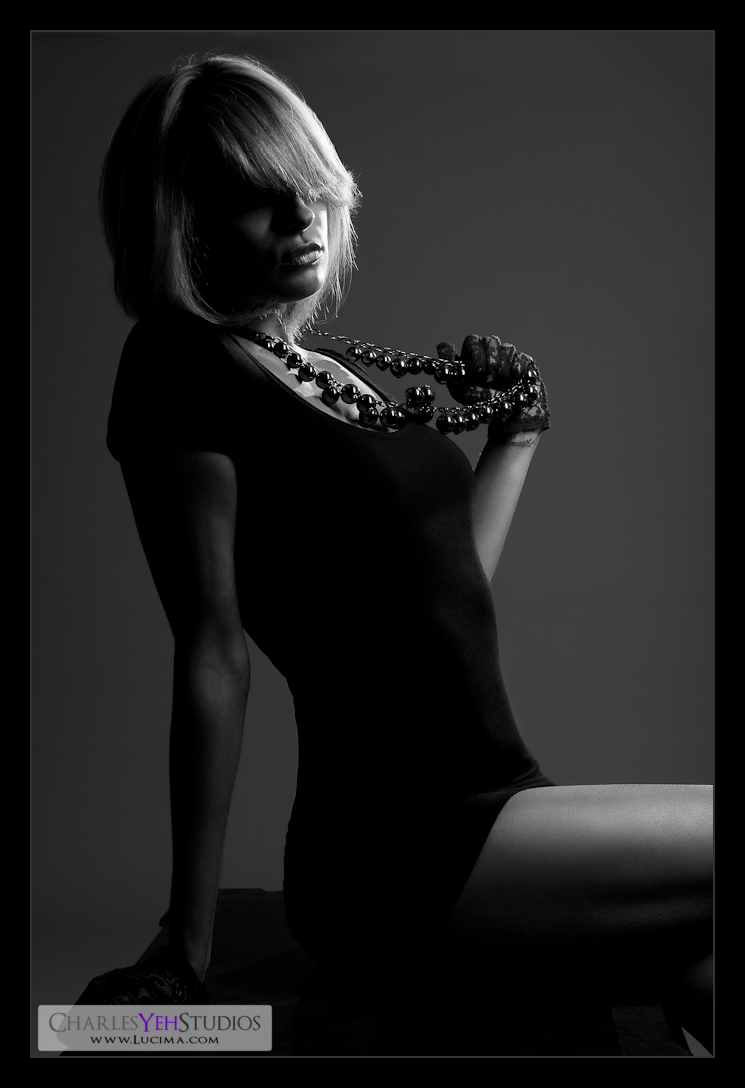
Model: Tricia Jo Hoffman

Makeup: Kelli Zehnder

Wardrobe: Tricia Jo/Michelle Green

Wednesday, October 28, 2009

Kenna: Secret


I can't tell you what Kenna's secret is because I don't know what it is. But that's the way Kenna works, she's mysterious :)

What I can tell you is how I work and how things have progressed over time to where it is today. Lately, I've been looking for a "crispness" to images that I have been seeing in others' work that seems to elude me.

But I'm getting closer.

There is a certain "paper-quality" to the images that I've been attempting to achieve with both Secret and
Kenna... And I'll tell you what the issue is: When you shoot at 12.1 megapixels (which is 4256 pixels on the long side) and then resize to 1024 like I do when I post to web, you're going to lose a lot of the detail which would otherwise make an image crisp and sharp.

What's the solution? Overall sharpening to counteract the anti-aliasing filter will help. Output sharpening on resizing will also help. I've found that adjusting for levels decreases the "haziness" of the image thus lending to an overall sharper look and feel. But the truth is, nothing is going to bring back those middle frequency details that are lost in both my retouching and resizing. Some have suggested reintroducing a small amount of noise which can help but I feel that perhaps NOT killing those middle frequencies via spatial frequency separation might be the best bet.

But the time savings in using the
spatial frequency separation method is extraordinary. So it's a compromise. Every retouch is different as well so there isn't a one-size-fits-all means of obtaining that crisp and sharp feel to all images.

Is there anything unique or special about this image that I don't usually do for others? Not particularly other than that I've been upping the vibrance on this and Kenna... Also I've gone back to playing with levels and trying to get them as crisp as possible without losing too much detail, really it's a compromise which means I have to adjust the middle levels bar. Lastly, I didn't go over the skin with the "spatial frequency" healing brush this time, which means the skin should retain a lot of the finer detail that should translate and hold even after a resize to 1024 pixels on the long side. Why do I resize to 1024 pixels on the long side? It's completely arbitrary. I feel it's a good web size that all displays can handle and not too small where it's useless.

What a body huh?

Camera info: D3/24-70mm f/2.8G @48mm, 1/200th, f/7.1, ISO200

Strobist info: Tried and true. I love the AB800 with beauty dish gridded with the 40 degree gridspot + Ray Flash adapter (on SB-800) combination.

Model: Kenna Cade

Makeup: Kelli Zehnder

Wardrobe: Kenna/Michelle Green

Monday, October 26, 2009

Kenna...


When I saw this in Lr, I said "Wow..."

Then I said it another 20 or so times.

There's nothing that can be said about this shot that could really do it justice. Words can't express what you see, which is probably why I do what I do.

I spent quite a while in PS because my lighting was done "poorly", casting the latter half of the body with more light which is exactly opposite of what I was going for. Oops.

There's one little thing that I did in Photoshop this time that I have never tried before. I'm going to keep this a secret for now and try it a few more times before I make up my mind about how I feel about it. It doe add a certain editorial feel to the image.

This was what I had in mind when I shot "
Sign of things to come?" In retrospect the scaling issue was bigger than I had planned because Kenna being 5'7" (and 6'0" with heels) can really stretch across the tile boards. I really need more space to shoot this with a darker background. Hell I might need another board or two.

Kenna's gorgeous. I realize that this might be the first time that the flickr world has seen her face since the other images of her were cast in shadow, but she's got incredible features as
Features shows. What a face! I suppose the endless legs aren't bad either.

Camera info: D3/24-70mm @55mm, 1/200th, f/7.1 ISO200

Strobist info: Ironically, this isn't so much the
Bear Lighting Setup but instead closer to a variation of the BD and Ray Flash combination, but lying down. I used the gridded BD from camera slighting upper left and filled with the SB-800 with Ray Flash adapter on it.

Model: Kenna Cade

Wardrobe: Kenna Cade/Michelle Green

Makeup: Kelli Zehnder

Sunday, October 25, 2009

Kenna: Beads


Decided to turn to the dark side today. Comparatively speaking, this isn't one of the darkest pictures I've released. It is well exposed for highlights produces a great sense of form and features around the face. Very much along the line of the other pictures of Kenna.

In fact I burned the area around her right eye quite extensively to remove everything but a hint of her eyes. It's simply not a part of the picture that I needed/wanted.

And we went directly with B&W and ditched any version of the color at all. B&W conversion plus a gradient map as usual.

Played a lot with sharpening today. Did the usual sharpening and then even tried my hand at some smart sharpening. Not sure if the results are exactly what I was looking for just yet. Might be too sharp, especially after some output sharpening (today going with low output sharpening).

Different yet the same? I don't know. I like this picture though, particularly of the shadows on the face. You tired of shadows yet?

Camera info: D3/24-70 f/2.8G @58mm, 1/200th, f/7.1, ISO200

Strobist info: This is actually a variation of Bear: Light Fall-off. I used the AB800 with strip softbox pointed directly at the background paper from camera right to feather the light onto Kenna. Then I added a AB800 kicker/rim light with 20 degree grid from camera front right to create highlights. Staying behind the softbox and out of line-of-sight of the kicker light prevented flares from the kicker/rim light but I was not always so careful...

Model: Kenna Cade

Makeup: Kelli Zehnder

Wardrobe: Michelle Green


Saturday, October 24, 2009

Kim: Flickr Favorite


You guys are killing me. I spend just as much time on the other pictures but you insist on rewarding the ones that show the most skin. What's so great about scantily clad chicks?

So here's one for the masses. You bastards. I hate you all :)

Spent lots of time in PS only to go full circle and pretty much end up where I started. I love the skin tones and the warmth and every time I tried to dial it back whether with desaturation or with B&W blending, I always came back to the warm skin tones and the blue background. Couldn't get away from it.

And no she's not topless... she's wearing a yellow bra. You know, the one she was wearing in the other picture. You sick sick puppies you...

Although I'll admit I picked this one because of the implied implied nudity. Haha, tricked you... bastards.

Can you sense the resentment? :)

Watch, this picture's gonna kicked out of the flickr groups because it's too "explicit".

Camera info: D3/85mm f/1.4D @f/8, 1/200th, ISO200

Strobist info: See picture for details

Model/wardrobe: Kim Fattorini (what wardrobe???)

Makeup: Alyssa Fong

The world is full of perverted minds and they all reside on flickr...

Friday, October 23, 2009

Kim: Blonde


I'm good at stating the obvious. I revisited an older picture from Kim's shoot back in the beginning of September. It's only been 7 weeks but it feels like months ago. Also, the flickr fans really like Kim, after all she's got one of the top pictures in my photostream... who am I to deny the masses?

I learned a few things from retouching this picture of Kim.

-You can run actions from the middle of the action. You don't have to start at the beginning. Each action script is a series of actions that can be started at any point.
-Instead of using Normal blend for Gradient Map on a B&W, you can use soft light instead to retain the color and still achieve the increase in contrast.
-Hell you can even do a Soft Light blend on a B&W adjustment layer. I did that for the face and then masked in what I needed and then adjusted opacity for the right "mix".
-In desaturating an image sometimes the face needs some resaturation otherwise it looks washed out. This is the second time I've done this recently. Oh and I put back some of the color in her lingerie as well...

Camera info: D3/85mm f/1.4 @f/8.0, 1/200th, ISO200

Strobist info: 2 AB800 as hairlights and rim lights from upper camera left and right. Main light is an AB800 in 10"x36" strip softbox from camera left. Fill light is an SB-800 in 28" Apollo Westcott softbox from camera right. Setup can be seen below.


Model/wardrobe: Kimberly Fattorini

Makeup: Alyssa Fong

Processing: PS/Lr

Kenna: Form


What can I say that's not already brutally obvious?

Kenna's got form.

The arms, legs, skin tight shirt/dress. The expression. I love this shot. It's probably the first time I've used a crop straight from the camera... all 12.1 megapixels.

Can we be any nerdier? *snort

I almost named this one "desat/resat" because in 20 layers I desaturated the image and then resaturated the image because I felt like I drowned out the skin tones. Also I decided I'd had enough of the desaturated look for the time being and wanted something with more "warmth" which contrasts against the colder light temperature... another juxtaposition.

I have a question. When I blog am I too technical or in laymen's terms too difficult to understand? Am I reaching my target audience? Who is my target audience? I dunno, I suppose you... whoever's reading this. Or me? Maybe I'm just doing this for me.

Camera info: D3/24-70 f/2.8G @66mm, 1/200th, f/7.1, ISO200

Strobist info: This is actually a variation of Bear: Light Fall-off. I used the AB800 with strip softbox pointed directly at the background paper from camera right to feather the light onto Kenna. Then I added a AB800 kicker/rim light with 20 degree grid from camera front right to create highlights. Staying behind the softbox and out of line-of-sight of the kicker light prevented flares from the kicker/rim light but I was not always so careful...

Model: Kenna Cade

Makeup: Kelli Zehnder

Wardrobe: Michelle Green

20 Layers...

Kenna: Features


I already know as I type this that I'm going to catch hell for this image because "the Average Joe" can't handle the shadows in her eyes and around her face.

But that's the beauty of this image.

So before you say, "it's too dark..." please understand that this was my intent. Kenna has incredible facial features, the pouty lips, perfect nose, godly cheekbones all shine in this image. Even her intense blue eyes somehow manage to shine through if you look closely enough even though I burned the shadows under her brow very hard.

I love the curvature of her body, the slight head tilt back. Everything about this full-framed image and the individual components screamed at me when I looked through it on Lr.

I treated this image very differently than normal. Kenna has such perfect skin it's amazing... and thus I don't have to go through the usual motions of blemish removal. Instead I spend my time burning those dark shadows... darker.

Looking through the layers that I worked through for this image, I spent a lot of time making sure that the exposure and color across the body was even. That's something I rarely have to do but I didn't want the blue in the jeans skirt to overpower the vibrance of the frame. Also the beauty dish gridded leaves the bottom half of the body a little dark so it was brought back up in exposure.

I love this picture. On an artistic and emotional level it really speaks to me... which is funny because I'm usually deaf to the mumblings of the inner creative.

Camera info: D3/24-70 f/2.8G @60mm, 1/250th (ooops that's faster than sync speed with the AB's and the V4), f/7.1, ISO200

Strobist info: AB800 in 22" beauty dish from upper camera right and SB-800 on-axis attached to the Ray Flash ringflash adapter. As always you can see the infamous setup here.

Model: Kenna Cade

Makeup: Kelli Zehnder

Wardrobe: Michelle Green

And in case you were curious about some of the earlier layers/steps I went through...

Thursday, October 22, 2009

Kenna: Levels


It has occurred to me that levels correction for color images and B&W images are completely different. Actually they're completely opposite. In color you can compress the levels more for contrast, but in B&W you need the entire range of levels to produce the gradations in the skin properly. Cutting down the highlights and/or killing the blacks loses those gradients in the skin tones and causes harsh tonal changes. At least that's what I discovered when I tried to process the B&W version of Kenna's color picture the same way. Maybe I'm wrong. I'll keep experimenting.

Another little trick that I use is desaturating via the B&W adjustment. After I create a good looking B&W, I then adjust opacity so that the tonal strength of picture comes through while desaturating the image.

One thing I ought to remember is that all liquefy effects should be done prior to any retouching. It's better when it's performed up front rather than at the end.

Another thing I should mention about this set is that sometimes it's okay to lose the details in the eyes if your trying to create a certain effect. In this set we tried to shift the focus to body positioning and therefore the height of the beauty dish was elevated to the point where it would cast a shadow from the top of her eyebrow into her eyes. It adds to the mystery as well as the punch. Unfortunately I had to battle the low ceiling as well as the umbrella adapter threatening to collapse under the AB800 and beauty dish's weight.

This was a great start to an awesome shoot. Kenna is strikingly beautiful and very easy to work with. Probably explains why we shot 1,400 frames in about 7 hours. There will be more to come.

Camera info: D3/24-70 f/2.8G @42mm, 1/200th, f/7.1, ISO200

Strobist info: AB800 in 22" beauty dish from upper camera left (that's odd, I don't remember it being on the left side...) and SB-800 on-axis attached to the Ray Flash ringflash adapter. As always you can see the infamous setup here.

Model: Kenna Cade

Makeup: Kelli Zehnder

Wardrobe: Michelle Green

Ambient Bear


It looks like this was shot with ambient light right? That was my intent. However without frontal fill-flash the bear would be entirely too dark in the front. Cue the 50" Apollo Westcott softbox. I wanted to post this so I would have settings for my shoot tomorrow in case I decided to use this setup. It really isn't revolutionary but I seldom use ambient light so this is different for me.

Camera info: D3/24-70mm f/2.8G @70mm, 1/20th, f/2.8, ISO200

Strobist info: SB-800 in 50" Apollo Westcott softbox from camera left. Ambient light from windows.

Model/wardrobe: Nude bear

Makeup: Nude bear

Wednesday, October 21, 2009

Mladenka: The Look

I had some more time today and decided to try my hand at retouching one of Mladenka's first sets we shot back in July. Digging through Mladenka's old shoots is like digging through a treasure chest... you know for sure you're going to find gold.

This picture is basically a derivative of two other pictures that I had already retouched back in July. Of course, lots has changed since July and just like my revisiting of Amber's pictures, I wanted to see what I'd do differently this time. Here's a comparison:

Nobody's Perfect... Right


Blue Muse


Mladenka: The Look


One of the first and most apparent things about the new pictures is clarity and sharpness. There is an unprecedented level of detail in the new pictures that the old ones lack. The old ones are smoother and almost hazier and perhaps more pleasing to the eye in that respect but the new ones have more crisp detail. It also takes me much less time to get through these new retouched pictures than before...

What obviously hasn't changed is Mladenka's incredible look.

Camera info: Nikon D3, Nikkor 85mm f/1.4, 1/160th, ISO200, f/10

Strobist info: Main light is an AB800 in a 22" beauty dish with 20 degree gridspot coming from upper camera left. 2 AB800's as kickers/rim lights left and right about shoulder high with barndoors. 1 SB-800 hanging overhead in a Lumiquest SB-III (camera upper front between Mladenka and the background). Lastly an SB-800 between the background and Mladenka, on a stand shooting directly into a black background. Pretty much my typical bread and butter setup :) The blue is from white balance settings. Triggered with Gadget Infinity (Cactus) V4.

Processing info: PS CS3 Lr2.0

Model/Makeup: Mladenka Grgic

Amber: Revisited

Every now and then I like to revisit some of my previous photoshoots. Today I decided to revisit one of these pictures from Ambers many sets. With the knowledge I have now regarding retouching and what not, I wondered... how different would this picture be from the original one that I retouched back in June (5 months ago!).

I went through the motions that I now apply to most of my images, first running a curves layer to brighten the image up. Then taking care of the big things first like the blotchiness, dark spots, big things that needed to be healed up. Then I ran through the layers action to separate the skin using spatial frequencies. After most of the uneven tones as well as the little blemishes on the skin had been taken care of, I spent lots of time dodging and burning the remaining uneven portions of the skin, paying attention to transitions of light and shadow (I used to do this quite arbitrarily). Then I made sure to sharpen, darken certain portions with another curves, bring out the eye color and eye lashes, dodge and burn some more, etc... all the remaining little things that I don't think about but depending on each image needs. Lastly, I used output sharpening from Lr to bring out the details at the output resolution of 1024 pixels on the long end.

Here is a June vs. October comparison at the same resolution (click on each for 1024 pixel version):

June


October


I'm not sure how I feel. The pictures are different to begin with but primarily I'm not sure if I'm completely happy with the October retouch. There's something about the resizing that I'm not happy with particularly as it applies to the sharpness...

Camera info: D3/24-70mm f/2.8G @70mm, 1/200th, f/9.0, ISO200

Strobist info: AB800 into a beauty dish from camera upper right. SB-800 placed on the ground in front of camera for hair/rim lighting.

Model: Amber McNeil MM#1188271

Makeup: Krystal Almanza MM#902517

Tuesday, October 20, 2009

Nude Bear: Light Fall-off


People are probably thinking, "OMG, he went from shooting models to shooting stuffed bears..." LOL :)

It's just temporary. I need to verify a few lighting techniques and setups before going into my next shoot. As a photographer and retoucher I have to practice. Growth for me comes in periods of exponential growth followed by periods of plateau. To me, the periods of leveling off (plateau) allow me to completely assimilate the knowledge I have accumulated during the periods of torrential learning.

Last week I ended a torrential period of retouching that lasted 2 weeks. This week I'm cycling back to shooting and putting some new tricks in the back as you can see with the experimentation with tile boards.

Today, I'm playing around with fast (yet soft) light fall off. yesterday I saw a picture of a model's body where only half of her body was lit. I was impressed by how well the light was feathered off her body and more importantly, how quickly it fell off the body. The combination of soft light and fast fall-off puzzled me because I'd always had trouble controlling one or the other. Soft light is easy, any light modifier that makes your light source relatively bigger (to your subject) will produce soft light. The problem is that by making your light relatively bigger, you run the risk of spilling all over the entire subject and into the background.

That's where feathering comes in. If you feather the light off the edges onto the subject, then not only will you get soft light but also good control over spill.

But that's not the end of the story.

Light to subject distance is critical here because at "normal" levels of power, the feathering effect isn't going to allow a fast light drop-off. I've done this experiment before and never have I been satisfied with the results, particularly with the light fall-off. Last night (literally while sleeping), I realized that I needed to bring the light in really close to the subject and turn down the power. Remembering the
Inverse Square Law equation, we know that the light fall-off is exponential with distance. By feathering the light, we're using diagonal distance as well as direct exposure to the light source to create fast light fall-off.

At least I think :) Sometimes I think, "Maybe I don't know what I'm talking about..."

We'll let the results speak for themselves. I only did a little retouching to black out the white BG paper that I left up from yesterday since it slightly reflected back some of the softbox. A bit of curves and levels adjustments were made also. Otherwise, the drop-off is apparent on the body while still maintaining good exposure on 1/4 of the bear, which is what I was shooting for.


Camera info: D3/24-70mm f/2.8G @70mm, 1/200th, f/5.6, ISO200

Strobist info: See picture above

Model/wardrobe: Nude Bear

Makeup: Nude Bear

Monday, October 19, 2009

Sign of things to come?

Flickr buddy Dom inspired me to experiment with tile boards when he took a picture of his dog Ernie below:


What caught my eye was the reflective nature of the surface in front of Ernie which I subsequently discovered was a tile board that could be had at Home Depot for $13 (now on sale for $11). After searching high and low at Home Depot, I finally found it (I can't even remember which department exactly only that it was closer to the doors and windows department than flooring). At 4'x8' I had to drive the Prius home with the hatch tied down. Fortunately the boards were flexible and I was able to cram them in the car.

Is it a sign of things to come? I hope so. A bear and a model are vastly different in size so we'll have to scale our light up in order to make this work. The beauty dish isn't going to get any bigger... only time will tell.

The challenges in using the tile board was getting making sure the "seams" didn't show when I lay the 2 pieces of 4'x8' tile board together. But it's nothing a gridded beauty dish can't handle with the controlled light and fast light falloff! Additionally the white background really wasn't a good color match with the tile. There was significant yellow in the background paper. The tile board also was lumpy and doesn't lay flat. I had to put lots of masking tape on it to make it sit flat.

Fortunately all those issues go away once when you blow out the background OR you let the light falloff so fast that the second 4'x8' is masked in darkness... then the background isn't so much of an issue!

On a side note, it's nice to work with a model that brings her own wardrobe and does her own makeup...


Camera info: D3/24-70mm f/2.8G at 70mm, 1/200th, f/4.5, ISO200

Strobist info: Single AB800 in 22" beauty dish with 40 degree grid from camera upper left

Model/wardrobe: Bear

Makeup: Bear

Here's the lighting setup complete with notes... wow, it's been a while since I've done one of these! I know you guys like these too, but it's just not a top priority when I'm shooting (I always forget!).

Thursday, October 15, 2009

Surface, Breathe... Retouch

As an avid surfer, I know a thing or two about coming up for air. Sometimes it feels like you're on the brink of drowning and can't hold your breath any longer. Sometimes I wonder how I've survived some of the big swells that have hit Southern California over the last couple years.

Surface and breathe.


It's rare that my desktop gets cluttered like this. I've been promising actual write-ups for the last 15 images posted on flickr. Some of them were B&W versions of the same pictures and some of them were 1:1 crops of the same picture but I've been retouching for what feels like a week and half non-stop. Now I need to take a step back and kind of sort out all that's happened in my mind...

Here's what happened...

Elle: Masterpiece


It was really
Elle's Masterpiece that kicked off this entire process. While I was extremely pleased with the outcome of the picture, I was also a little peeved at having spent 8-10 hours retouching it. The next day after uploading this picture to flickr, I stumbled on Kesler Tran's work and while I mentioned it in my "Weekend Update", I felt overshadowed by his work (even though I'd never met him!) In a nutshell, it was difficult coming off of the high that Elle's Masterpiece gave me and then discovering Kesler's work, put me in a temporary low. I tried following up with Elle's Shadows but it wasn't as good...

Elle: Shadows


I should mention that Elle's Shadows was the beginning of the new retouching rampage that I've been on. I went on Lynda.com and looked over a few of the online tutorials that Chris Orwig had and learned a few basic techniques such as D&Bing with a 50% grey layer, patch tool and other little things that I mention in
my writeup for Elle Shadows.

Processing Elle Shadows and seeing great B&W pictures from Kesler pushed me to ask the right questions about B&W tonality, contrast and overall "punch". That led me to the post
"Stuff no one tells you about... B&W" where I discuss my new techniques for processing better B&W images. Needless to say, Kesler's work has had a huge impact on my retouching of pictures and I constantly compare and "consult" his work when retouching mine. This is one of the ways that I learn best...

In the process of trying to backsolve Kesler's work and learning new retouching techniques, I stumbled upon perhaps the greatest skin retouching secret. Actually it's no secret and was easily found via a google search (I forget what I was searching for) and is an on-going thread in ModelMayhem.com where I spend a lot of time "procuring" models and makeup artists. The thread is called "
High Pass Sucks (+ Solutions)" and if you're technically and PS-inclined, I would very much suggest reading through the entire thread to learn these new techniques. These new techniques are the reason I have been retouching faster and more effectively than before and cutting down my skin-retouching by several hours. In addition, it has also provided me with an arsenal of techniques to sharpen my images before posting on web (and print). You should be warned that the thread is highly technical and is should probably carry an advanced rating as far as Photoshop is concerned. To summarize, spatial frequency separation allows the user to separate an image based upon user-specified frequencies (in pixels) without introducing artifacts. This allows the user to then modify the low frequencies without altering the high frequencies and vice versa. The applications for this technique is endless where smoothing and sharpening are just the beginning of it.

If I had this technique for Elle's Masterpiece I could have cut the overall retouch time from 8 to 4 hours. That's truly substantial.

But as I mentioned, reading that thread was not easy. Working through actual pictures with the instructions and actions provided, was not easy. I spent days trying to make sense of all the jargon and even had to ask a few clarifying questions. When the dust settled, I processed 5 pictures the two days averaging 3 to 4 hours per picture. Considering my average being 8-10 before, my efficiency and effectiveness improved by leaps and bounds. The following are the 5 images in the first 2 days:

Mladenka: More


Mladenka: Horizons


Mladenka: Colors


Mladenka: More Colors


Elle: Fade to Black


I was on a total tear when I retouched these. It was magical shooting with Mladenka again who actually filled in for another model who cancelled last minute. As I've mentioned before,
Mladenka is totally my muse and she's awesomely beautiful and easy to work with. In fact if you look over the end of July and early August you'll find lots of pictures and write-ups of my work with her. What you'll also notice is that my "work" looks dramatically different from merely 2 months ago.

I continued on to process more of Mladenka and even revisited some of my work before with Mara as well as Elle (as seen above):

Mara: Office Furniture


It was also at this time that I finally got to see the last set of pictures that we had shot with Mladenka, which I had at that point yet to review. I was stunned. Totally blown away. In fact my first reactions were captured on this post
here when I saw this in my Lightroom:


What made these images really pop were the lighting, the fur hood, the light passing through just a peak into the eyes, her face and her exceedingly incredible poses. This is what encouraged me to retouch the following series of pictures from that set (one of which has yet to be uploaded to flickr):

Mladenka: Hot and Cold


Mladenka: Intensity


Two other notable differences in my more recent work is the simplicity of my lighting, when I'm often only using 1 light. Also, I've started using more telephoto lenses such as my Nikkor 85mm f/1.4D, Sigma 105mm f/2.8, and last week I even pulled out the 70-200 f/2.8G VR although it seemed to be back-focusing for some reason. Recently I've done a lot of beauty and close-cropped face shots and I think soon I'll be moving away and focusing more on the body.

On Monday, I had the pleasure of working with Sophie again, this time on a lingerie shoot. Here are some of the initial results:

Sophie: Hat


The one that's really getting people's attention is this one, aptly titled
Sophie: Leopard


Now that I have the basic techniques down, I'm searching for the answer to a new question. The problem with separating an image via spatial frequencies is that you can sometimes lose the information in the middle. That is to say, the medium frequencies sometimes get washed out when separating on low and high frequencies thus causing skin to look flat and "plastic" when resized to a smaller resolution. Sure at 1:1 the pore detail is there but when you zoom out, it looks too smooth. The challenge is to retain some of that middle frequency while still having the workflow to quickly and efficiently work through the blemishes and the uneven skin tone. That's the problem...

But I'm going off on a tangent with that thought. It will probably be several more experiments before I find something that will satisfy my thirst for a worthy workflow for retouching skin. My recent PS layers have gotten quite complicated. In fact this is simply the final editing phase for my most recent picture:


Truly there is so much to reflect upon in the events of the last 10-11 days. I'm sure I'm missing lots of the detail in this overarching post, but I've tried to hit the main points and provide as much detail and pictures to illustrate the changes that have been effected over this period. I feel tired... exhausted really. So much has happened that it really needs a little bit of time to all sink in.

Wednesday, October 14, 2009

Behind the Scenes with Kesler Tran

Stuff like this makes me want to barf, laugh and cry all at the same time. It's disgustingly good...

Nikon D3s: Night Vision


D3s will be able to capture images at ISO 102,400

Yes. That's 6-digits. Click
here or on the image to link.

Saturday, October 10, 2009

Mladenka: OMG...

We took these on Tuesday and I'm finally looking through them 4 days later. Typically when that happens, the momentary excitement from that day's shooting dissipates.

These totally blew me away! Mladenka totally owned this set!


I'm trying to select pictures in Lightroom for retouching but as you can see I'm having a hard time when they're all so good. I haven't posted any blog entries about the retouching process and all the new pictures but I had to say something when I saw this. I had to tell someone, anyone! First thing I did was do a screen capture and send them to my brother. Then I posted it on flickr and my ModelMayhem site. These are straight out of the box images (unretouched)! I can't believe we shot these...

I'm totally blown away. Did I say that already? Seriously, I'm so rarely impressed these days but this is phenomenal!

Breakthroughs

I've made a breakthrough with my retouching...

7 days ago I almost quit shooting/retouching because I found Kesler Tran's work. Simply put, it's lightyears above what I'm capable of! So much so, it was extremely discouraging.

6 days ago, I decided to use Kesler's work as an example and learn from it.

5 days ago, I discovered a thread regarding "why high-pass sucks (as a sharpening method)" and spent 2 days reading it. Yes, 2 days reading it. You can read it too, here. I'm on page 7 out of 15.

3 days ago, I started applying those techniques. Not only does it help because I never used to sharpen my images but it also allowed me to process pores/skin 2-3x as fast.

2 days ago, I discovered why my B&W pictures weren't as powerful. See my previous post.

Today I discovered that a B&W gradient can make a powerful desaturated picture. I'll probably post something on this later.

These are the reasons I haven't posted any pictures or made any typical posts regarding the pictures on flickr.

Friday, October 9, 2009

Stuff no one tells you about... Black and White


There are some things you can google 'til the cows come home but you'll never find an answer to. Or if you find an answer it will be buried within pages and pages of google results before you find it.

For example, how to make a good black an white image. Sure there are TONS of "techniques" and processes online that will aid you in creating a good B&W but no one ever tells you what to "look for". You can have all the controls in the world but if you don't know what you're looking for, you'll never be able to utilize those controls to the fullest degree.

Let me cut to the chase:
A good black and white shows dynamic tonal ranges across the subject matter.

See? Now if only someone had TOLD me that when I started shooting/retouching. I had to go figure that out for myself. Before you get upset at me for "stating the obvious" let me give you some examples of how this should influence your B&W decision-making.

I shoot people. So for me the model is the subject. More specifically it's the model's face and thus her skin that's the subject. It's rarely the wardrobe or the background or the set. It's the skin. That being said, we need to exaggerate the tonal ranges of the skin. Does that make sense? That means there needs to be dynamic range across the skin. Contrast. Highlights and shadows. So when you're doing your B&W you need to try and exaggerate this expression of tones across the skin. The transition shouldn't be "bright-highlights to not-so-bright-highlight". It should be "highlight-to-shadow". You could go really extreme and go with "white point to black point" but I find that going too far. It has to be "believable" and still natural. If you go from white point to black point, then everything else in the frame is likely to get pushed to black or blown highlights.

If your subject is the sky, then you need to express the dynamic range of the sky from highlight to shadows. Don't keep it one constant shade of grey. Give it range. Give it dynamic tonal range. The decision-making process when considering your subject will assist you in mapping the B&W tones to the proper color ones.

In Photoshop, I always use the Image>Adjustment>Black and White conversion. The red and yellow tones are the most important ones because skin is comprised of yellow and red tones. Everything else is there to help you bring out the subject and create punch. Now ironically, I don't push the red and yellows to the max. Instead, I leave them pretty low (somewhere between 0 and 30) where they can express range without being pushed to the extreme. It's natural. It's "believable".

Then I typically run the resulting image through a Gradient Map. This is another "secret" that creates punch that I wish more people would talk about. Running it through a B&W gradient map makes the picture "pop". Selecting a good percentage for the blend is key.

When everything is said and done you should have a punchy B&W image that expresses great tone across the subject, in my case the model's skin.


Photoshop on iPhone!


And it's free! :)

RGB

Monday, October 5, 2009

Elle Woolley: Shadows


The way you see this picture is pretty close to the way it appeared on the back of my camera when we first shot it. Dark. Shadowy. And if you've seen my work, then you know this isn't the first shot that I've done in the shadows for the shadows. In retrospect I should have exposed this shot for a nice round histogram so I could have more details to play with and then decide what parts that I didn't need (the highlights and the darks) to compress the brightness levels for good tonal range on the face.

But I didn't.

I think I learned quite a few things with this image:

-Expose properly when shooting and retouch later for effect
-When and why to compress brightness levels
-Adjusting "local contrast" with unsharp mask
-To retouch with a specific effect/feel such as the cool darkness in this picture but without losing skin tone
-Using the inverse of high-pass filter for skin softness
-Using the spot healing brush as a faster version of the healing brush
-Using the patch tool to reduce uneven skin tone
-Always sharpening the final image for a "crisp" look and feel
-Bringing out the color and the details around the eyes
-Sometimes simplicity and angles are your friend. This shot was taken from a higher angle than most of my work
-Watch out for distracting stray hairs
-Never finish an image without looking over it from multiple angles
-Never finish an image because you're in a rush to finish it

All that said, I did have some trouble with some uneven tones in the skin as a result of lighting, saturation, and makeup. I have a new technique I need to try courtesy of Chris Orwig of Lynda.com, from whom I've learned lots of my PS techniques. Anyway, this image was fun to work on and required lots of patience because it was not only an image that I retouched using my typical techniques but also an image on which I used lots of new techniques.

Camera info: D3/24-70mm @70mm, 1/200th, f/9.0, ISO200

Strobist info: AB800 with 20 degree grid camera front left for hairlight/rim-highlight and AB800 in 28" Apollo Westcott softbox camera upper left for main light. No fill card or fill light was used for this image. Triggered with Cactus V4 (Gadget Infinity)

Model/wardrobe: Elle Woolley

Makeup: Kayla Bresee