Tuesday, September 29, 2009

Elle Woolley: Masterpiece


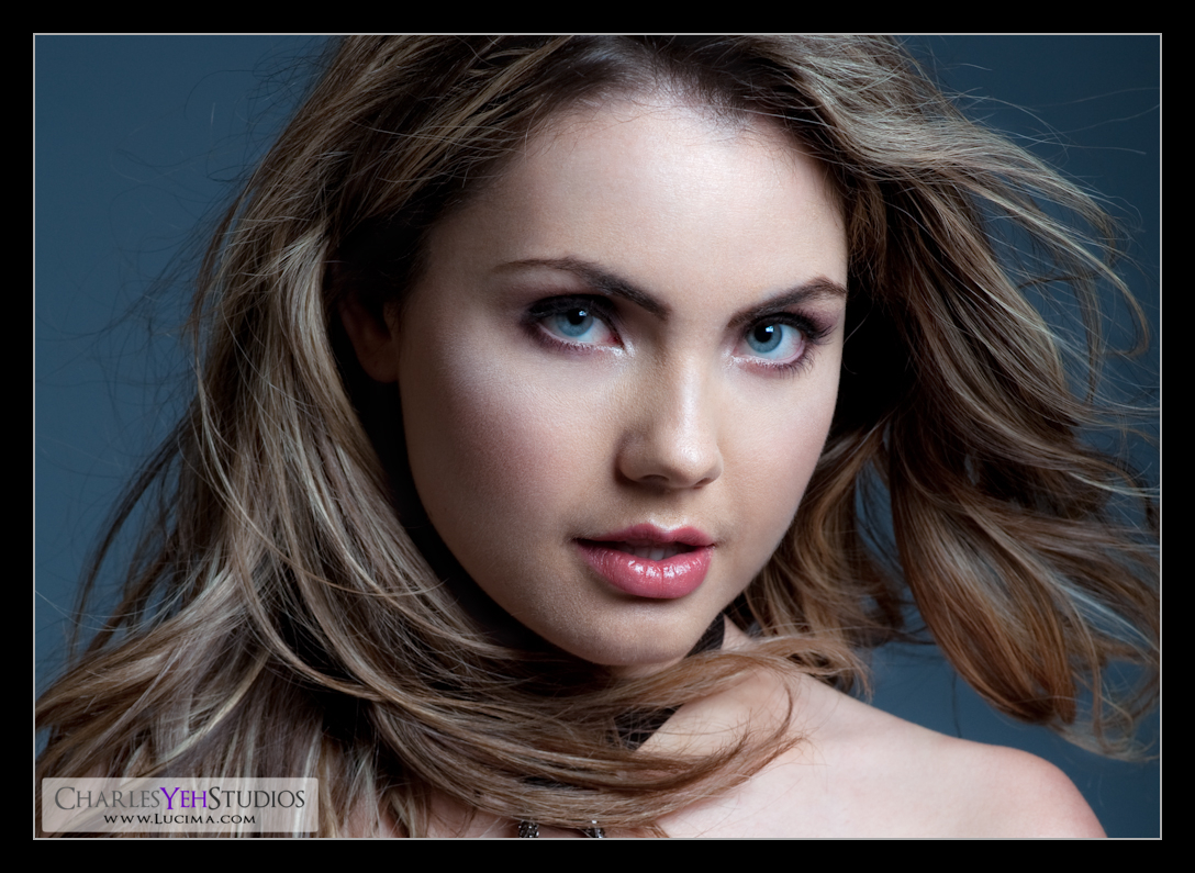
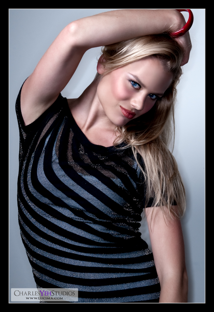
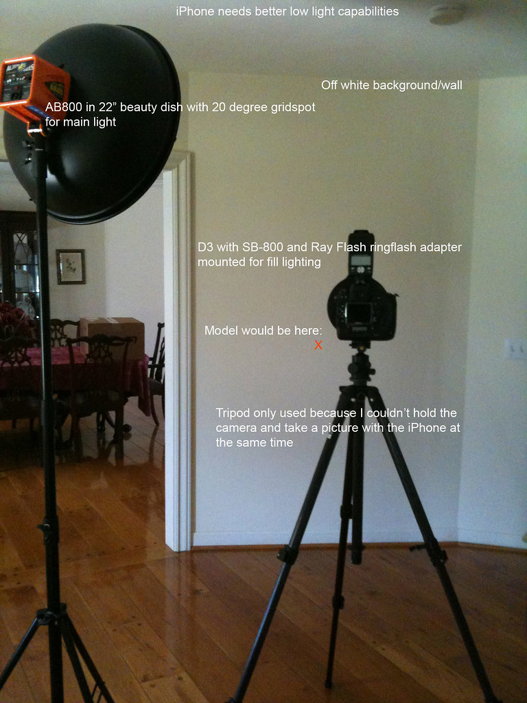
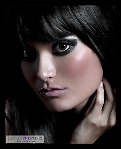
Today has been a total clinic on makeup and retouching. The shot was straightforward. We had Elle look straight up into the AB800 in 28" Apollo Westscott softbox. Since the shadows were too harsh we placed a fill card camera lower left to flush out the cheeks and underneath her chin.

That was the easy part.

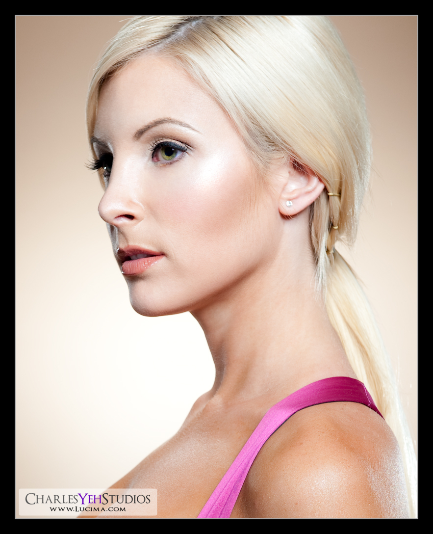
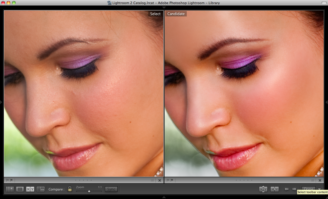
I spent well over 8 hours retouching this picture. But when all is said and done, sometimes you feel like you're part of something greater. This one qualifies for me as one of those instances and is a masterpiece.

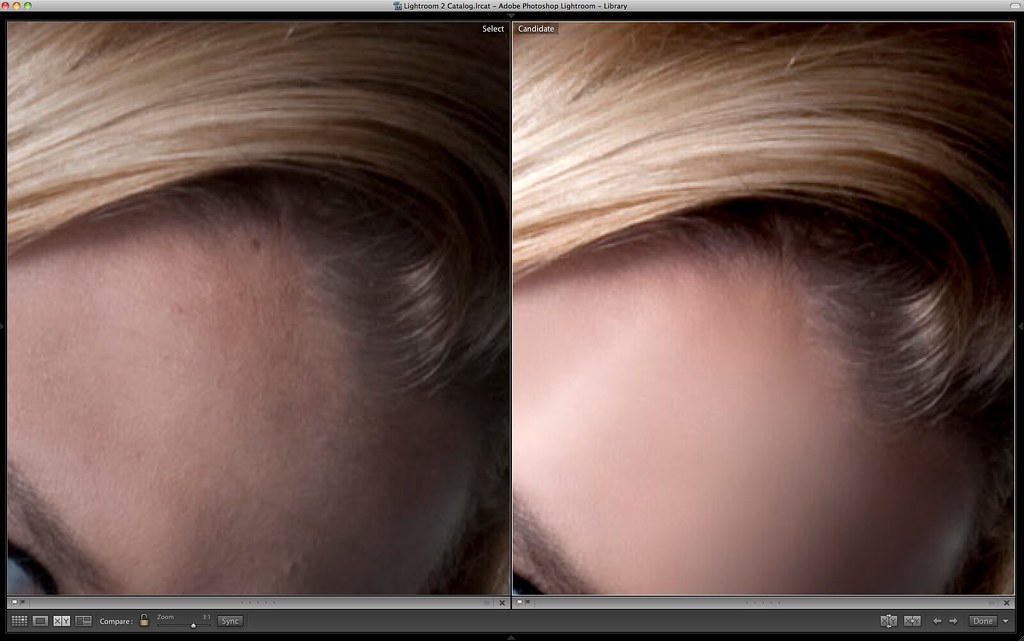
First of all there's no blur. I am growing tired of the blurred and plastic skin look. It's the quick and dirty version of cleaning up blemishes on the face but to do it right you still need to work through the big blemishes anyway before blurring. So why not spend more time pore-by-pore and just do it right so you don't have to blur? That's what I did and it took me the majority of the day. Every pore on her face is her own although it might have been sampled from another part of her face. Due to the fact that all the pores are intact, I was able to really bring out the sharpness and clarity with both the sharpen feature in PS and also pushing clarity in Lightroom.

When it came time to adjust the makeup, I had no idea what I was doing. After consulting our makeup artist Kayla to verify that what I was seeing was indeed makeup and not an artifact of the camera (as far as colors and shades were concerned), I proceeded to really bring out the colors and effects. In fact the most unorthodox thing that I did with this image was to paint in the inside of her eyelid with the same color as the purple eye-liner above and below her eye. I don't know if this is true but I'm guessing that you don't draw that part of the eye because it's millimeters from the eyeball and also supposed to be kept moist at all time with tears. While you can't physically put makeup on there, I don't have those limits in Photoshop. I don't know if I was supposed to but the result was an improved framing of the eyes.

Overall however I think it's the colors of this capture that make the shot. Elle's eyes are a breathtaking blue. The makeup was a combination of nude and purple. The lips were luscious red. Finally the blush was a perfect shade to accentuate her facial structure. Bringing all these elements meant a powerfully alluring face that you can't help but stare at. With that said, the final crop is a small portion of the overall image and leaves out her wardrobe as well as her hair which aren't the focal points of this shot.

Other things to note are that I drew in some of her eyelashes with the burn tool and that I evened out parts of her eyebrows. For spending 8 hours on a picture, I sure don't have much to say. I suppose that an image of this sharpness and clarity simply required that I spend most of the time on the skin. Which is exactly what I did. Oh and I cropped this with the 5x7 ratio again because it fit what I needed.

Camera info: D3/85mm f/1.4D, 1/200th, f/7.1, ISO200

Strobist info: AB800 in 28" Apollo Westcott softbox upper camera right straight into Elle's face. Fill card lower camera left.

Model/wardrobe: Elle Woolley

Makeup: Kayla Bresee

Retouching: PS/Lr2

Monday, September 28, 2009

Elle Woolley: Back to Basics


It's been a while since I've gone back to my roots. It's amazing what you can do with a single strobe if you use it correctly. If you don't believe me, look in her eyes... the eyes never lie :) This was shot with a single AB800 in a 28" Apollo Westcott softbox with a fill card (white reflector) placed so low (camera lower left) that I kind of doubt it added to the exposure.

This isn't the first set that I've done which was inspired by the great B&W picture of Kate Beckinsale that I have immortalized in my mind, nor will it be the last. Also in my habit of shooting is turning on the
paint dryer to move some hair around for dynamic effect. Elle was very good with the wind and her eyes didn't tear up until the last few frames. This was one of many great shots we got while moving her hair around. Occasionally a certain misappropriated lock of hair would get get stuck across her face but the wind is fair and ultimately if you wait long enough, you'll get a clean/clear shot of the face.

It should also be said that I've moved into a level of comfort with the studio that is comfortable but can be mistaken for complacency. I no longer lose sleep the night before (I never did honestly) thinking about setups and new ways to put together a set or an entire shoot. These days, I walk into a shoot very much blind without putting too much forethought into it and letting things develop organically. I've mentioned this before to my models that on one hand it's laziness and on the other hand it's spontaneity to be able to go with the flow and create as is required. That being said, I should probably put more time and effort into pushing the boundaries researching setups during my off-hours.

On the other hand, I will say that the lighting setups that I put together these days are never predetermined. They are always the result of necessity; a light here, a fill card there, taking out a light that is causing problematic highlights... I also take a lot more care and time when evaluating my first few frames to ensure that I don't go 100+ frames with something wrong. I am more patient with the setup. I take my time. I don't get flustered (anymore). I don't lose my cool. In fact, I bet the models I work with think I'm a little lackluster. But I'm not. I'm just comfortable shooting. I'm comfortable with the models. And I'm comfortable with the lights. There isn't anything that remains particular or technically challenging about what I typically do anymore which means it's time I graduated to the more abstract level of this profession and really push the artistic and creative element of the shot.

But with this comfort means that I can go back to the beginning... go back to the beginning and revisit some of the simpler elements of shooting, sometimes with just 1 light. In this set we were actively trying to recreate Kate's B&W picture as I've mentioned above and therefore working with another picture as reference. I must have provided Kate's B&W picture on this blog sometime in the past so I won't bore anyone with a repeat. I thoroughly enjoyed the last few sets with Elle because we were able to take our time and really do whatever we wanted. Sometimes, "whatever you want" yields the best and most creative results.

Post-processing this picture was straightforward and yet not straightforward. This picture has no blur. All the pores are original save the ones that were "healing brushed" in Photoshop. With such clarity and sharpness on the 85mm f/1.4D however, it's rare for me NOT to use a minimal blur. But Elle's skin does not require the blur and I spent enough time post-processing on a pore-by-pore basis so it was entirely unnecessary. Final image was cropped to an unorthodox 5:7 ratio because it included more than a 4:6 vertically and less than a 4:5 vertically. If that made no sense to you don't worry about it. All I mean is that the 5:7 ratio was exactly what I needed for this shot and I never use the 5:7 aspect ratio.

Elle was a joy to work with. Easy-going and very open to ideas/instructions. More to come soon.

Camera info: D3/85mm f/1.4D, 1/200th, f/7.1, ISO200

Strobist info: Single AB800 in 28" Westcott Apollo softbox camera upper right. Fill card camera lower left.

Model/wardrobe: Elle Woolley

Makeup: Kayle Bresee

Retouching: Lightroom/Photoshop

Color Me Bad

I have been battling an issue where Lr and Photoshop don't consistently show the same colors. Sometimes Lr is more saturated and sometimes they do show the same colors. It has been an issue that I've researched extensively, beseeching all the powers of the Internet but to no avail.

I have two posts here from several weeks ago that document the start of my color problems:

Colors Problems, Blurs, Time Spent Retouching, and Foreheads


Sypder3 Pro, Unibody Macbook, Dell 2405FPW


Here's a brief run down of the color issues in story form:

Once upon a time, I didn't give a rats ass about color profiling and color accuracy. I figured, 99.9% of Internet users would not have a color calibrated display so why bother trying to make my pictures true to form. Well, doubt crept into my mind and I started doubting the colors that I was seeing and if there's anyone you must always be true to, it's yourself (so trite, but it's a story so bear with me).

So I stopped editing my images and in the meantime purchased a Spyder3 Pro from Adorama which took a week to arrive. Since I couldn't vouch for the color accuracy of my images, I didn't want to release any in the meantime. So I waited and when it finally arrived, I realized my MacBook Unibody had a warm tint.

The arrival of my Spyder3 Pro also ushered in my use of dual displays with the purchase of a Mini DisplayPort-to-DVI adapter. My secondary display was now my old Dell 2405FPW that I've had since 2005. Incidentally Snow Leopard was released and I upgraded to OS X 10.6 (Snow Leopard) and never looked back. In retrospect, I should have done one piece at a time, but this is my life and I'll screw up if I want to, thanks.

After verifying that my calibrations were color accurate (I drove to Samy's Camera in Hollywood to look at their Eizo CG241W), I finally put behind me that my displays' colors were accurate. Furthermore, I began printing my work at a local Costco after downloading their color profile from
Dry Creek Photo the result of the prints were further assured me that my displays' colors were finally accurate.

However, I found a single discrepancy... Lightroom and Photoshop did not match. After substantial research, I uncovered that Lightroom is simply not programmed to handle separate color profiles across multiple displays. It seems that Lightroom grabs the color profile of the display it starts in and then uses that color profile regardless of which display the user drags the Lightroom window into. Photoshop on the other hand shifts its colors according to which display the user drags the Photoshop window into and seemingly uses the correct color profile.

Only, I can't repeat this issue consistently. It would appear that there are subtle shifts in Lightroom after dragging the window from one display to another. To further complicate matters, another variable that seems to influence which color profile Lightroom grabs when starting is whether or not the secondary display is the default display (System Preferences>Displays>Arrangements>drag the menu bar to the secondary display). Needless to say, this has all been quite frustrating and I have yet to figure out how to repeat this issue consistently for others. To make matters worse, I have heard different results from different users, therefore making it nearly impossible to replicate across the board. Some people are blaming Lightroom, some people blame Photoshop, fortunately both those programs belong to Adobe, but then there are those that blame Snow Leopard for "breaking" the color consistency across displays.

This will be an "ongoing investigation" and if you get bored, you can see my documentation of this issue
here at the Adobe forums. To be honest, some of my earlier reports are weak because the issue is impossible to replicate. My later posts are better but I still feel like there should be a rhyme and reason to this madness.

The only consolation of this entire debacle is that I can safely say that my Costco prints look like my Photoshop window regardless of which display the window is dragged into and which display is the default display (not entirely true but usually true). So at least I can trust PS to "tell me the truth". Stay tuned for more updates...

Sunday, September 27, 2009

Kimberly Fattorini: Punch


Here's one of Kim with the beauty dish ring flash combination. Hopefully the picture doesn't look obviously similar but since I've used this setup for several shoots, I shouldn't be surprised if it did.

Camera info: D3/24-70mm f/2.4G, 1/200th, f/7.1, ISO200, 70mm

Strobist info: AB800 in 22" beauty dish camera upper left, SB800 with Ray Flash ring flash adapter on camera. Setup here.

Model/wardrobe: Kimberly Fattorini

Makeup: Alyssa Fong

Processing: PS/Lr

Thursday, September 24, 2009

Amy: In the Dark


I got bored and curious today at the same time and wanted to see if I could apply the same lighting techniques on a dog that I would on a human being. While the technical nature of lighting stays the same, many elements change when you're lighting a dog. Here are my notes:

-She sits about 2+ feet tall. That's pretty close to the ground which means all my lights have to be closer to the ground. Good thing is that I don't have to pull my background paper too high.
-She's impatient and doesn't like sitting too close to things that might topple over, such as a reflector stand. As a result, a bribe was in order. In fact you can see the bribe in the frame. It's a small rawhide bone in her mouth on the right (no those aren't her lips) which makes her look like she's snarling but she's not.
-The angles aren't the same. Her snout is so long that the typical 45 degree camera upper left thing doesn't work quite the same way on dogs. I'll have to play around with the angles and see what's good. For example, the light from the back didn't pass that little divot between her eyebrows. Of course, there are some people that have eyebrows that are so protruded that you'd think they were Neanderthal, but fortunately I haven't had to shoot anyone like that just yet.
-There's hair everywhere. In addition to not having shot any Neanderthals, I have yet to shoot a Sasquatch or any other hairy beast. Amy's got hair all over her body and to capture the detail in the hair is unique to shooting a dog. In addition, the hair throughout her body isn't the same color. She's got white on her face, lighter patches of hair on her chest, etc. Some dogs have totally different colors throughout their body. Interestingly, I shot with a conventional f/9.0 to capture good detail throughout a more forgiving depth of field. Usually that's good enough with human models but with dogs, it looks like a smaller aperture is in order. But it really depends on what kind of look you want to achieve.
-Don't shoot when it's hot. She was running earlier and panting throughout the whole shoot. Totally not sexy.
-Take the collar off. Only if they're okay with taking it all off though.

Well, I'm sure there's more but I'm going to bed so, let's talk tomorrow :)

Camera info: D3, 24-70mm f/2.8G, 1/200th, f/9, ISO200, 48mm

Strobist info: AB800 with 22" beauty dish from camera front left and white fill card (reflector) to camera right in front of Amy

Model: Amy

Makeup: Charles Yeh (I brushed her!)

Monday, September 21, 2009

Jessica Just: Degrees of Freedom


"Degrees of Freedom" is (to me at least) originally a term used only in statistics (usually N-1) for calculating distributions (confidence intervals, etc.)

Having all that knowledge does absolutely nothing for me in terms of photography and retouching unless I were to read some published research on the technical nature of camera technology. So I have changed the definition of "degrees of freedom" to something more literal and easy-to-understand. These days when I say "degrees of freedom" I am referring to the number of degrees a model can move in a set and still be properly lit by the strobes.

The degrees of freedom a model is allowed will vary with photographers, type of shoot, and the lighting setup. I like giving my models more degrees of freedom for expression and range of motion. I don't want my models to feel limited by the lighting setup as that could potentially limit the type of looks that they are able to create during the set. With that said, the type of work has a lot of influence on whether the model gets to move around or not. For example, if we're doing headshot portraiture, then the photographer will generally ask that the model not move around a whole lot because the lighting becomes very specific and directional and any change in angles will likely throw off the look. Some lights are more finicky than others. I find the hair light very limiting because it still eludes me to set it up properly sometimes, thus limiting my provisions on degrees of freedom.

Then there's what I call "range".

In my shoots, the "kiss of death" is when the model gives me the same look; frame after frame, over and over again, with such imperceptible variation between pictures. I've learned not to shoot models like that anymore because it's frustrating and makes me want to blow my brains out. I like models with range of facial expressions and body movement/positioning. Actors are really good at this because they're used to being in front of the camera and open to emote what they feel without being camera-shy which often leads to the "deer in the headlights" look. Dancers are good too because they're good with their bodies and generally know how they look without being able to see themselves. And of course, working models are good too! Such as the case with Jessica Just, who is signed with
Wilhelmina.

I don't know if I've ever said this before but Jessica is a machine. You just turn her on and she'll give you more looks than a search engine. She's the only model that I've ever shot that has pushed past the speed with which the Nikon D3 can write files onto disk (including the 14 frame RAW buffer). She literally never stops moving and is incredibly fluid with her expressions and body, to the point where every nanosecond is a pose and not merely a transition from one pose to another.

It's the luxury of being able to work with a model of Jessica's caliber that allows me to know what I want from a photoshoot and what I want from the models with whom I work. Each of these shots took me an average of 4 hours do retouch. The ones with more hair covering her face obviously took a lot less time. Putting the four of these pictures together into a photo montage was an inspiration that I got from
Ender Nygen who is totally one of my heroes as a photographer.

As these pictures go up into my flickr photostream, it will set a precedent and possibly even make it seem that I have a "style" of shooting. I will say that I have enjoyed the beauty dish/Ray Flash combination very much as it leads to great contrast of highlights and shadows up against a generally brighter background such as the white walls that I use. I also find that simply using the Ray Flash for fill flash (since it's on-axis lighting) provides great control over exposure. I like it more than I like using a fill card (reflectors) or using other light sources that aren't on-axis. Plus with the Ray Flash you get the neat little halo/silhouette around the model on the background.

Camera info: D3, 24-70mm f/2.8G, 1/200th, f/8.0, ISO200, focal length varies per picture

Strobist info: Bread and butter setup for me these days. 22" beauty dish in AB800 from camera upper left. Ray Flash ringflash adapter on SB-800 mounted on camera for fill flash. Here's a picture of the setup.

Model/wardrobe: Jessica Just

Makeup: Alyssa Fong

Mara F: Commercial Beauty


This shot was taken during the last set of the shoot. The setup was simple and virtually impossible to show you unless I had another camera to record. (20 minutes later) Well I figured that the iPhone could be of some use in this situation so I popped a shot of the setup that I used to shoot this picture:


The only difference was that instead of shooting with a 22" beauty dish, I mounted a 12"x36" softbox on the AB800 for softer effects. Also, the background is grey in this picture. Otherwise the setup is the same with the SB-800 mounted in the Ray Flash ringflash adapter providing fill lighting.

Speaking of the grey background, it's extremely useful. Depending on the distance from the light source it can really range from light grey to very dark grey (almost black). The color is called "Fashion Grey" and is produced by Savage. From the shade of grey that it provides, I do recognize it from all the magazines as it provides a nice yet subtle background for focusing on the model.

I love this picture of Mara because it was probably a transitional pose that I caught in the middle between two other poses. The fact that she pulled off this pose was quite impressive as the balance seems to be very delicate. We had the
industrial fan on for half of the set, turning it on and off intermittently when needed. Overall it was a unique experience because these days when I do shoots against a solid colored background, I usually light with background lights, hair lights, kicker/rim lights, etc. The austerity of this set was different and thus the look and feel was unique to my typical work. But do I have a "typical work" look?

Camera info: D3, 24-70mm f/2.8G, 1/200th, f/9, 48mm, ISO200

Strobist info: 22" beauty dish in AB800. SB-800 with Ray Flash ringflash adapter mounted. Triggered by Cactus V4


Model/wardrobe: Mara F.

Makeup: Nikki Marshall

Spring Cleaning: Visible Dust Sensor Brush and Swab


A while back I bought a sensor brush for the 1.0x sensors (D3, 5D, 1D). With the kit came some sensor swabs and sensor solution. This was months ago and for the last 20k+ shots I've mostly gotten away with being able to blow the dust away with the Giottos Rocket Blower and occasionally brushing the sensor with the Sensor Brush

Giottos Rocket Blower


Sensor Brush from Visible Dust


But 20k+ frames later you'll inevitably have some dust bunnies that you can't remove with the blower and the brush. For the most part since my images are fairly focused on the face with a dark background the dust bunnies aren't ridiculously obvious. However on the rare occasion that I shoot against a lighter background and/or landscape, the bunnies are there and there in hordes.

So I caved in and decided to try the sensor swab that came with my kit. I've read up on the swab method numerous times and was well aware of the dangers of scratching the sensor, getting dirt/grease from the chamber on the sensor, and leaving streaks. I reread all the instructions and went for it.

My first impression was that the swab was too fat, it would get caught on the sensor chamber along the sides of the chamber walls. Visible Dust has since redesigned the swab to be thinner where it does not need to have such width. I got around this by inserting the swab horizontally then rotating it vertically when it was right above the sensor's side ready to be swabbed.

I found that the eyedropper would sometimes not evenly distribute the fluid and would sometimes require more than 2-4 drops as the instructions say. I also mistakenly let the swab dry out (or almost dry out) once. Fortunately with my light pressure I don't think I scratched the sensor.

I also found that the fluid that Visible Dust uses left streaks for the me the first time around and I had to use 2 swabs in order to A) remove the dust and B) remove the streaks. This could very well have been user error though.

Ultimately however, I think I succeeded in cleaning the CCD without scratching and streaking the AA low pass filter. I've done some test shots of the sky/wall at small apertures to ensure the bunnies are gone. I will need to evaluate future pictures for streaks but it would appear that I did not leave any streaks on the sensor in my initial test images (3 sets of tests already).

Having only 1 sensor swab left, I have the urge to replenish my stock (I only had 3 to begin with). The sensor swabs are expensive as is the fluid/solution. It's all part of the advancement in technology since we don't use film anymore and must rely on these sensors to translate an analog signal into a digital file. For what it's worth it's well worth the trouble and it's not too difficult to perform correctly without damaging the sensor. Lots of care and patience is required but it's not rocket science by any stretch of the imagination. Good luck!

Save the Environment: Rechargeables


I go through about 2-3 sets of these per shoot. Back in April I went to Taiwan and purchased 32 of these suckers along with a charger. At 1.2V (vs. 1.5V for the alkalines) and 2100mAH they hold a good charge and perform just as well as any alkalines that I've ever used. With the charger they recharge in about 4 hours which means that if I'm diligent in recharging my batteries, I can be ready for a full shoot the next day even if I go through 3-4 sets of batteries.

The really good thing about these things is that I CAN recharge them after every shoot. With alkalines you want to get your money's worth so you use them down to the last drop. However, as they start to deplenish in charge, they're also recylcing slower which means you're waiting longer and longer with each flash. The luxury of using rechargeables means you can use them 1/4 of the way down and then put in a fresh set of full-charged replacements while the other ones recharge. This ensures that you're always shooting at the maximum recycle rate. Typically I find this helps me the most when I have the Ray Flash ringflash adapter on the SB-800 mounted on the D3 because I need power to push enough light through the Ray Flash... which means I'm typically shooting at full power and quickly draining the batteries.

Sure, if I shot with alkalines I wouldn't have gone through nearly as many sets of batteries as I've charged my NiMH (Panasonic and 1 set of Sanyo Eneloop). Using rechargeables is good for the environment though. Also as a side note, I don't leave the batteries in the charger long after they're charged so the heat doesn't kill the batteries (when I remember to take them off the charger).

Tuesday, September 15, 2009

Kimberly Fattorini: Darker


I have been pining to do something darker for a while. My struggle with creating something of the literally darker nature is that I'm not sure how dark I am "allowed" to go. Sorry this is going to be boring and technical but this is what I think about. If you're looking for emotional darkness, this is not the post for you.

I have always been drawn to images that are don't have a lot of highlights but instead are lit selectively and with low exposure. Almost to the point where there is no exposure. I'm talking about lots of darkness and maybe just a little bit of "not so dark" but definitely nothing that we'd consider a "highlight".

With this picture, I struggled. I tried to keep it dimly lit. The setup was all for this mood. The main light is a feathered strip softbox (12"x36") that ensures there are no hot spots and also ensures a smooth transition from bright to dark since really it's all pretty dark. A second AB800 sitting in a 28" Westcott Apollo softbox provides my fill light and just a touch to ensure the rest of Kim isn't drowned in darkness. The funny thing is that I think I still "over-lit" the shot. On the back of the camera, it looked pretty damn dark, but when it came into Lightroom it was kind of bright.

Of course, then I had to go and really brighten the hair, parts of hte face, and of course the highlight on her left breast (via the dodge tool). Then of course, I compressed the levels by bringing down the top from 256 to 220 or so. I kept all the darks because I would loose too much detail if I even moved the bottom slider at all. Some color adjustments were made but nothing significant.

The final product is what you see above. Am I happy with it? I'm not sure. I don't know if this is what I had in mind as far as selective lighting is concerned. I think we could go darker still and keep the brights/highlights even darker. I think I'll try my hand at another image later on from this set. Incidentally this picture was a "test shot" and one of the first in this set when I was till "dialing in" the settings on the strobes/camera

Camera info: D3, 24-70mm f/2.8, 1/200th, f/8.0, ISO200, 42mm

Strobist info: See diagram


Model/wardrobe: Kimberly Fattorini

Makeup: Alyssa Fong

Monday, September 14, 2009

Kimberly Fattorini: Something Different


The more I shoot and retouch the more I look for something different. After shooting consecutively for several weeks straight I have finally had a little time to step back and reevaluate my style and finished products. I find that I am more and more lured by the simple enigma of raw emotion captured on flim/digital than the complicated setups and prop-intensive shoots that I could be doing. Of course even in simplicity, there is a lot going on in my setup and final product that may elude the untrained eye. Which is why I make sure to go over in detail all the thoughts/processes that I go through to create the final product, here.

Here are the beginning thoughts when I see this picture. First off the focus is off. It's focused on her shoulder. At f/7.1 it's not THAT noticeable but at 1:1 you can see it's not tack sharp on the face. Secondly, I blew the highlights on the center of the highlight on the cheek. It's not that big of a deal since it's a highlight anyway, but you're not supposed to blow your highlights. I simply overexposed and/or Kim stepped a tad closer to the light. Anyway it's still my fault.

Now onto the good stuff. Blonde hair, green eyes, incredible physical proportions, what's not to like about Kimberly Fattorini? In this shot, I've only given you a taste of what's to come as far as her physical assets are concerned. This is only the second shoot that I've done with a blonde and Kim's light but flawless complexion makes for easy retouching with such a soft skin texture that is like butter.

This is the first time with the beige background. Yeah. Beige. I guess my idea of beige has been wrong all this time. Whatever this color background is, I like it! Such perfect match with Kim's hair and skin.

With the setup of this shot, I was really going for something commercial that you'd see in a magazine, I spent a lot of time putting the kicker/rim lights in the right place to make sure they were symmetrical and would create the right highlights when Kim looked directly into the lens. That said, I never limit the models to pose in a certain way because freedom of expression is what my shots are all about. I try and give the models as many degrees of freedom of movement as possible. But the hairlights are finicky and sometimes the models have to stay within a certain area of confinement. Fortunately blonde lights well and the hairlight was spot on.

Retouching was pretty simple. No blur. No real touching of highlights and shadows. Left most of it as is. I cropped for 4:5 ratio instead of the original 4:6 ratio. I find the 4:5 is better for headshots and what not.

Here's the setup:


Camera info: D3, 24-70mm f/2.8, 1/160th, f/7.1, ISO200.

Strobist info: 1 AB800 in barndoors camera left for rim/kicker. 1 SB-800 camera right for kicker/rim (gelled with 1/8 CTO to match color temp of AB800). 1 AB800 in 20 degree gridspot camera high (above Kim's head shooting back into camera) as hair light. One SB-800 on stand between Kim and the background. Lastly, the tried and true AB800 in beauty dish (can't remember if gridded or not, probably was gridded) as main light just above the camera.

Model/wardrobe: Kim Fattorini

Makeup: Alyssa Fong

Friday, September 4, 2009

Jessica Just: Beauty Dish + Ray Flash


This is the first time that I've used this combination of light/light modifiers. The original idea was to create a dramatic high contrast image with my 22" beauty dish mounted on a single AB800. The problem with only using the beauty dish is that the darks/shadows were too dark and ironically the image came out "too contrasty" (I never thought anything could have too much contrast).

The troubleshooting analyst in me initially tried to resolve this issue by using my trusty reflector to bounce some of the beauty dish light back into the shadows. This proved to be somewhat challenging because the reflector didn't bounce back enough light at the distance I needed to allow Jessica her necessary range of motion ("degrees of freedom" as I sometimes call it). So what now?

In a moment of brilliance, I remembered that the Ray Flash adapter could also be used to fill in shadows from an on-axis plane. So I grabbed an SB-800 and mounted the Ray Flash adapter and the result was pure magic. The contrast were there and the shots looked fantastic. The "secret" (not really a secret since I learned this from David Hobby) is to dial in your fill flash first, then add your main light to the shot. If you do this in reverse order, you'll wind up having to adjust your main light again anyway after you see how the fill light adds to the main light in the bright areas and highlights.

In post processing a lot of magic happened as well. Jessica is first of all a fantastic model. Very commercial, very fluid in her movement and poses, very aware of her body and her face, very relaxed, very energetic, very everything. Probably the only downside with Jessica is that she gives you so many looks and poses and your camera can't keep up! I have a memory buffer of 14-15 frames on the D3, which is to say that I can pop off 15 frames in a row before I am limited by the time it takes for the camera to write the files onto the CompactFlash card. Jessica is the only model that I've ever shot where I encountered this limitation. With Jessica, I'd could go 100 frames in probably about 3 minutes. Shooting this many frames in sequence before "coming up for air" also means that you have to have your settings dialed in pat otherwise, you'll discover 100 frames later that "something's wrong"... which means you just lost 100 frames.

Where was I? Oh yeah, post-processing. I really pushed the highlights and shadows. By "pushing" I mean really cutting off the ends in Photoshop's Levels adjustments. I find that by doing so, we achieve an image with much greater contrast with darker darks and brighter highlights. The downside is we lose some detail at the extreme ends such as the blacks and the highlights but I find that these sacrifices must be made in order to put the focus where the focus ought to be, the face. If the adjustments aren't made with the face as the focus, then sure we'll have better detail overall but the viewer's eyes might start to wander and the face won't make as much of an impact as it would otherwise.

In Lightroom, I played around with the colors, vibrance, and saturation to achieve a more dramatic effect. Really nothing out of the ordinary. Just looking for the right balance of saturation and skin tones.

There you have it, the first of Jessica's retouched pictures. Now that my color ordeal is over I might actually have time to look at and process the other sets.

Strobist info: SB800 with Ray Flash adapter as fill lighting. Main light is a 22" beauty dish in AB800 from camera upper left about 45 degrees down onto the face. Triggered wirelessly via Cactus V4

Camera info: D3, 24-70mm, 1/200th, f/9, ISO200, 70mm

Model/Wardrobe: Jessica Just

Makeup: Alyssa Fong

Wednesday, September 2, 2009

Sypder3 Pro, Unibody Macbook, Dell 2405FPW

It all boils down to 1 thing.

Trust.

Ladies and gentlemen, we're in the business of trust. In fact I have a whole rant about how being a photographer is in the business of buying and selling trust.

The same thing holds true for color accuracy. When you look at your MacBook screen, you trust that you're seeing the colors for what they really are. What happens when that trust is eroded after connecting a few secondary displays via the Mini DisplayPort and seeing different results? In my case, I felt cheated. Cheated, because all this time I thought I was seeing the correct colors and producing images as a result of that belief when in fact I was creating pictures that were quite desaturated with a slight tint of green. If you can't trust the display then what can you trust?

Well, I thought I could trust a calibrated display so I purchased a Spyder3 Pro. The problem with my displays that I have is that the unibody MacBook is quite poor in reproducing colors accurately, particular from different angles. Furthermore, the MacBook display has a narrow color gamut. I also have a Dell 2405FPW that is a regular color gamut monitor (as opposed to wide gamut display), capable of reproducing only 74% of sRGB colors.

Let me cut to the chase and offer the settings that I finally decided on after 20 hours of testing the Spyder3 Pro with the Macbook display and the Dell 2405FPW:

MacBook: Gamma 2.2, native White Point, brightness set to 2 bars less than maximum brightness (F1/F2), profiled in the dark. Every time I rinse and repeat with the above settings, I get the same results.
Dell 2405FPW: First turn on the advanced feature of individual RGB sliders. Then "Edit Display" and tell the calibration software that you want the advanced feature of adjusting the RGB sliders. In the software select Gamma 2.2 and White Point 6500K. During the calibration test you should be able to adjust your RGB sliders to achieve a certain display luminance as measured by cd/m2. So before the test, I adjusted my Brightness down to 10 and then adjusted the individual RGB to (30, 35, 32 respectively) which yielded a 158cd/m2 luminance. Then you let the software do its thing and calibrate. Later I decided to recalibrate with these user RGB settings but instead with native white point. So ultimately, I used Gamma 2.2 native White Point, brightness 10, User RGB, profiled in the dark. (I have since adjusted Brightness to 20 but not recalibrated because I felt I was loosing a little detail in the darks with that luminance level.)

The problem with the MacBook is that the display's native White Point is approximately 5000K. So many people online suggested that we should always set the White Point to D65 or 6500K. In my experience however that yields greys with a red cast. In fact, the red cast was so prominent that when I looked at the keyboard, I could see a layer of red reflected off the whites of the screen. The strange thing is that when you look at the screen, you don't immediately notice the red cast, but it was there. Changing the White Point to native allowed the MacBook to calibrate more naturally and produce colors that to my eye seem more accurate. Saturation of colors remains the same, very vivid, and brightness and contrast remain the same.

The Dell fared even better and after achieving an acceptable profile post-calibration, I was impressed with the colors. But is it accurate? Even more importantly, why does each calibration differ so much with the Dell 2405FPW? This drove me bonkers and led me to question the calibration more than anything else.

As I mentioned earlier, my pictures before now all look like they had a green tint to them which would indicate that my display was too red? To check to see if my new calibration was accurate, I made sure to look through sites of several professional photographers and ensure that their pictures looked good, which they do. Although in the back of my mind I feel like the new calibration makes things look like they are slightly green tinted...

1 day later.

After writing the above, I consulted a friend who suggested that I attempt to calibrate the displays of the other computers in my house for comparison. This calibrating a 12-year-old Vivitron 21" CRT that has was obsolete over 5 years ago. The result was a slightly warmer tint but pretty close to my MacBook and Dell calibration.

Still not convinced, I visited the Samy's Camera on Fairfax to check out their calibrated Eizo CG241W. I came armed with 4 pictures which were as follows:

Snow Leopard


Sophie Close


What's the Difference?


Sophie Comparison


The results were pretty convincing. My Spyder3 Pro calibrations were well within spec of the Eizo CG241W. If you looked at certain grey portions of Sophie Close, you could see that it almost appeared like there was a green tint. The Snow Leopard had yellow chest hair and What's the Difference? had a noticeable greenish hue to the skin. I even pulled out my MacBook and showed Bill (the Eizo guy at Samy's) how it looked on my screen and the verdict was in. My calibrations were good.

So finally after several days of this stuff, I can finally give it a rest. Or can I? I'm going to see if I can achieve a better color profile with my Dell because looking at the graphical representation of my current color profile, I don't like how it skews to one side... I'm sure I'll have an update later on. For now, I am satisfied with my color configuration.

Update: Sometimes when you run the Spyder3 calibration software on the Dell 2405FPW it returns with a narrow color gamut which means all your colors look super saturated for whatever reason. Running it again will usually return with a wider gamut and less saturated colors that are more natural. I don't know why this is. Also, native White Point is definitely the way to go on this display. Picking D65 (6500K) usually comes back with a greener cast on the whites. So, for now I'm done calibrating this display. No more futzing around and delaying on retouching!

Tuesday, September 1, 2009

Colors Problems, Blurs, Time Spent Retouching, and Foreheads

Color issues

I'm waiting for my Spyder 3 Pro colorimeter to arrive via Fedex on Wednesday. Until then, I really don't want to release any newly retouched pictures because I can't attest to the accuracy of the colors. I talked about this in the
"Duel Monitor Dilemma" post so I just have to be patient and wait until Wednesday... but it's killing me because I am still retouching and I can't do the final color adjustments on the pictures because I have no idea what is what! Incidentally, I can't remember the last time I was so excited and anxious to receive a product in the mail!

Gaussian vs. Surface Blur

In the beginning I would use Gaussian Blur for smoothing out the skin. Later, I realized that even with blurring, imperfections would pop up, so I would use clone stamp or healing brush after blurring. Of course, I later realized that the layer of blurring simply blurred the imperfections that existed so if I removed them first and them blurred the skin, I'd achieve better results. So I started doing a layer of blemish removal before blurring. Of course, even after this you can see problems with skin tone, so after blurring, I'd still do another layer of blemish removal. Now, I basically do these actions in no particular order sometimes doing blemish removal in my D&B layer or whenever I think it's needed.

The Surface Blur has popped up a few times in my more recent pictures such as
Sophie's and also Mladenka's pictures. The problem with the surface blur is also the primary benefit of the surface blur, that is it creates a more plastic-feel to the surface of the skin. Sometimes it works for pictures like Sophie's where her wardrobe and makeup made her quite doll-like. Most of the time however, I find that the surface blur overdoes the plastic feel and just makes the skin a little too unrealistic. I've gone back to using the Gaussian Blur instead.

Time Spent Retouching

I spend anywhere between 1-8 hours retouching photos. I think I average about 4-5 hours per picture. The problem is that I never really know when I'm done and that's a problem when you're a perfectionist. I've gotten very good with the Wacom Intuous4 tablet but I find that the faster I get, the more I do. You'd think that the time I spend retouching pictures would go down after I get better/faster at doing each individual action. The problem is that my more recent pictures have required a high level of detail that preclude the possibility of spending less time on the picture. For example the following picture:


I believe that picture is at a 1:1 crop. As you can see, I work at a pore-by-pore level so even though most of the pictures I upload have a long edge of 1024, the 1:1 version has the integrity for large prints. Which leads me to the next topic...

Foreheads

As I've mentioned before I spend a lot of time with highlights and shadows. The problem sometimes arises that highlights and shadows appear in the "wrong" places. I've discussed this throughout multiple posts. Recently, I've had to deal with some bumpy foreheads that have presented a challenge as far as smoothing out the highlights and making sure it appears pleasing to the eye after retouching. Here's an example of what I've had to go through:


Sure no one is perfect and some people have better facial structure than others. When I'm posed with a challenge such as the one above however, I have to essentially decide (almost arbitrarily) where the highlights and shadows should be. Sure, I could always leave the picture alone and not retouch the forehead or any other part of the face for that matter, but what would be the fun in that? Incidentally the forehead you see above has is not from any of the pictures I've uploaded thus far. It's hours of work to retouch the forehead in the manner that you see above. There's actually to my knowledge no really easy way to do it or perhaps there is, I'm just not enlightened. What you see above is a series of healing brushes combined with dodging and or blurring out the problem spots and then using the healing brush again. Rinse and repeat several hundred times and you can fix the forehead the same way I did above...


More

Anyway, I originally had more to say and this is only 1/2 of the topics that I wanted to discuss but I'm ready to really talk about the others so here's what I've got now.