
Trust.
Ladies and gentlemen, we're in the business of trust. In fact I have a whole rant about how being a photographer is in the business of buying and selling trust.
The same thing holds true for color accuracy. When you look at your MacBook screen, you trust that you're seeing the colors for what they really are. What happens when that trust is eroded after connecting a few secondary displays via the Mini DisplayPort and seeing different results? In my case, I felt cheated. Cheated, because all this time I thought I was seeing the correct colors and producing images as a result of that belief when in fact I was creating pictures that were quite desaturated with a slight tint of green. If you can't trust the display then what can you trust?
Well, I thought I could trust a calibrated display so I purchased a Spyder3 Pro. The problem with my displays that I have is that the unibody MacBook is quite poor in reproducing colors accurately, particular from different angles. Furthermore, the MacBook display has a narrow color gamut. I also have a Dell 2405FPW that is a regular color gamut monitor (as opposed to wide gamut display), capable of reproducing only 74% of sRGB colors.
Let me cut to the chase and offer the settings that I finally decided on after 20 hours of testing the Spyder3 Pro with the Macbook display and the Dell 2405FPW:
MacBook: Gamma 2.2, native White Point, brightness set to 2 bars less than maximum brightness (F1/F2), profiled in the dark. Every time I rinse and repeat with the above settings, I get the same results.
Dell 2405FPW: First turn on the advanced feature of individual RGB sliders. Then "Edit Display" and tell the calibration software that you want the advanced feature of adjusting the RGB sliders. In the software select Gamma 2.2 and White Point 6500K. During the calibration test you should be able to adjust your RGB sliders to achieve a certain display luminance as measured by cd/m2. So before the test, I adjusted my Brightness down to 10 and then adjusted the individual RGB to (30, 35, 32 respectively) which yielded a 158cd/m2 luminance. Then you let the software do its thing and calibrate. Later I decided to recalibrate with these user RGB settings but instead with native white point. So ultimately, I used Gamma 2.2 native White Point, brightness 10, User RGB, profiled in the dark. (I have since adjusted Brightness to 20 but not recalibrated because I felt I was loosing a little detail in the darks with that luminance level.)
The problem with the MacBook is that the display's native White Point is approximately 5000K. So many people online suggested that we should always set the White Point to D65 or 6500K. In my experience however that yields greys with a red cast. In fact, the red cast was so prominent that when I looked at the keyboard, I could see a layer of red reflected off the whites of the screen. The strange thing is that when you look at the screen, you don't immediately notice the red cast, but it was there. Changing the White Point to native allowed the MacBook to calibrate more naturally and produce colors that to my eye seem more accurate. Saturation of colors remains the same, very vivid, and brightness and contrast remain the same.
The Dell fared even better and after achieving an acceptable profile post-calibration, I was impressed with the colors. But is it accurate? Even more importantly, why does each calibration differ so much with the Dell 2405FPW? This drove me bonkers and led me to question the calibration more than anything else.
As I mentioned earlier, my pictures before now all look like they had a green tint to them which would indicate that my display was too red? To check to see if my new calibration was accurate, I made sure to look through sites of several professional photographers and ensure that their pictures looked good, which they do. Although in the back of my mind I feel like the new calibration makes things look like they are slightly green tinted...
1 day later.
After writing the above, I consulted a friend who suggested that I attempt to calibrate the displays of the other computers in my house for comparison. This calibrating a 12-year-old Vivitron 21" CRT that has was obsolete over 5 years ago. The result was a slightly warmer tint but pretty close to my MacBook and Dell calibration.
Still not convinced, I visited the Samy's Camera on Fairfax to check out their calibrated Eizo CG241W. I came armed with 4 pictures which were as follows:
Snow Leopard

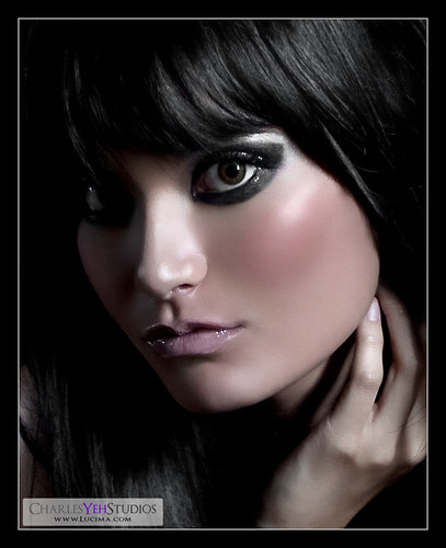
Sophie Close
What's the Difference?

Sophie Comparison
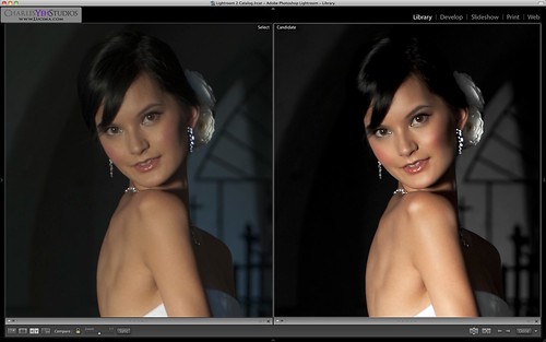
The results were pretty convincing. My Spyder3 Pro calibrations were well within spec of the Eizo CG241W. If you looked at certain grey portions of Sophie Close, you could see that it almost appeared like there was a green tint. The Snow Leopard had yellow chest hair and What's the Difference? had a noticeable greenish hue to the skin. I even pulled out my MacBook and showed Bill (the Eizo guy at Samy's) how it looked on my screen and the verdict was in. My calibrations were good.
So finally after several days of this stuff, I can finally give it a rest. Or can I? I'm going to see if I can achieve a better color profile with my Dell because looking at the graphical representation of my current color profile, I don't like how it skews to one side... I'm sure I'll have an update later on. For now, I am satisfied with my color configuration.
Update: Sometimes when you run the Spyder3 calibration software on the Dell 2405FPW it returns with a narrow color gamut which means all your colors look super saturated for whatever reason. Running it again will usually return with a wider gamut and less saturated colors that are more natural. I don't know why this is. Also, native White Point is definitely the way to go on this display. Picking D65 (6500K) usually comes back with a greener cast on the whites. So, for now I'm done calibrating this display. No more futzing around and delaying on retouching!
No comments:
Post a Comment