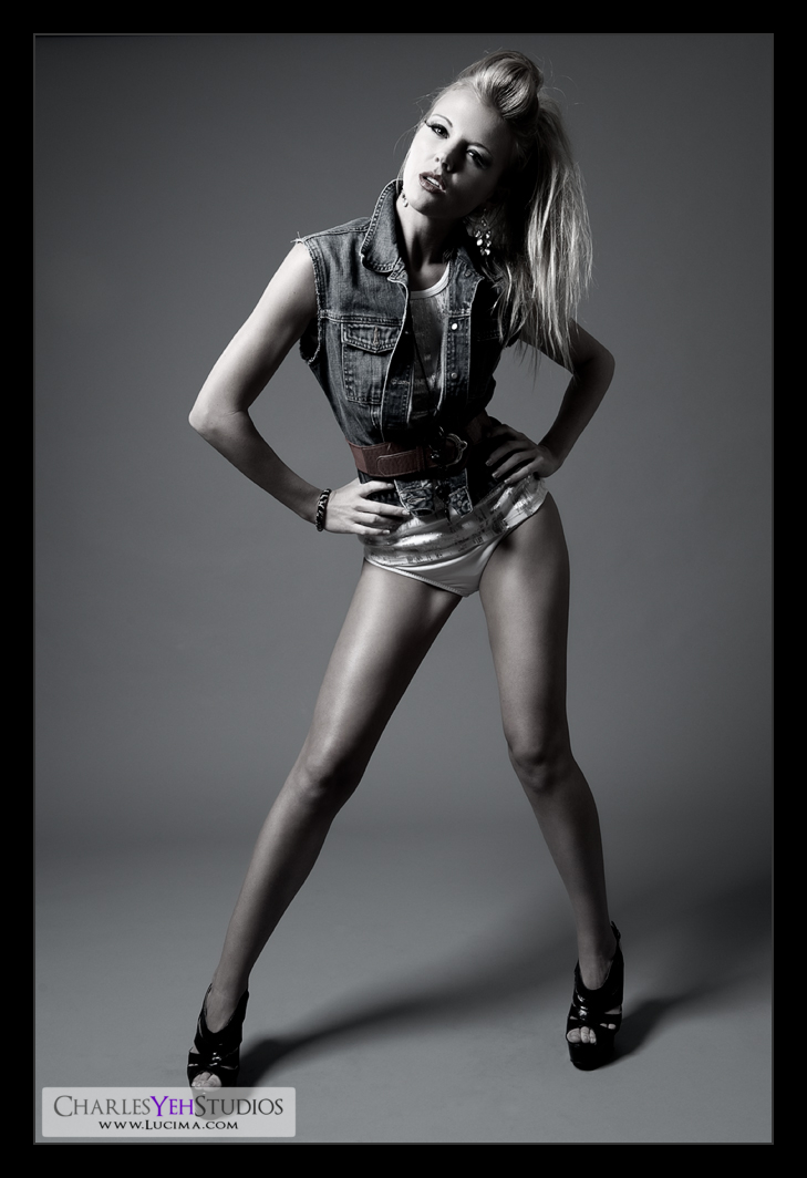
I so love this set. I have always loved this set for the obvious reasons; the attitude, the wardrobe, the style, the looks, etc.
I also really like it because for whatever reason, the camera and lighting really captures the crispness/sharpness/contrast of the look very well. Maybe it's because the colors of the clothes contrast against the skin after B&W conversion (via gradient map) and in combination with the lighting it really pops?
I dunno.
It just works.
This might be the last one for a while because I'm using this 4th and final picture to create a 4-some for Tricia Jo.
Again, what's special about this picture is that I used 90% opacity gradient map without applying any B&W conversion. This action is responsible for the desaturation as well as the contrast and also the 'pop'. Really applying a B&W gradient map is quite powerful.
Camera: D3/24-70mm f2.8G @44mm, 1/200th, f/7.1, ISO200
Strobist: AB800 in 28" Apollo Westcott softbox from camera upper left. AB800 from camera far upper left.
Model: Tricia Jo Hoffman
Makeup: Kelli Zehnder
Wardrobe: Tricia Jo/Michelle Green

No comments:
Post a Comment