But let's talk shop first. I've been retouching Tricia Jo's set where she's wearing this jeans jacket with bikini bottoms. They are striking images and have turned out really well. Here's the first two that I've done:
Bam

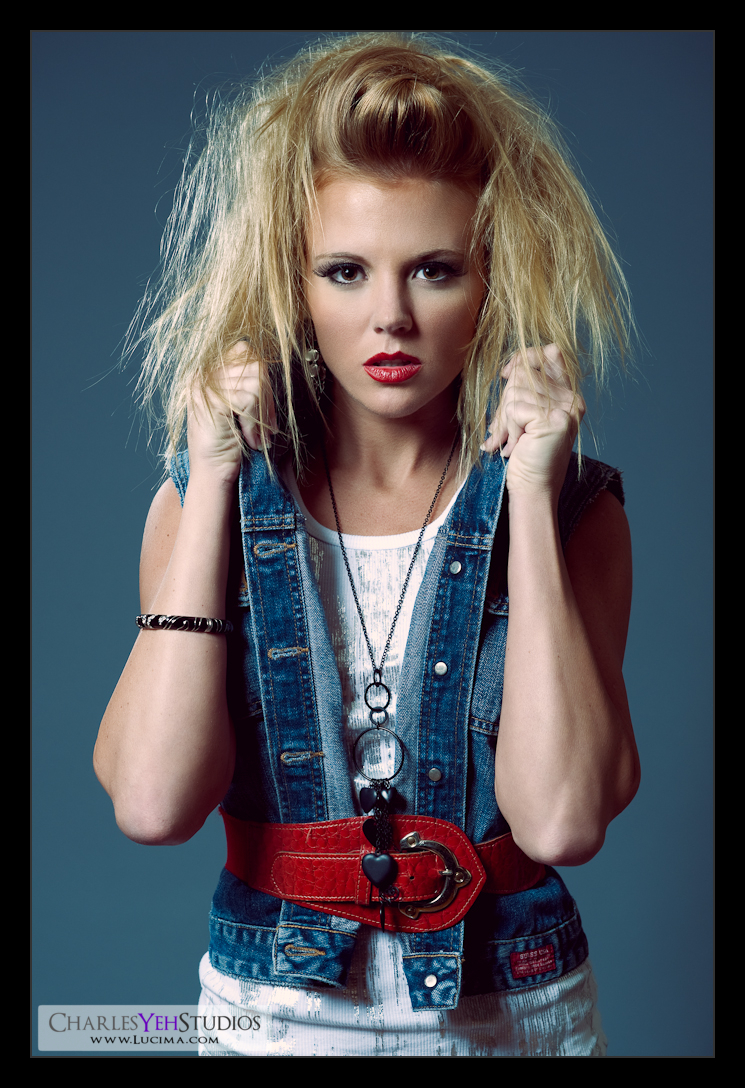
80's

I can't say enough about Tricia Jo's willingness to really put herself out there as a model. She's fearless. She's got range. And she'll do what it takes to get the shot. Plus, she expects you to be top-notch. I love a competitive girl! I think these images speak for themselves.
Regarding "Bam" I was surprised by how compelling and striking the B&W version turned out. I was originally going to do a desaturated version but I found that the B&W was much more compelling. The darks were truly dark and the highlights were good contrast. Best of all however I think the skin tones on the legs turned out perfectly. What's most surprising is that rather than do the typical B&W conversion via adjustments, I went and just applied a B&W gradient map instead. I guess it's all that the doctor ordered. Post-processing-wise this went through very little transformation but yet achieved the most resonance and impact in its final state.
"80's" was a 1/2-body-focused shot where part of her legs originally showed but I had to crop it away to focus on the composition and the main focus which is the face. Her angelic yet bad-girl attitude shines in this one and the image captures that sassy but sweet feeling perfectly. I fear however that this will elude many and be forgotten in the abyss of wonderful captures on the web. Or maybe I just don't know what I'm talking about.
As an aside, I've discovered that the masses typically just want to see skin. The Average Joe doesn't care about skin tones, post-processing, etc. They just want T&A. Sometimes I cater to them just to get eyeballs to the flickr blog, but deep down inside that's all superficial. I'm more concerned with what makes a quality emotional experience with every shot.
Back to "80's". The final product called for a different gradient map, this time I used one of Photoshop CS4's (and I believe it's in CS3) default gradients that goes from orange,yellow,green,blue, to purple. I adjusted it for about 8-10% opacity and voila, you get this faded feel, where if you close your eyes you can almost hear the disco music blaring, see the popcorn ceilings, and relive some of those moments where you weren't sure who you were gonna get at the key-party.
Then again, I really don't know what I'm talking about.
Both images were tuned for shadow levels but the highlight levels were not touched. Both images were shot well-exposed and I actually had to turn down the exposure by .08 to .17 in PS. That's rare because usually I underexpose and then I have to turn things up.
I should talk about "Vulnerable", "Abs", and "Vibrant" as well while I'm at it.
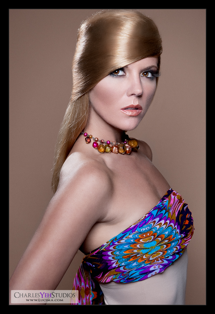
Vibrant

"Vibrant" was a total experiment. TJ did her own hair and it was an awesome weave-like hairdo but there were bits and pieces that were "cross-hatching", basically running against the grain. On-screen her real hair was not going to make the cut and I had to do something. After doing a little research online I discovered that many of the PS masters make their own hair and then blend it in. Well, I guess for a first try it wasn't bad but it could have been better and taken a lot less time. I think I spent about 2 hours on just the hair alone which is rare since I never spend time on hair other than to brush in a little highlight here and there and/or remove a strand from the face. The coloring turned out well but was tweaked purposely so it would look like her actual hair. The blending was difficult because I couldn't find the right blend that would allow the old hair to provide the lighting and allow the new hair to provide the texture. Again, I think it was a success for a first experiment but I don't look forward to doing this type of retouching. It's simply too much. Too much time for too little reward... The wardrobe was made more vibrant in PS while the skin was held down a little so it wouldn't oversaturate with oranges and reds.
Abs

Vulnerable

"Abs" and "Vulnerable" are throwbacks to my traditional white-wall work that you've probably all seen in the past. It's something that I do every shoot just to ensure I have something that I know will absolutely work. With TJ's shoot, this wasn't necessary because I got more than enough good shots but it was great to have more.
Note: I blame the over-bearing contrast and brightness of "Abs" on my display. It wasn't supposed to be that contrasted. By the way I'm getting an Eizo CG-243W from Adorama when they catch up on the backorder. This is the last few pictures that I'll be editing on my Dell hopefully. Having a color-accurate display that doesn't band, doesn't fluctuate over time, holds gamma, has a hood, etc. is going to really give me more confidence in what I am seeing on the display... I can't wait to see the Eizo CG-243W in person!
Not much to say about "Abs"other than the fact that TJ has killer abs and I even toned down the definition in her abs in this one. As far as "Vulnerable" is concerned, I loved the expression in this picture. I think she nailed it in this one. The slight left shoulder lift almost as if to hide from being exposed is priceless!
Anyway, there's more to come. I needed a break. Haven't been feeling well lately. Lots of stuff going on. Sometimes I wish I could actually tell you guys everything. But alas I can't!
Camera info: D3/24-70mm @various lengths, f/7.1-9.0, 1/160th-200th (mostly), ISO200
Strobist info: All there at http://www.flickr.com/cyeh01
Model: Tricia Jo Hoffman
Makeup: Kelli Zehnder
Wardrobe: Tricia Jo/Michelle Green

No comments:
Post a Comment