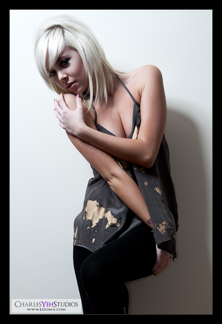
When comparing retouches you have to compare apples to apples...
Whatever the hell that means...
What I was trying to get at was that I've been comparing my new outdoor images with obviously different camera and lighting, to my indoor photography and comparing sharpness, contrast, etc. Sure even the retouch techniques are slightly different here and there so it simply isn't a fair comparison.
The thing is that I was comparing some of the new images of Ashley to some of my older images. I've used different sharpening techniques and obviously I'm going to get different results but also the thing to remember is that the entire situation is different. So it's kind of unfair to compare these images to the older images.
Which is why I reverted to the old tried-and-true white wall with beauty dish and RayFlash combination in order to see where my retouch techniques stand. The problem is I kinda screwed up the retouch. I usually don't sharpen until the end (output sharpening) and this time accidentally sharpened after my skin treatment. Therefore even this image isn't a fair comparison.
But it's not bad for sharpness, clarity and what not.
I used a different gradient map yet again, this time opting for B&W but using overlay blending at about 21% and then using a B&W adjustment for desaturation. Previously I've used the B&W gradient map as a two-birds-one-stone type adjustment but I felt it was not providing the right amount of desaturation with the given contrast adjustment which is pretty much what I use the B&W gradient map for typically.
Interesting I was at first dismayed by the fact that I accidentally sharpened (turned off a low frequency layer) because I could not revert back to the previous state. I have 60 states of history and by the time I realized I had turned that low frequency layer off, I had gone too far in dodging and burning and healing that I could not get it back.
In retrospect it might have been a good mistake. The image is clear and does not seem to suffer artifacts on sharpening twice (the second time was output sharpening). I did however opt for a less aggressive sharpen adjustment in the form of spatial frequency sharpening on the output resolution image. Even then I only did a 66% sharpen at .25 pixels (turning down the LF layer to about 33%).
Anyway, is there anything else interesting about this image? I've been using the beauty dish without the gridspot lately. It's different because obviously there's more spill and the lower body gets more light. In these pictures it matters more because I'm shooting more full body frames so I need the light to travel lower.
Oh and lastly, I called this one "Diagonal" because it intrigued me that her arm creates this diagonal line across the frame thus making it an interesting composition in my opinion. Or maybe I don't know what I'm talking about :)
Oh and did you see the cleavage? Just a by product of the pose and totally not the reason I chose this image... honest!
Camera: D3/24-70mm f/2.8G @42mm, 1.200th, f/9.0, ISO200
Strobist: Tried and true. AB800 with 22" beauty dish from camera upper left at about 45º down onto Ashley's face/neck without the gridspot. SB-800 on-camera with RayFlash ringflash adapter. See here
Model/makeup/wardrobe: Ashley Twomey

No comments:
Post a Comment