Monday, November 30, 2009

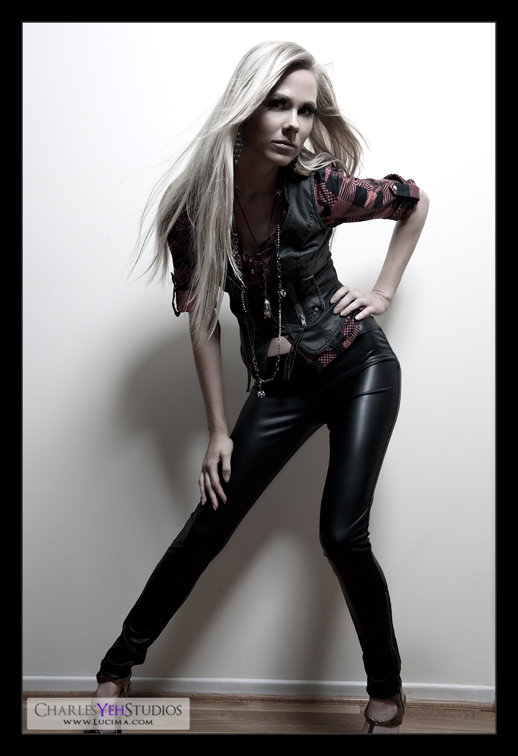
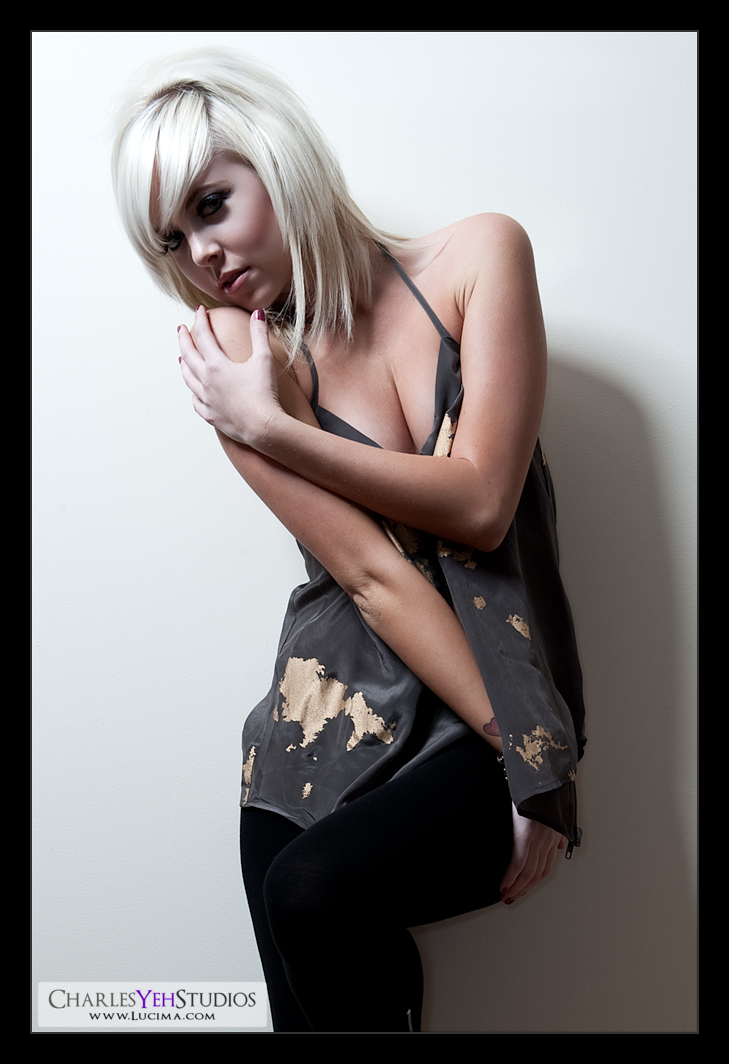
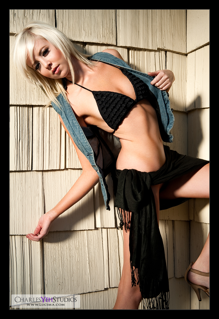
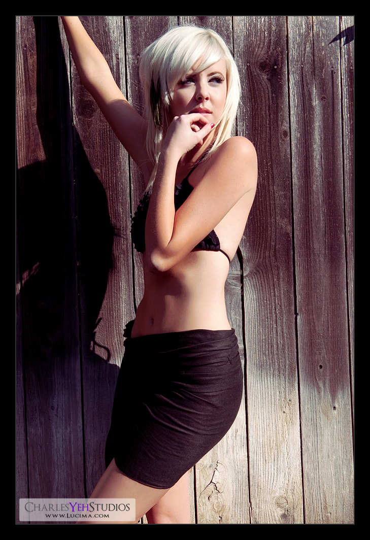
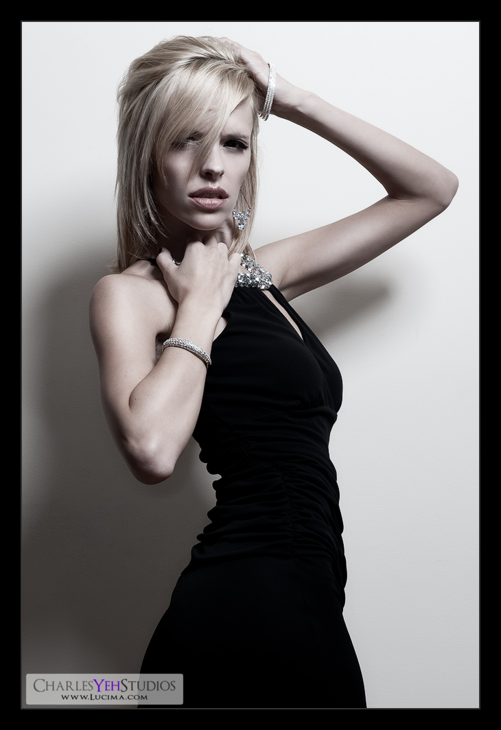
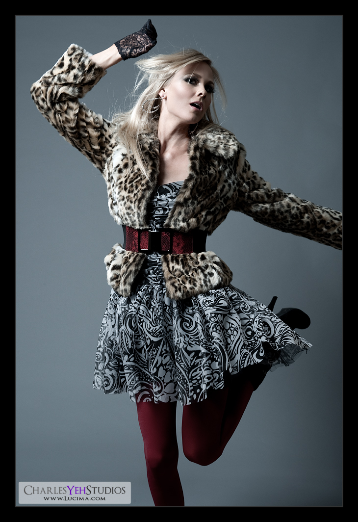
Kendall: In motion


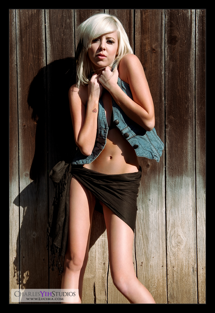
Taking a break from lingerie. You can only retouch so much lingerie before it gets tiring. Really who wants to look at pictures of beautiful women in lingerie all the time? Surely you guys must get tired of this type of stuff too? :)

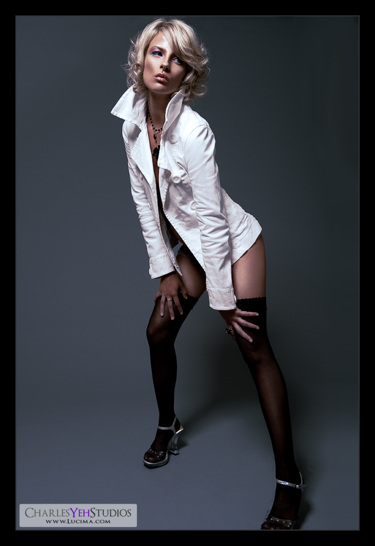
Stylistically this should look familiar. It's shot the same way that I did Tricia Jo's Hard Rock set. Lighting-wise it's an AB800 in a 28" Apollo Westcott softbox from camera upper left and an AB800 in 20º gridspot from camera front left for hair increased contrast from left to right (in the frame). I don't remember why I originally shot Tricia Jo with this setup but it worked in that set and it works in this set.

Wardrobe-wise this is just as fashion forward as the Hard Rock set. Michelle really went to the pushed the envelope on this one and I love the look. It's just really well put together. The leopard spots work really well too as does the material because the fur shows up really well in the frame.

Retouching-wise there's really nothing special. A B&W gradient map (normal blending) with 50% opacity provided both the increased contrast as well as the desaturated effect. After outputting to 1000 pixels on the long-end I sharpened the whole frame while slightly sharpening the skin/face.

I guess I should talk about the dynamics of this frame. We had Kendall spin on the count of 3. Setting the D3 to continuous focus and ensuring I had good depth-of-field (f/9.0) I focused on the back of her head. As she spun, I waited until her face was visible, and hoped that the D3 follow and capture the frame in-focus. Of course the D3 never fails, only the operator ever disappoints. At 1/200th there was slight motion/focus blur, but nothing more than I'm used to as far as variance in focus is concerned for my shoots within the studio particularly at f/9.0. We did this over and over again until she was dizzy. Then we did jumping frames. :)

I suppose I could have made this frame better by using f/11 to get a more forgiving depth-of-field when it came down to focusing but f/9.0 is pretty good.

Camera: D3/24-70mm f/2.8G @56mm, 1/200th, f/9.0, ISO200

Strobist: See above

Model: Kendall B.

Makeup: Kelli Zehnder

Wardrobe: Michelle Green

Sunday, November 29, 2009

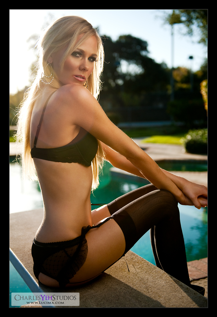
Kendall: Sunkissed


Jetlag really kicks in around this time. After all it's 6AM in Los Angeles which would meant that I pretty much pulled an all-nighter.

I was really excited about this set and actually skipped 2 sets to retouch this picture. As an aside this is the first picture that I completely retouched with the Eizo S2402W-H.

The reason for the excitement was that this picture was shot with only ambient light. And if you've been following this blog you know it's a big change for me to go outside the studio and shoot with ambient light.

That's not to say that there wasn't any manipulation of the ambient light. In order to expose Kendall properly, we used a white reflector (white satin backed with silver) from camera right to bridge the exposure gap between the background (including the sun) and Kendall's skin. This meant we had to put the fill card right up against Kendall to give her as much light as possible. And as we know from strobist 101, putting the reflector up close against Kendall also gives us the added benefit of creating a relatively large light source thus providing softer light, which is what I wanted for this shot. Unfortunately, putting the reflector so close to Kendall meant that I was limited in the angles I was able to shoot, particularly to the right.

My other limiting factor was the sun and the backdrop. I used f/2.8 to attempt to blur the background. Well, that was a fail because it wasn't shallow enough at that focal length to completely blur out the background.
And the reason I used 45mm focal length was because I wasn't smart enough to step farther back and use a longer focal length. I needed to capture Kendall's entire body but I forgot that I could have gotten shallower depth-of-field with longer focal lengths at the same aperture. This is why you can identify the tennis court in the background. This really pisses me off. The more I think about it the more I can't forgive myself for missing this detail. Of course, had I really gone with a longer focal length, I would have had trouble with sharpness and focus-recomposing but that's not the point. The point is that I missed this at the time of the shot. Unbelievable.


Edit: Even though telephoto lenses appear to create a much shallower depth of field, this is mainly because they are often used to make the subject appear bigger when one is unable to get closer. If the subject occupies the same fraction of the viewfinder (constant magnification) for both a telephoto and a wide angle lens, the total depth of field is *virtually* constant with focal length! (Source)

But don't forget that the perspective changes with distance so when you stand farther back and use a longer focal length (assuming the subject occupies the same amount of the frame), what you'll get is less background, which can be more appealing depending on your compositional goal. In my case it would have reduced the "clutter" in the back and while the background sharpness would have remained the same it would have felt "cleaner" which is something that I would have liked...

Actually this was not the angle of the backyard that I wanted to use. I would have liked to shoot with the sun directly behind Kendall because that's the angle of the backyard that is probably most flattering. The problem is that you can't shoot directly into the sun. Even in this frame, I was battling the flaring with the sun coming down from upper camera front left.

WIth those things being said, I feel like the frame was acceptable as a starting point for retouching. The flaring makes the frame a little hazy and I had to correct for that by adjusting levels (15/240) and increasing the contrast with a gradient map. Only this time I didn't use a B&W gradient map.

Actually it was kind of dumb-luck the way I applied this gradient map today. I think I had a skin tone selected as the foreground color in my color palette. So when I chose a gradient map adjustment, I was offered a default Foreground-to-Background gradient map using my selected color as the foreground color and white as the background color. The foreground color was a coffee-like color and when I selected Overlay blending, I got this incredible haze removal effect with the final effect being that the image increased in contrast in all the right places. As an added benefit I got a nice warm tone to the image that added to the effect of the shot.

Sometimes you get lucky. Because I need luck to make up for forgetting important details.

I decided to make this image one of my more "colorful" ones so I bumped the vibrance and saturation. I bumped the curves up because it was overall a tad dark.

Lastly, my output resolution sharpening included a simple resize and then spatial frequency separation sharpening with the low frequency layer set to 45%. No gaussian blur prior to resizing because I wanted to try something different and see if it would make a difference. In this image, there were no added artifacts introduced with the light amount of sharpening that I did after the image resize... or at least not to my eyes.

And that's it. :)

Camera: D3/24-70mm f/2.8G @45mm, 1/3200th, f/2.8, ISO200

Strobist: White fill card from camera right

Model: Kendall B

Makeup: Kelli Zehnder

Wardrobe: Kendall/Michelle Green

Saturday, November 28, 2009

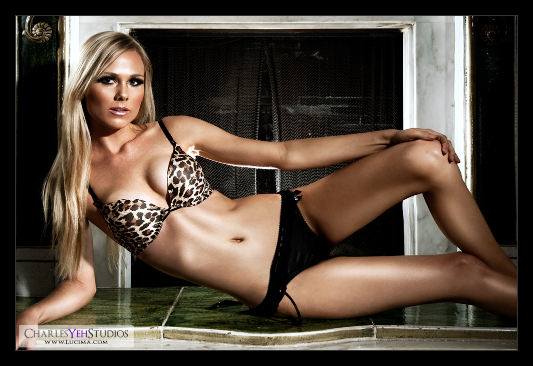
Kendall: Fireplace


Photographically-speaking I really botched this picture with Kendall at the fireplace.

The idea started with a bear and a couple Speedlights (Nikon strobes). When I lit the bear, being that it was only a 18"x12" object, I could really control the light and focus it onto the bear without spilling it onto the side of the fireplace. Thus I was able to keep the sides of the fireplace dark while fully lighting the bear.

Not so with a 5'9" model with long legs.

I lit Kendall with an AB800 with 7" reflector from camera upper right. I also used another AB800 with 20º gridspot from camera front left as a hair/side light. Lastly, in typical strobist fashion I lit the white granite of the fireplace with a SB-800 with a diffuser dome placed behind Kendal. This also acted as a rim light for Kendall so I got double-duty out of the SB-800.

The dilemma with the lighting setup is that it was a compromise between lighting Kendall and then not spilling the light onto the fireplace. The problem is that I didn't do either properly. I spilled the onto the sides of the fireplace anyway but I really didn't light Kendall properly.

So I spent a little more time in post-processing than I had anticipated in order to save the image. I really have to remember the size discrepancy between a bear and a full-sized model. I've said this before but apparently I don't listen to myself and therefore repeat the same mistakes. I think I last said this in one of the posts regarding Tricia Jo's picture...

Another challenge was that the fireplace was so reflective that the strobes were annoyingly apparent in the granite but not obvious enough to identify the type of light modifier I used for the image. On that note, I really ought to take more pictures of lighting setups but when I'm shooting, but I always forget. Things are so dynamic that the setup usually changes throughout the set anyway. The reflective nature of the granite meant that I had to be wary of placing the lights in such a way that it would reflect directly back into the lens, thus causing a large specular highlight in the granite and even worse, cause flaring.

The "win" for this picture was how well the white granite lit up with the SB-800 behind Kendall. Completely hidden by Kendall, the SB-800 provided good rim-lighitng and good fireplace lighting from the back.

Another bright point about this picture was that I used the B&W adjustment differently. Today, I tuned it as I usually do for the skin tone but then decided to keep the image in color and added a tint (color). I never noticed the "tint" feature but there's a checkbox next to the words "tint" in the adjustment where you can select a color to tint the entire image. I found thisvery interesting and basically used it as a gradient map instead of a regular B&W conversion. I set the blending to "overlay" and the opacity to 60% after choosing a skin-tone/color I'd used earlier during post-processing. The result is a tint that's not overtly obvious but adds something different to the picture.

Camera: D3/24-70mm f/2.8G @42mm, 1/200th, f/9.0, ISO200

Strobist: See above.

Model: Kendall B

Makeup: Kelli Zehnder

Wardrobe: Kendall/Michelle Green

Eizo S2402W-H


I wanted an HP LP2475W or an NEC 2490WUXi for a secondary display here in Taiwan. I was pretty sure they weren't going to sell any Dell 2408FPW.

Well just my luck, no HP, no NEC.

Lots of Acers, Asus, Benq, and even more from brands that I'd never heard of. Lots in the US $200-$300 range that were S-PVA panels.

Let me give you a little background on how things operate here in Taiwan.

There are no Best Buys. There are no Walmarts. There are no huge online e-tailers... There's no Fedex and no UPS. Hell, if you buy online, you're likely to get a courier drop ship the item to your house, sometimes same day delivery.

What we do have is a few electronics chain stores that are kind of like Best Buy (so I kinda lied) but they don't have any high-end equipment (just like Best Buy).

But you don't buy from these places.

Instead you go to these places (in Taipei) like Nova and Guang-Hwa where there's a building with multiple floors and each floor has these tiny little shops that average 50 square feet in retail space, most of which sell electronics. You can haggle, but these guys are competitive and the prices are pretty firm. Or maybe I just suck at getting a bargain because I also know that lots of these store fronts are actually owned by the same company and therefore are the same business...

Anyway, I digress. These places are pretty much mini-electronics conventions. They sell mostly the same stuff but they sell pretty much anything under the sun, or at least everything under the sun that's available in Taiwan...

Of course, multi-nationals based in other countries that don't manufacture in Taiwan get the short end of the stick because they can't compete with the manufacturers that make stuff within the country. Furthermore we're talking S-PVA panels for about $200-300 so import taxes make else pretty much uncompetitive.

So how did I wind up buying a TN panel in an Eizo S2402W-H?

Before going to Guang-Hwa, I had the HP LP2475W in mind. My backup plan was the NEC 2490WUXi. But after asking around a few stores, I realized that no one was going to have these models. After all these were H-IPS wide gamut panels that were truly competitive in the US selling for about $550 (the HP) to $850 (the NEC) and are well-known to be color accurate (after calibration).

Of course, no one had either of these models. To make a long story short, I gave up and was almost going to go home until I came across a store selling an LG unit that I was considering... then I noticed that they had an Eizo.

The salesperson admitted that the Eizo's were expensive but this Eizo S2402W-H was an entry-level Eizo (TN panel) for those that wanted an Eizo but couldn't afford the uber-expensive ones (like the CG 243W that I'm waiting for). Upon inquiry I found out it cost $510 which was less than the HP even though the HP has an IPS panel. Truth be told, no company really sells TN panel displays anymore because it's an obsolete technology. Only Eizo has the balls and the clout to manufacture a TN panel display and sell it for what other companies sell their S-PVA or IPS panel displays.

But I bought one.

Yes the viewing angles are pretty horrendous. I've gotta move my head around to make sure that I'm looking at the display straight on which changes with each corner of the display. Really a few inches really make a difference, particularly vertically. Actually horizontally speaking you'll also get some variance particularly as a reddish tint appears at the extreme angles.

But it's color accurate.

Out of the box, it was off by a little but much better than my Dell 2405FPW. Of course, I came prepared and I knew I was going to acquire a display for temporary use here in Taiwan so I brought the Spyder3 Pro. The awesome thing about the Eizo S2402W-H is that it has all of the controls that the Dell has and more. It has Kelvin presets, gamma settings, brightness and contrast.

But the best thing about the Eizo is how easily it calibrates to 2.2 Gamma, 6500K, and 150 cd/m2 (later readjusted to 120 cd/m2 because it was too bright at 150 cd/m2) because straight out of the box it was super close with the exception that it was too bright, running at 150 cd/m2. That being said, I feel that it was much easier to calibrate than the Dell 2405FPW. Maybe it's because I've done it now multiple times (feels like hundreds) on the Dell 2405PW as well as the MacBook. Or maybe because it's just closer to ideal from the start.

Anyway, I'm surprisingly happy with the Eizo S2402W-H. I thought I was gonna be disappointed because it runs off of technology from the Jurassic Era but I suppose Eizo doesn't disappoint even with it's entry-level displays.

I'll provide another update in a month.

If you're curious how the CG 243W and the S2402W-H stack up, here's the
spec comparison.

Friday, November 27, 2009

Check it... Nikon Girl music video, The Photo Club

Sorry for the delay guys, I'm in Taiwan right now and looking for an HP 2475W for a secondary display to speed up the editing. Anyway, this ones for you guys :) I don't care what you shoot, just shoot...

Thursday, November 26, 2009

Gradient Maps

I talk about gradient maps so much that I probably should elaborate a little on their function and my use. Besides, I've got a little time on my hands at 30,000 feet and hours to spare.

In Photoshop you can find gradient maps via Layer>New Adjustment Layer>Gradient Maps. I like making these adjustments as new adjustment layers because they don't affect your base layer (the one with the image) but instead adds the adjustment as an effect. This should appease those that stress about losing "information" contained within the original image.

Anyway, I don't have any "textbook" information about gradient maps. All I can tell you is how I've seen it used and how I use it. I have never done any research about it online because it comes pretty easy at the expense of several hours of trial and error.

I think my first contact with gradient maps resulted from wanting to create a B&W image with more "punch" (contrast). Basically after converting the image to B&W via the Black and White layer adjustment (see my previous post), I'd add the B&W gradient map to really push the contrast. If you haven't done this you should try it. It really adds significant contrast to the image and might even have to be dialed down. The good thing is that you can adjust the "Smoothness" to control the effect. I rarely touch the smoothness these days and instead opt to control the amount of B&W gradient map via opacity. This however assumes that you've done the B&W conversion otherwise adjusting opacity might bring back some color to the image which you may or may not want.

Lately I haven't done any 100% B&W images. Most of them are desaturated via a B&W conversion and/or a B&W gradient map. My brother says all pictures look better a little desaturated and that it's a trick. I guess I'd have to agree. It's really a one-size-fits-all. I think it's harder to pull off a vibrant and colorful image than it is to make it desaturated. I bring this up because I'm saying that (these days) I don't use the B&W gradient map so much for the B&W elements but for the luminosity elements that the B&W gradient map delivers. So what I do is apply the B&W gradient map and then instead of leaving it on normal blending, I use "luminosity" blending. To my knowledge (I could be wrong) the luminosity blending provides the well... (light) "levels" contrast of the B&W elements and applies that to the image while filtering out the monochromatic element of the B&W gradient map. Essentially you get all the contrast of a B&W gradient map with all of the original colors.

I rarely leave any adjustment layer at 100% opacity. I am compelled to adjust things so I feel in control. Besides, whenever I leave anything at 100% I get the subconscious feeling that I've "maxed out" and what if I needed more? Could I get more? Maybe I haven't gone far enough? So I'd rather have gone too far and then dial back with opacity.

So that about sums up my use of the B&W gradient map, but what about all these other colorful presets that we have in Photoshop? Well, I say go ahead and play with them. To me the presets are great and I've used quite a few of them myself. Each one adds a different feel and effect. If you want to see some of them in action check out my most recent posts particularly those of Ashley. Sometimes I can't seem to get the right "feel" and I'll experiment with different colors of my own but typically the presets provide great benchmarks.

Along with the color gradient maps, I like to experiment with the blending modes. Especially with the color gradient maps, I feel like the right blending mode makes a big difference. Are you going for subtle? Or over the top? Do you want the added contrast or just the colors? I've used the following blend modes (off the top of my head): soft light, overlay, color, multiply. I'm sure there are others but those are just the ones that I remember that I typically try when applying a gradient map.

To bring this post full circle, I started using gradient maps when I discovered significant highlight and shadow coloring in pictures of those that I admire. Sometimes it's particularly obvious that there's a green or purple tint to the entire image. Sometimes it's a two-tone highlight and shadow tint (incidentally that Lightroom performs very well!). And sometimes it's a rainbow of colors like the Yellow, Violet, Orange, Blue which I might have used before, I can't remember. Not to sound like a broken record but each map has its own feel and depending on the colors of the original image you're working with will create a different effect... so there's no right answer and you'll just have to experiment to get the effect you want. I've seen gradient maps applied to lots of wedding photography to give it that "old vintage" look and sometimes I feel like it's overplayed. For me, it's a new foray into creating an effect/feel so I'll suffer through the cliche-ness for now.

The last thing I'll add about gradient maps is that it can sometimes subtract contrast to your image. Sometimes it makes it hazy and if you're trying to create a crisp and vibrant image, this might not be the way to go. That's when you can consider different opacities and blends. Hell I think I've even used a gradient map that wasn't a solid "gradient type" but instead I tried using noise (one of Ashley's pictures).

Happy experimenting :) If you have questions, I'll be happy to answer.

Wednesday, November 25, 2009

Answering Some Questions...

I got a response from one of the followers of this blog (Dante) and started typing away, until I realized that to fully answer his questions the response would have to be a lot longer than I originally intended.

So why not make it a full-on post?

Let me disclose that I don't truly consider myself an "artist". I consider myself a businessperson with a knack for imaging. I like imaging (photography and retouching) and have always had a discerning eye for faces. The extent of my art studies was that I liked to draw when I was a kid. But I couldn't draw to save my life (I really sucked) and hence never cultivated that interest. At one point I thought that I might want to be an architect but never pursued that idea either. Anyway drawing stayed tucked away for the last 25 years until I recently got a Wacom tablet and rekindled that relationship.

My brother's a singer/songwriter and I'm musically inclined as well. We get it from my dad, so I suppose music runs in the blood. I think that's about it as far as I go with "art" talent. If you read my blog you'll find I often lament that I'm not very creative. My creativity stems from doing something really really well, and then asking, "what if we did... [fill in the blank]". My current work isn't groundbreaking by any definition of the word.

So how did I learn Photoshop? Well, I've been around PC's for a long time. I'm good with troubleshooting and problemsolving and I'm good at games. Basically I'm a quick study and learn well from documentation. With the advent of the interwebz, I've learned a lot of stuff on my own. David Hobby was a great resource when I first started. So was Lynda.com (Chris Orwig). Then it just became a matter of what effect I was looking for. Starting with certain role models like Dave Hill gave me a tangible starting place for certain effects instead of opening a document and asking "well, what do I do now?". Then it was just a matter of putting 2-and-2 together as far as getting from A-to-B (A being the starting point and B being the finished product with that specific effect). Reading these tutorials and online material gave me the fundamentals to work with PS on a more fluid basis, henceforth being able to manipulate layers, adjustments, and masks comfortably. But I've probably only really scratched the surface with what I know about PS.

But that being said, I've gotten to the point in my retouching career where learning is often times a process of trial-and-error. As I've mentioned many times before, I don't always know what direction I'm necessarily going to take the picture when I first open a picture in PS. I have a laundry list of stuff that I usually do (depending on the flavor of the week) and then when I'm not sure what to do, I will run through the checklist and see if those effects enhance the image at all.

But not everything comes easy. And not everyone is willing to teach. I've come across photographers/retouchers that aren't keen on sharing their secrets. So what do I do when there's something about their image/picture that I want? Well, I ask first and when they don't share, I stare at their pictures over and over again for hours at a time (over time) until I glean little bits and pieces of effects I *think* I see in their images. Then it's a matter of backsolving... going to Photoshop and trying to recreate their effects.

Sometimes it's easy. Gradient maps are easy to spot because they tend to leave a certain color cast, tint, or color difference between highlights and shadows. That's the easy stuff. Other times I'm mesmerized by a certain sharpness or crispness that I'm still looking for but can't easily recreate. So I experiment. Every picture I retouch is done just slightly different from the last and so you'll occasionally see different "flavors of the week" pop up now and then in my pictures. The same goes for my photography as well but in longer cycles because I don't shoot as often as I retouch.

As far as B&W conversion layers are concerned. I'm specifically referring to a Photoshop adjustment layer (Layer>New Adjustment Layer>Black and White). I think this feature popped up more recently in Photoshop (maybe CS3 or CS2?) and allows you to tune the different colors to your liking. So you'll get sliders for each red, yellow, green, blue, magenta channel/color and you can adjust them however you choose. The most important ones are red and yellow to me because it's all about the skin tones ESPECIALLY on the face. I've dedicated an entire post about B&W tone processing for skin
here if you're inclined to read more :)

As far as composition and cropping and perspective are concerned those are more photographic elements that you should try and capture in the original frame. My pictures these days are less and less cropped because I'm getting better at composing the final shot. Sure sometimes it's .4 degrees off or I need to chop a small part of the left side off to get better perspective, but at the end of the day it's your "eye" and there's no right answer. I wasn't aware that this picture was that well composed but I guess I can understand why people like it. I dislike how the perspective makes her legs a little shorter than they really care because she's very slender and long. That's a function of using a shorter focal length (38mm) and Kendall leaning forward to the camera thus making parts of her head and torso a little larger than the rest of her body (i.e. her hips). I didn't capture all of her feet in the original frame so I made a slight mistake there. If I did, her legs would have looked slightly longer... that's my fault. :)

I deliberately left some more wall on the right of Kendall and in post-processing the "balance" in me felt it was "off" and wanted to chop that off, but upon further internal reasoning I felt that it gave the leg more attention and framed slightly better. I dunno. It's really just taste at that point. I was actually limited from cropping more wall on the left because it would at 4x6 ratio lose too much wall above her head for my liking and there was no way I was going to take the vertical space away from the bottom (her feet were already too cropped!).

So I guess there's a lot of consideration that goes on in my head that I don't really talk about in my retouch posts. The truth is I don't really think much about it because it's a process that flows for me. And when I make a decision, I typically move on and don't really look back. That allows growth and significant timestamps in my learning to be made because yes, there will be "mistakes" and those mistakes (and successes) will be well documented as a trend-line (change) over time that's visible and apparent :)

If I were using open source tools to replicate the effects of Photoshop, I think I'd have killed myself by now because it makes it that much harder to learn when you're not using the same tools as everyone else. But that being said, I applaud you for your courage, bravery, and willingness to try something different. For me, that's a "no go" because I'm trying to get from A-to-B in the shortest amount of time possible. A being a newb and B being a professional photographer/retoucher. Remember, I have no background in any of this stuff. Academically I have a BA in Economics, an MBA and an MA in Psychology. Yay me, but that doesn't help me with any of this stuff. :)

Welcome to the blog!

Tuesday, November 24, 2009

Kendall: In leather


Every now and then you come across a model that's simply a delight to work with. She's nice, funny, got a great personality and totally down to Earth.

Oh and did I mention she's beautiful and has Victoria's Secret abs?

It's easy to overlook the physical attributes when you're stunning in all the right ways. Sorry guys, she's taken and her boyfriend's a nice guy too so you're all out of luck.

So I thought I'd change it up and really tell a story which I don't do enough here. I suppose what I left out of my "6 months review" was that I want to push myself explore the "uncomfortable". This for me means stepping outside the studio and shooting natural light, reflectors, on-location. In fact I had a night shoot today that got cancelled, but hopefully you get the idea and see where I'm going with this. I need to grow. I need to keep pushing photographically and in retouching. I've spent a significant amount of time in the retouching department and it's time to start wandering back into the photography department. In my last shoot(s) you can see this trend. I've been shooting in the backyard, the pool, the walls, the shake sidings along the house, hell it's been a shoot and half since I pulled the fashion-grey background that I've loved so much. But it's time for a change, really when is it ever not?

I haven't really stated this in writing here but I've been shooting more high-fashion and editorial content. I've always been so "face-focused" and captivated by faces that naturally my first images were beauty/glamour oriented. But as I grow in this field, I find that I've acquired a taste for the full-length frame and as such take more and more body into consideration.

With a body like Kendall's, the fine line between an acquired taste and a total obsession can quickly become rather blurry.

Michelle and Kendall styled this shoot. Michelle has been in an edgy/rock phase which totally suits my taste because I'm always bored of my own stuff. If you don't know me by now, I'm the one who runs a half-Ironman and upon finishing thinks that just because I've done it, it's really no big deal. So, you can say I've got the attention span of a goldfish or that I'm simply not easily impressed. Either way, this shoot was just what the doctor ordered.

This first set aptly titled Kendall: In leather was done in 27 minutes which included all test shots, chatting, getting warmed up, turning on and off the fan, adjustments, etc. I mention this only because Kendall's performance allowed us to transition through 9 sets. That's 9 sets with different lighting and conditions. I've never shot more than 5-6 sets in a day so this was a first. But when you click with the model and everything just falls into place, you can get a lot done in a short amount of time.

Retouch-wise, I'll first settle the overall feeling and goal. First of all, I don't always know how I'm going to approach an image until I start to work with it. It's not always immediately apparent. The first thing I seem to always do is play with the levels and see what kind of contrast comes out of it. From there, I then fix major bugs/flaws/problems including liquify. Then I work on the skin tones/blemishes/smoothing. When I finish that, I look at the overall frame and then ask myself, "What does this picture need?". I'll play with the gradients, the B&W conversions, curves, it really depends on the look and feel.

For example, with this image the primary concern was the darkness under the eyes. I could have gone really dark like
Kenna Features where I purposely burned the shadows under the brows. I decided against it and simply added some contrast via levels and curves and then desaturated with B&W. It was a little tricky because in the B&W conversion process I wanted to keep the reds in the shirt bright but pull the reds in the skin on the face so I did 2 B&W conversion layers (for desat) and masked one for face and one for everything else so I could tune the face differently from the rest of the body/wardrobe.

Because I used a B&W conversion layer, I didn't need a traditional B&W gradient map for more B&W effects. Instead I used a B&W gradient map set to luminosity blend for contrast.

In the sharpening phase, I didn't blur before converting to the new image size (1000 pixels). Instead, I downsized and applied a light sharpen via the
spatial frequency separation method. I turned down the sharpening (low frequency layer) to 34% so while I could have gotten more sharpening out of this image, I didn't need it. In the end I tried adding a little noise back to the skin, but it didn't really need it so that was a wrap.

There's nothing special lighting-wise about this picture but the ones to come will have description and explanation behind the logic behind the process.

There was a small spot that irked me, and that's the skin between the vest that was visible. In its original form it looked like Kendall has a stomach, which is far far from the truth. The pose and the tightness of the pants made the stomach protrude slightly and it was fixed in post-processing.

Camera: D3/24-70mm f/2.8G @38mm, 1/200th, f/9.0, ISO200

Strobist: Tried and true AB800 in 22" beauty dish from upper camera right (no grid). SB-800 on-camera with RayFlash ringflash adapter. See here.

Model: Kendall B

Makeup: Kelli Zehnder

Wardrobe: Michelle Green
Friday, November 20, 2009

So guess who's an idiot...

All this time I thought I was talking to myself...

It turns out there are actually people reading this blog (other than myself). While I have no idea why they'd want to read my ramblings and nonsensical technical jibber jabber, some of them have chosen to respond and comment on my posts...

and I've totally overlooked their comments this whole time!

You see, I never noticed the comment column in the blogger dashboard. Today was the first time I think I ever paid any attention to it. Most of the time it's empty so you can see how that might be an honest mistake on my part.

I'd love to hear from you though, you who are reading this right now. What would you like to see/hear from me? How may I serve you better? :)

Let me know! Leave a comment. I promise I'll read it. :)

Cheers!

Ashley: Diagonal


When comparing retouches you have to compare apples to apples...

Whatever the hell that means...

What I was trying to get at was that I've been comparing my new outdoor images with obviously different camera and lighting, to my indoor photography and comparing sharpness, contrast, etc. Sure even the retouch techniques are slightly different here and there so it simply isn't a fair comparison.

The thing is that I was comparing some of the new images of Ashley to some of my older images. I've used different sharpening techniques and obviously I'm going to get different results but also the thing to remember is that the entire situation is different. So it's kind of unfair to compare these images to the older images.

Which is why I reverted to the old tried-and-true white wall with beauty dish and RayFlash combination in order to see where my retouch techniques stand. The problem is I kinda screwed up the retouch. I usually don't sharpen until the end (output sharpening) and this time accidentally sharpened after my skin treatment. Therefore even this image isn't a fair comparison.

But it's not bad for sharpness, clarity and what not.

I used a different gradient map yet again, this time opting for B&W but using overlay blending at about 21% and then using a B&W adjustment for desaturation. Previously I've used the B&W gradient map as a two-birds-one-stone type adjustment but I felt it was not providing the right amount of desaturation with the given contrast adjustment which is pretty much what I use the B&W gradient map for typically.

Interesting I was at first dismayed by the fact that I accidentally sharpened (turned off a low frequency layer) because I could not revert back to the previous state. I have 60 states of history and by the time I realized I had turned that low frequency layer off, I had gone too far in dodging and burning and healing that I could not get it back.

In retrospect it might have been a good mistake. The image is clear and does not seem to suffer artifacts on sharpening twice (the second time was output sharpening). I did however opt for a less aggressive sharpen adjustment in the form of spatial frequency sharpening on the output resolution image. Even then I only did a 66% sharpen at .25 pixels (turning down the LF layer to about 33%).

Anyway, is there anything else interesting about this image? I've been using the beauty dish without the gridspot lately. It's different because obviously there's more spill and the lower body gets more light. In these pictures it matters more because I'm shooting more full body frames so I need the light to travel lower.

Oh and lastly, I called this one "Diagonal" because it intrigued me that her arm creates this diagonal line across the frame thus making it an interesting composition in my opinion. Or maybe I don't know what I'm talking about :)

Oh and did you see the cleavage? Just a by product of the pose and totally not the reason I chose this image... honest!

Camera: D3/24-70mm f/2.8G @42mm, 1.200th, f/9.0, ISO200

Strobist: Tried and true. AB800 with 22" beauty dish from camera upper left at about 45º down onto Ashley's face/neck without the gridspot. SB-800 on-camera with RayFlash ringflash adapter. See here

Model/makeup/wardrobe: Ashley Twomey

Thursday, November 19, 2009

The last 6 months...

It's funny how quickly this journey has gone warp-speed. Back on April 6th I registered for ModelMayhem.com but wasn't approved until April 14th. That same week I received the Cactus V4 trigger/receiver combination and shortly afterwards made another order for 3 more receivers.

My how time flies.

Most of the models that I've shot with have been from ModelMayhem.com. That is how I procure the talent that you see on this blog as well as the flickr photostream and also my website (www.lucima.com). Scheduling and preparing for a shoot takes a lot of time. That's a lot of the behind the scenes stuff that I never talk about here because it's well... boring and often times simply frustrating because let's face it, models can be very flaky. Sometimes it works out and the model shows up. Sometimes the models flake and cancel last minute. I would say that 1 in 3 scheduled shoots get cancelled. That's a pretty high percentage. One reason is that photographers are (unfortunately for me/us) a dime a dozen and good models are hard to find. With that being said, good photographers are also hard to find and I'm slowly climbing that ladder and trying to establish myself among the best.

In this time so many realizations have occurred. One of which is that technology and equipment most likely trumps our ability to use it. Could I use more dynamic range? Sure. Could I use a better and more accurate focusing system? Sure. Could I use more megapixels? Sure. But 6 months ago when I first started really using my D3, I really couldn't take advantage of those benefits because the D3's capabilities trumped my ability to use it. The D3 with the 24-70mm f/2.8G is a killer combination. Sharp as hell at the right apertures and versatile as hell with fast glass and great low-light capabilities. Is it the perfect combination for what I do? Probably pretty close. It's not worth moving to a P65+ with Phase One 645 (costing $50K or more) to get a few more stops worth of dynamic range.

While on the topic of technology and gear, I would like to see a better trigger in my repertoire. Some of you know I have the Nikon SU-800 infrared commander that controls up to 3 groups of strobes in Nikon CLS TTL mode, but that I never use it because the reliability of infrared outdoors is terrible. The Cactus V4 trigger/receivers I use right now are simply to tie me to 2010 when PocketWizard finally releases their Flex TT5 for the Nikon lineup (thanks for the delay PocketWizard) when I'll upgrade. The V4 work but only at a rate of about 95-97% of the time. Sometimes it's spottier than others but sometimes it works nearly flawlessly. Regardless, I'd like something that always works because the times that it doesn't work, it's extremely frustrating... especially outdoors and on-location when it really needs to work.

Glass-wise I don't have any immediate need for better glass. I love the sharpness and contrast of the lenses that I have. The 85mm f/1.4D is incredible and the 24-70mm f/2.8G is practically glued to my D3. Perhaps down the road I would like to see faster and sharper glass but I'll let Nikon do their thing. In addition to faster glass, I think we're sitting around 9-11 stops of dynamic range whereas the medium format cameras will do 12-15 stops of dynamic range. I could definitely use more dynamic range as can anyone but most displays won't be able to present that range anyway so we're really quite limited to what's useable in the web world. Nonetheless, more dynamic range would provide me with a lot more margin of error in exposure, particularly in hihg-contrast situations like sunlight. So maybe a few more megapixels and a little more dynamic range please in the next iteration of the flagship Nikon camera (the D4)? :)

Speaking of hardware, I'm still waiting on my Eizo CG-243W. It was unveiled in August and silly me, I ordered it less than a month ago and of course it's backordered from Eizo and Adorama doesn't have a clue when they'll get their next batch. I've noticed significant banding in my Dell 2405FPW but what would you expect of a non-wide-gamut display that's 4 years old and made for consumers. It still gives me variances in gamma between the time I turn it on and 30 minutes later. With that said, I enjoy being able to plug CF cards into the side of it as well as charge my iPhone from it.

Retouching has come a long way hasn't it? Gosh, since April we've learned lots from Photoshop ("we" LOL) and read up on several techniques that I use pretty regularly now. After the whole "color accuracy" phase, I was finally able to focus more on the actual pictures themselves. Well actually let's start at the beginning...

When I first began retouching in April, I was still very enamored with the Dave Hill and Jill Greenberg effects and their treatment of highlights and shadows. I indiscriminately brightened highlights and darkened shadows. Timeline-wise I was in Taiwan from April to May and it wasn't until late May that I first shot Stephanie Reading from MM. This was also before I really understood how to light people and faces.

From the time I finally started shooting models until about July, I retouched all my pictures roughly the same way with a little too much contrast and a little too much harshness in highlight-to-shadow transition. It was all a little too much Dave Hill, a little too much LucisArt, and a little too much clarity in Lr. In mid-July I became fanatically obsessed with cheekbones and began drawing in cheekbones where they didn't even exist. I was under the influence of
Warren Seren and his simplistic style of retouching, from which I drew many lessons. One thing that you'll notice about my styles is that inevitably I push too hard too far in any one direction from which I later have to withdraw.

From the Seren influence I later went through a short social commentary phase with recycling and tree huggers, but that didn't last long because the sets were too complicated to create and my focus has always been simplicity. I went back into the studio and then focused on creating more B&W and dramatic pictures from solid backgrounds and contrast lighting as always. It was around August that I took facial retouching and particular pore-by-pore retouching a little too far. I wound up with plastic looking skin like the first pictures of
Sophie (in this shot you also see some of my color accuracy issues). From over-retouching the pores I quickly snapped back and started creating much more natural looking retouches. Jessica Just's pictures were a marked improvement over the unreal skin that I took too far in August. Here's some more Jessica...

In fact September/October marked several phases and turning points in my shooting and retouching style. First I went through a short B&W phase where I was keen on making sure the tonal range in the skin was well represented by the B&W. Prior B&W pictures I retouched were too flat. Second, I created a masterpiece with
Elle Masterpiece where I spent 10 hours retouching pores on Elle's face. Then I flipped out and realized that it was much too long for any retouch and so I did some research on skin treatment in Photoshop. I found a new technique and then tried that out on Mladenka's Colors which became my new masterpiece, one that didn't take 1/2 as long! With Mladenka's 3rd shoot, I realized I was tired of shooting just faces and retouching just faces and started shooting bodies and putting more emphasis on sex appeal. All of this really did happen in a blink of an eye and suddenly models were wearing less and pulling more poses.

October also marked the point where I found
Kesler Tran's work who has had an amazing influence on my retouches. Interestingly I only found Kesler's work 40 days ago! My recent retouches have crispness and sharpness that I'm trying to emulate. What's funny is that I think I took the skin smoothing techniques a little too far at first in early October. Since then I've really dialed it back to create once again more natural looking retouches. I think around that time I just started to do some sharpening with my pictures which was a marked improvement over the blurriness of the past.

It's now November. I've been caught up with sharpness, output sharpening, output resolution, and getting that sharpness and crispness in the final state of my pictures. I think I've pushed the sharpening a little too far and it needs to be dialed back just a little. I've been applying a lot of gradient maps to my images and I've also kept a log of screenshots of my retouches for almost a month now. I can say without a doubt in my mind that my pictures from this past month are easily the best pictures I've created. I am sometimes still bugged by the inconsistency of final products though. Some of the final retouches just come out so much better than others. I still can't explain why exactly
Kenna... is so incredibly sharp that it practically leaps off the display... There's nothing special about the frame, it's D3/24-70mm f/2.8G @55mm, 1/200th, f/7.1 ISO200. I mean, is it because Kenna's head takes up almost 20% of the frame? Is it because I put noise back into the image? Whatever it is, I haven't had many or any images nearly as incredible as that one. I'll need to look into it some more...

Onto the models themselves. I've been shooting a lot of blondes lately. Kenna, Kimmy, Ashley, Tricia Jo, I don't know why. I don't know how. It just happened. It's not by design but there's definitely a lot more fill lighting of the face when you shoot a blonde. That light colored hair reflects light back onto the face so well, I sometimes want to stick a black flag right up in there between the hair and the face. Just kidding. I never really notice that they're blonde other than the fact that often the images lack the kind of contrast I'm used to with brunettes. Personally I like brunettes better. Dunno why, just wired that way.

On the topic of models, the ones that I shoot these days tend to have more experience and are more well-versed with their poses and modeling talents overall. That's good for me because I'm tired of shooting models that I need to pose. I've said this before but when every frame is exactly the same as the last, it's a waste of disk space... and most importantly it's not interesting. I refuse to shoot with newbie models these days. Models like Kimmy and Jessica with their unlimited "dynamic range" are the holy grail of modeling talent. I hope to work with more models like them...

There are so many nuances that I've completely overlooked over the last 6 months. This post was not meant to really highlight any particular nuance but instead take a look at the road behind me and reflect quickly upon the progress made in the short duration in which I've been doings this. I mean, back in April I was still asking my brother for lessons on PS and now, I know volumes more than he does and how to apply that to retouching people, particularly women.

Truth is, I don't know where this journey will take me. All I know is that I've enjoyed my time here so far and hopefully the next 6 months will prove to be every bit as exciting. I will be taking a break from shooting models from Thanksgiving to Christmas as a result of traveling to Asia. I still plan to shoot but will not have the luxury of my equipment or my studio or the models on Model Mayhem.

For those of you that have stuck around to follow this journey I hope I have much more to share soon...

Ashley: Shakes


Allow me to explain the title.

Ashley is posing in one of the many corners outside of the house. We have wood shakes painted off-white (perhaps they were once white) for siding and the supposed-creative in me decided to use it as background.

Does it work? I suppose it does, it's simple. The other cool thing about it is the fact that it's a corner so I guess it's a tribute to Irving Penn who did corner shots better than anyone else. It also casts a warmer color temperature back on the skin given that the light comes from a silver reflector from back upper left. This is one of the only corners around the house that allows me to reflect light into it adequately. It's the first time that I've ever shot here and it may at some point be a staple of my shooting routine. I don't know, it's too early to tell. I am looking around the backyard for fences, walls, and other solid backgrounds though...

Anything else special about this shot?

No gradient map other than the typical B&W gradient map luminosity blended at 16%. Just needed a little more contrast. Whereas the previous image of Ashley required a tone down of contrast, this one needed just a touch more. I used levels, curves and the gradient map to achieve this.

I suppose the overarching difference in this is not particular to this picture alone but the direction of my images overall. I've been shooting more body and a lot less face. As such the retouching focuses heavily now on the body, making sure the lines are "true to form" whatever the hell that means, making sure shadows and highlights appear in the right places to provide depth and contrast. Having come from retouching mostly beauty, I find it somewhat odd that I can move through the body so much quicker while placing somewhat less emphasis on the face. That said, I took special care that the facial retouch was not neglected this time around as I might have "forgotten" to touch certain elements on the previous two iterations of Ashley...

Camera: D3/24-70mm f/2.8G @48mm, 1/320th, f/7.1, ISO200

Strobist: Silver reflector from camera back upper left.

Model/makeup/wardrobe: Ashely Twomey

Ashley: Getting hotter


Actually it wasn't getting hotter, if anything it was 1:30PM and the sun was setting already (sun sets around 5PM here) so it was getting colder.

But she's wearing less, so theoretically it was getting hotter.

In retrospect, I probably shouldn't have chosen this image because the frame chops off her right arm. I should have composed it for a little higher, but you have to understand that it the wooden fence doesn't extend much higher than her head so I would have gotten some of the top of the wooden fence and maybe some of my neighbor's backyard.

I also applied a "thicker" gradient map this time at about 18% on soft light blending.

The other thing I did differently was that I did NOT do a levels adjustment because the data falls throughout the entire spectrum of the histogram 0-255 and was still information outside of this range (mostly in the shadows). I could have lowered the highlight portion of the levels to 250 but some of her hair was already blown (very little).

Edit: There was something else I did differently. The gradient map that I applied was not "Solid" but instead "Noise" which gives the map a different characteristic that I can't really describe.

Camera: D3/24-70mm f/2.8G @44mm, 1/400th, f/7.1, ISO200

Strobist: Sun from high right

Model/Makeup/Wardrobe: Ashley Twomey

Wednesday, November 18, 2009

Ashley: Sun Shy


No Ashley's not afraid of the sun.

I suppose the naming convention for these pictures is quite arbitrary. But that won't stop me from naming these whatever I want.

Okay, so what did I learn? I learned that at this angle of the sun simulates the same way I use my strobes. That said, I typically modify my strobes to come in slightly softer with either a beauty dish or a softbox or something.

The other lesson I learned from experience at the
back wall with Kenna was to read the damn histogram when shooting outdoors and not to use a shallow DoF unless you need it and if you do, you better not be focusing-then-recomposing. With that said, I shot this at f/7.1 and could have STILL used a longer dept-of-field. Mental note: use f/9.0 or smaller aperture next time, hell I had enough light at ISO200 and 1/500th shutter!

I guess I only learned 1 lesson... I read the damn histogram. Some of the resulting shots were a little out-of-focus but only slightly, nothing that sharpening couldn't fix in post-production but I'm a stickler for sharpness out-of-the-box.

I applied a small amount of Orange, Green, Purple gradient but applied it on Overlay at such a small opacity that it's not really noticeable. I'll fix that with the next iteration of Ashley on this wood wall.

I'll have more to say later when I upload the new iteration. BTW, what's with all the blondes in my portfolio? I haven't shot a brunette since Mladenka filled in for another model close to a month ago!

Camera: D3/24-70mm f/2.8G @45mm, 1/500th, f/7.1, ISO200

Strobist: The sun from upper right, but because I needed the sun coming in from a slightly adjusted angle, I shot from a little to the left which made the fence lines a little crooked :\

Model/Makeup/Wardrobe: Ashley Twomey

Kenna: Happy Sailor


From butcher to sailor, I suppose she pulls off all these looks pretty naturally.

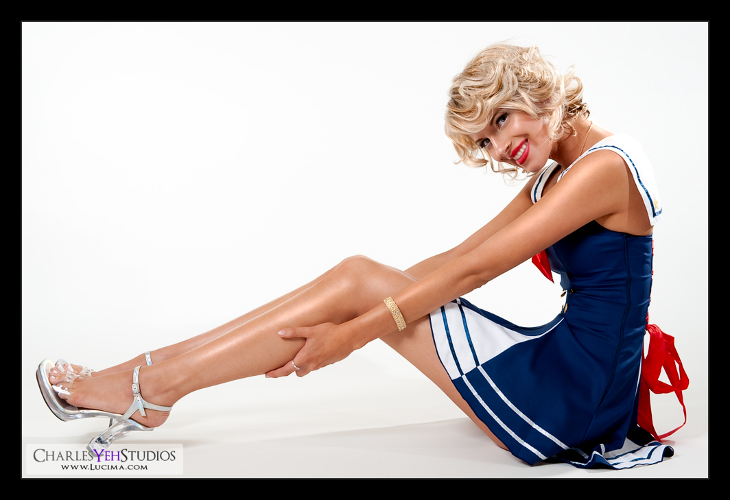
We shot this in the traditional pinup style which means... I don't know. I have yet to find a universal standard for what it means to be "pinup". What I've noticed is that typically it's shot with a lot of light and lots of highlights (specular) in the face/body with some shadows on the ground.

Or maybe I don't know what I'm talking about. :)

Single B&W gradient map this time but not for desaturation. Instead for luminosity blended at 29% opacity.

A layer of vibrance was added for more color.

A layer of levels as always.

Otherwise this image is almost straight out-of-the-box.

Are my edits getting more diluted? Or is my style requiring less editing? Am I getting faster? Am I experimenting less? Am I plateauing?

I don't know. But these images are taking less time to run through.

I did brighten her teeth and the whites of her eyes just a tad. I don't usually do that although I've done it before.

Really I can't tell you that there's any special retouch in this picture... because maybe there simply isn't. Or maybe what makes it special is simply that I'm stepping outside my comfort zone and doing things I usually don't in terms of shooting pinup? Oh, there is something different! I used a little more skin blurring in this image than usual. But it's a matter of 52% versus 80% so marginally different.

Camera: D3/24-70mm f/2.8G @56mm, 1/200th, f/11, ISO200

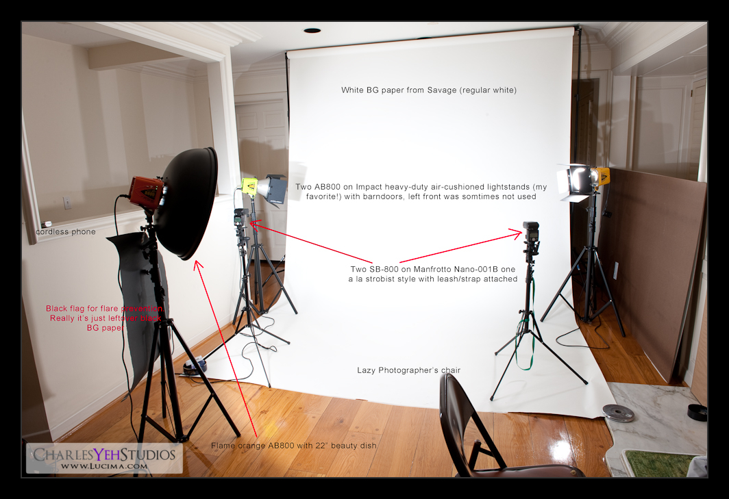
Strobist: See setup

Model: Kenna Cade

Makeup: Kelli Zehnder

Wardrobe: Michelle Green/Kenna Cade

Tuesday, November 17, 2009

Kenna:Butcher Jacket


Now that I mention it, you can't help but admit it does resemble a butcher's jacket.

What's interesting about this image? I had to lengthen the right border so I could crop it correctly kinda like I did for
RockNRolla but I used the original image and just copied the right side a few times. It was my fault that I didn't compose this picture correctly to begin with but I liked it the most out of all the others in this set.

What else is interesting? Double gradient maps again just like
Kenna Scarf. This time I opted for a Yellow, Violet, Orange, Blue gradient with overlay blending at 13%. Then I applied another B&W gradient, normal blending at about 40% opacity.

Otherwise, it's just the "typical" retouch :)

I should mention that the Smart Sharpen after resizing came out a lot sharper than I expected. I had to tone it down from 100% removing lens blur to 60% and then use luminosity blend and then adjust the blend levels a bit too.

Oh and the wide-angle at 38mm distorts her height and the length of her legs just a touch to make her longer.

Camera: D3/24-70mm f/2.8G @38mm, 1/200th, f/9.0, ISO200

Strobist: See here

Model: Kenna Cade

Makeup: Kelli Zehnder

Wardrobe: Kenna Cade/Michelle Green

Monday, November 16, 2009

Kenna: Scarf


I really wanted to title this post, "Finding what works".

There's so much in PS that can be done. Just sharpening alone, there are like a million options. Smart sharpen, USM, Sharpen more, and my usual spatial separation sharpening... and within each of these a million options on how to do it right.

Today I opted for Smart Sharpening at 100% but instead of removing Gaussian Blur as I usually do (when I use SS), I removed Lens Blur. At the same % sharpening I got more pore detail which is reflected fully in this picture of Kenna. You can see she was getting a little cold with the fan turned on and blasting her hair because she was getting goose bumps.

Anyway, the point is to keep trying. I'm looking for a feeling. A look. A style. But it has eluded me for a long time and IMHO still eludes me to this day. It's what keeps me going... looking.

For this picture, I applied another gradient map, which I seem to be in love with these days. It was a blue-yellow-blue gradient map that's a default option in PS CS4. I used overlay blending at 9% and then applied another B&W gradient map normal blending at 49% to desaturate the image and drive through a little more contrast.

This image didn't take me long but it shows that certain elements of my retouching are surfacing as standards. There's a general look to my retouches lately. There's always a trendline to style and retouching for me. Looking through my portfolio on flickr, you can see a general set of trends over time. Sometimes they overlap, sometimes they are short-lived. I don't even really know how to describe this latest trend. I'll think about it some more and get back to you...

Camera: D3/24-70mm f/2.8G @62mm, 1/200th, f/9.0 ISO200

Strobist: See picture

Model: Kenna Cade

Makeup: Kelli Zehnder

Wardrobe: Michelle Green
Sunday, November 15, 2009

Tricia Jo: Hard Rock


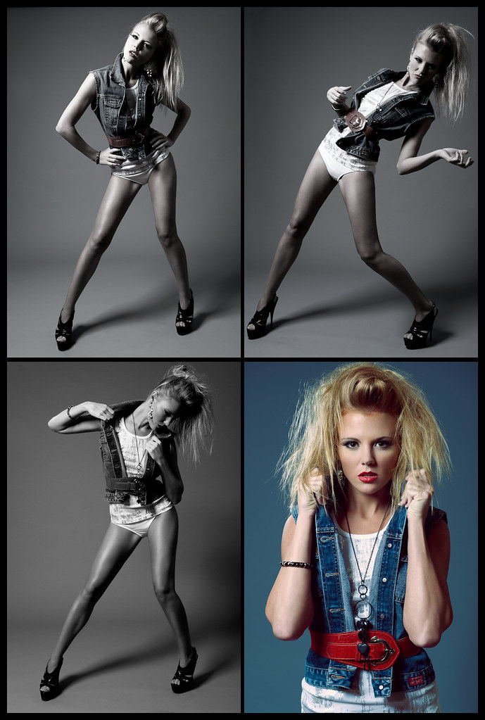
Composite of the 4 images that I've created from this set of pictures of TJ. Enjoy :)

Tricia Jo: Reprised


I so love this set. I have always loved this set for the obvious reasons; the attitude, the wardrobe, the style, the looks, etc.

I also really like it because for whatever reason, the camera and lighting really captures the crispness/sharpness/contrast of the look very well. Maybe it's because the colors of the clothes contrast against the skin after B&W conversion (via gradient map) and in combination with the lighting it really pops?

I dunno.

It just works.

This might be the last one for a while because I'm using this 4th and final picture to create a 4-some for Tricia Jo.

Again, what's special about this picture is that I used 90% opacity gradient map without applying any B&W conversion. This action is responsible for the desaturation as well as the contrast and also the 'pop'. Really applying a B&W gradient map is quite powerful.

Camera: D3/24-70mm f2.8G @44mm, 1/200th, f/7.1, ISO200

Strobist: AB800 in 28" Apollo Westcott softbox from camera upper left. AB800 from camera far upper left.

Model: Tricia Jo Hoffman

Makeup: Kelli Zehnder

Wardrobe: Tricia Jo/Michelle Green

Saturday, November 14, 2009

Making Marilyn


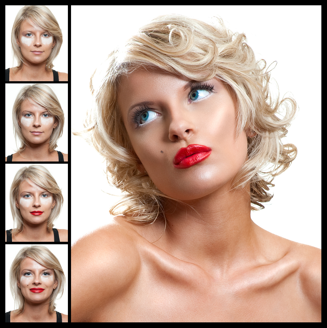
Here's the picture and copy we're submitting to a potential magazine.

To achieve Marilyn's classic look:
1. Start with a clean face, moisturize well. Blend a creme foundation from center of the face out towards the hairline. Use a foundation brush or sponge to work foundation into the skin.
2. Conceal any imperfections, with small synthetic brush.
3. Dust face with loose powder and large fluffy powder brush. Pack powder under the eyes with a sponge to catch eyeshadow that may fall to cheekbone.
4. Apply a light brown shadow from lid to brow focusing on outer eye.
5. Use this same shadow to lightly contour face.
6. Apply a shiny white shadow, preferably loose to inner lid and corner of eyes. Brush onto brow bone as well. With a fan brush, remove loose powder from under the eyes and add shiny white shadow to cheekbone.
7. Line top of eyes with a brown creme liner, winging the end out.
8. Line waterline with white kohl pencil liner.
9. Add a full strip lash to top lashline. Brush real lashes and falsies with one coat of mascara.
10. Finish with red lipstick extended out beyond the lip line.
Have fun!

Now photographically and editing, I didn't do much with this picture. Truth is, I didn't have to. You've got a girl with stunning looks and perfect makeup. I had to find things to do to this image to make it marginally better. Enough said.

Camera: D3/85mm f/1.4D @ f/9.0 (what a waste of the lens), 1/200th, ISO200

Strobist: AB800 from front left creating hair highlighs and AB800 in 22" beauty dish from camera upper right. Head tilt created a nose shadow that was too high but overall acceptable IMHO.

Model: Kenna Cade

Makeup: Kelli Zehnder

Wardrobe: Kenna Cade/Michelle Green

Friday, November 13, 2009

Kimberly Ann: Attitude


This is a great look. I love how she pushes herself to push the envelope. In my mind, I compare Kimberly Ann most closely with Jessica because they both have this incredible range and unfettered quality in front of the lens. They come alive and there isn't anything they can't do. I mean, some models say they come alive but then there are models that amaze me...

I finished post-processing this in a couple hours but played around with output sharpness for another 2 hours. I don't feel confident in the workflow and I don't like the final product because it doesn't have that crisp quality. I can't understand why really and it bums me out. I think about it all the time which is borderline obsessive but there's something to be said about the quality of the image that I post at the end of the day. It needs to be spot on. It needs to be unbelievable. It needs to be jawdropping.

I could have made this picture better but I don't know how. All I know is that I could have gotten more out of this image.

Camera: D3/24-70mm f/2.8G @70mm, f/9.0, 1/200th, ISO200

Strobist: Tried and true

Model: Kimberly Ann

Makeup: Kelli Zehnder

Wardrobe: Michelle Green