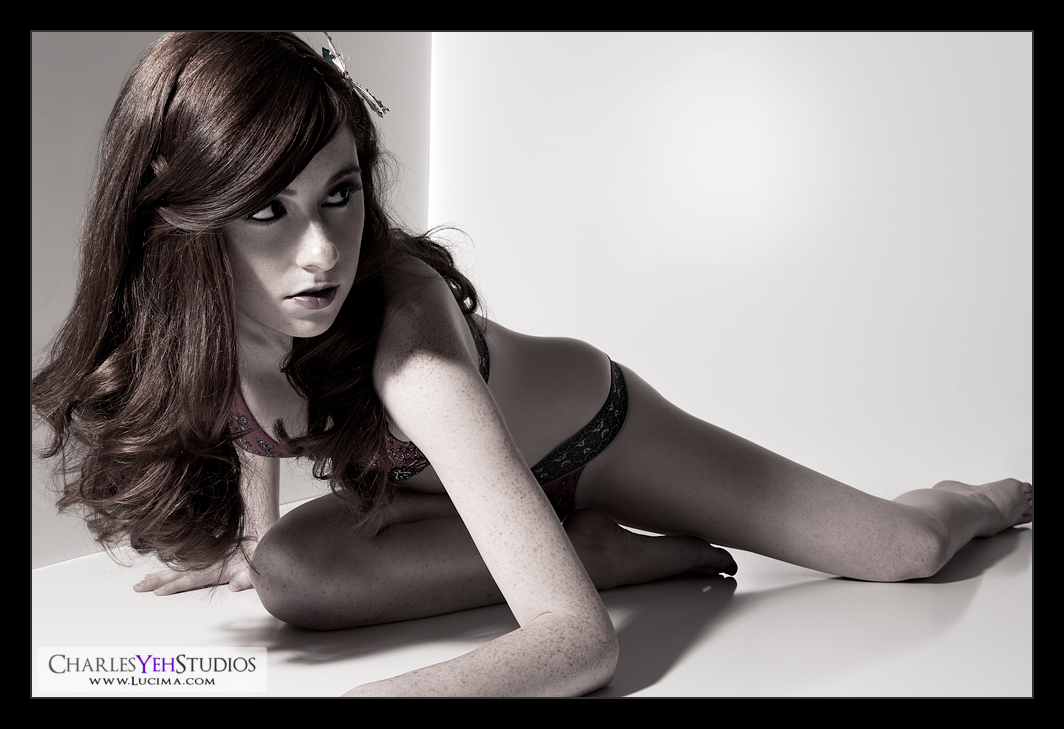
Yeah, I kinda lied. This isn't colorless. Actually it's only 80% B&W.
Let me be honest with you. I didn't know where I was going with this image. I wasn't even sure if this image would post-process "correctly" so I ran through some global adjustments in the first 5 minutes that gave me the confidence to even continue. It'd be a bad idea to work on the skin for hours only to find out that it lacks that "je ne sais quoi".
So here's why I think this image is interesting but don't let me sway you, everyone should have their own opinion:
-The shadows across the face particularly under the eyes. Anna almost looks like she's wearing a mask if you step back and blur your vision.
-The lines and the posture. Different. Could be more aggressive. But interesting nonetheless. I would have changed the angle of her left arm in retrospect to be a little more acute and less obtuse... basically to match the angle of her right leg. That's my fault. I very much like the length of her left leg though. She's proportionately perfect for 5'5".
-The face and the hair. I should have put this first because the face is always my first and foremost consideration. There's something about her expression and particularly those flowing red locks that I really like. It's almost a hair commercial really.
This mini-set with her on the ground proved difficult in my selection process because I think that I screwed up the light. Sure the "mask" thingy is kinda unique but not the best angle for this particular image. Light's coming in from camera upper left and should have hit her face pretty square if not for the fact that she turned away. BUT! It's not Anna's fault because even in reviewing the other images, the light doesn't pass the hair nicely and still casts a bit of shadow on her face in the other images. Fortunately being in the white corner makes it easy for bounce/fill so exposure isn't an issue except in the placement of the shadows. Take mental notes Charles. You got away with it this time but next time you may not be so lucky...
The treatment of this particular image works though. Even through the desaturation the hair comes through and rightfully so. There are a few things going on in this image. Aside from the global levels and curves adjustments there are 3 important layers to note.
1) The B&W conversion at 80% opacity to bring things more greyscale but leave the hair color somewhat intact
2) The luminosity gradient map (B&W) at 60% opacity for added contrast
3) The purple/orange overlayed gradient map at 3% opacity to give it a tint (you knew I couldn't get away from using gradient maps for long)
For the loyal followers, here's the curtain pulled back. Both the original image and the layers I've used:

Few things to note. The freckles stay again mostly intact. I did work the skin more systematically as far as smoothing it out. The hair needed to be tamed a bit in places. The specular reflection of the AB800 needed to be removed. Otherwise it was straightforward.
Thoughts? Comments? What do you think?
Camera: D3/24-70mm f/2.8 @40mm, 1/200th, f/13, ISO200
Strobist: AB800 in 7" reflector from camera upper left
Model/wardrobe: Anna K. Mason
Makeup: Kelli Zehnder
Hair: Michelle Green
Stunning image, model, and great PP!
ReplyDeleteWhat exactly do you call frequency, in the layers?
A highpass filter?
Thanks for sharing!
http://charlesyehstudios.blogspot.com/2009/10/surface-breathe-retouch.html
ReplyDeletehttp://charlesyehstudios.blogspot.com/2009/12/bandstop-processing-aka-spatial.html
This comment has been removed by the author.
ReplyDeleteVery cool "colored colorless" photo. ;-)
ReplyDeleteI like how the hair turned out as well -- the perfect reason to keep some color in the shot.
The shadows across the face are a nice effect. It would have been interesting to take it one step further and put Anna in an actual mask, perhaps a colorful Mardi Gras mask (not big and crazy, but more Zorro or Lone Ranger in size and shape). It could add some mystery to the already interesting pose.
I like the cropping on the top, left and bottom, but am not sure about the right side. There is a delicate balance between making her leg look like a stump and losing that great body line that Anna has. I tried cropping a bit off from the right side -- cropping just to the left of where the big toe is connected to the foot -- and think that I like it better. What do you think?
The foot is actually very interesting visually, but because it is so eye-catching, I think that it tends to draw the eye away from Anna's hair/face/pose. I'd love to hear what other readers and you think. Perhaps I am just off my rocker (actually, that is very possible).
Overall, I love the image. I now realize when one of your photos is one of my favorites because I'll call my wife with a "You have to see Charles' new photo." She, too, loves your work, btw.