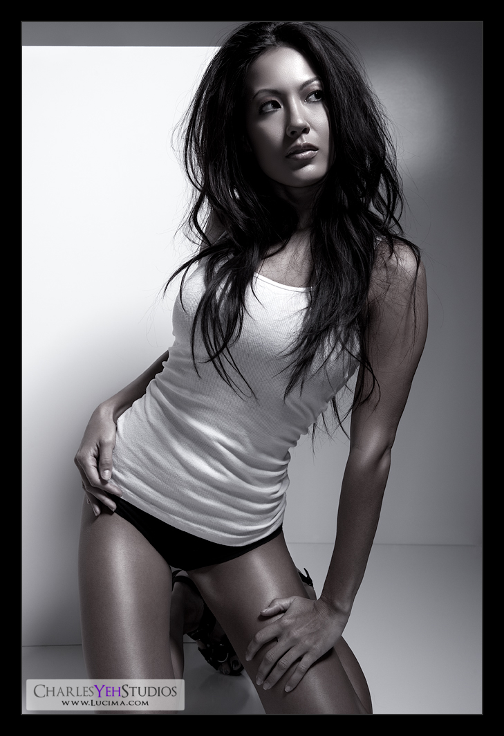
This edit of Brandy thankfully took a lot less time than the first one. The 3 hairs left on my head can rest safe... for another day.
I liked this picture. For the pose. For the idea that I had with the walls. For the simplicity.
What I didn't like about this picture? That annoying specular highlight of the AB800. In the words of Sit 'N Sleep, "You're killing me Larry"
Where did I go with this picture? Not far from where it started. I mean, none of my edits are ever drastic but this one was as subtle as they go. I didn't even desaturate the image all the way. Just turned down the colors 80% or so. I like the contrast between the skin tone and the B&W wardrobe.
Did I learn anything new? Yup. That highlights should never be totally blown out and that they can still be blurred gently into the non-highlight area. I'm starting to understand the whole "smooth transitions" thing but I need more practice. Nothing "heavy-handed" as Amy Dresser would say.
Why do I reveal the screenshot of the retouch now whereas I didn't used to before? Because those "effects" layers only represent 5% of the work. 95% of the work goes into carefully dodging and burning and healing and tediously working the little things. Sure those 5-6 layers will yield 95% of the effect of the picture, but the "je ne sais quoi" is in that bottom layer (Frequency Pass). It's that which can not be taught. You just have to do it. And that's why Amy is open about "revealing" her techniques because at the end of the day, they are nothing extravagant. If anything Amy uses the simplest tools and techniques but it's her "brushstroke" if you will, that's special.
Besides, the nomenclature on the layers is cryptic. If you can decipher it, you already know more than I do :) If you really want to know, you'll stumble over it on your own. But ultimately I'll just tell you if you ask anyway LOL :) Besides, there's nothing that I'm doing in those layers that I haven't already discussed ad naseum in my posts!
Oh and remember the walls? Yeah, I'm not using them the way what's his name uses his. This is only one of several orientations and combinations you'll see me use these things. I only wish they weren't so reflective. Can you backsolve the orientation? Shouldn't be hard.
Oh and I drew eyeshadow on Brandy in Ps to bring out the eyes.
Camera: D3/24-70mm f/2.8G @48mm, 1/200th, f/8.0, ISO200
Strobist: Light's coming from camera upper right. It's an AB800 in a 22" beauty dish gridded by 40º. The rest of the light is simply bounce from the walls and what not.
Model/wardrobe/makeup: Brandy Grace


No comments:
Post a Comment