I need to dedicate more time to this post but I'm hungry so this will have to suffice for now:
Edit: I'm going to flush this post out now
-I did not crop this picture down from out-of-the-box. When I first started shooting, I would often crop 40-50% of the frame to get better composition. Now that I've developed a tiny more of my compositional eye, I find that I'm cropping a lot less. This helps in 2 ways. For one, that's one less step that I've gotta take when retouching. Secondly, my camera all of a sudden seems like it has more megapixels and therefore more detail in the frame. Kapow! Megapixels FTW!
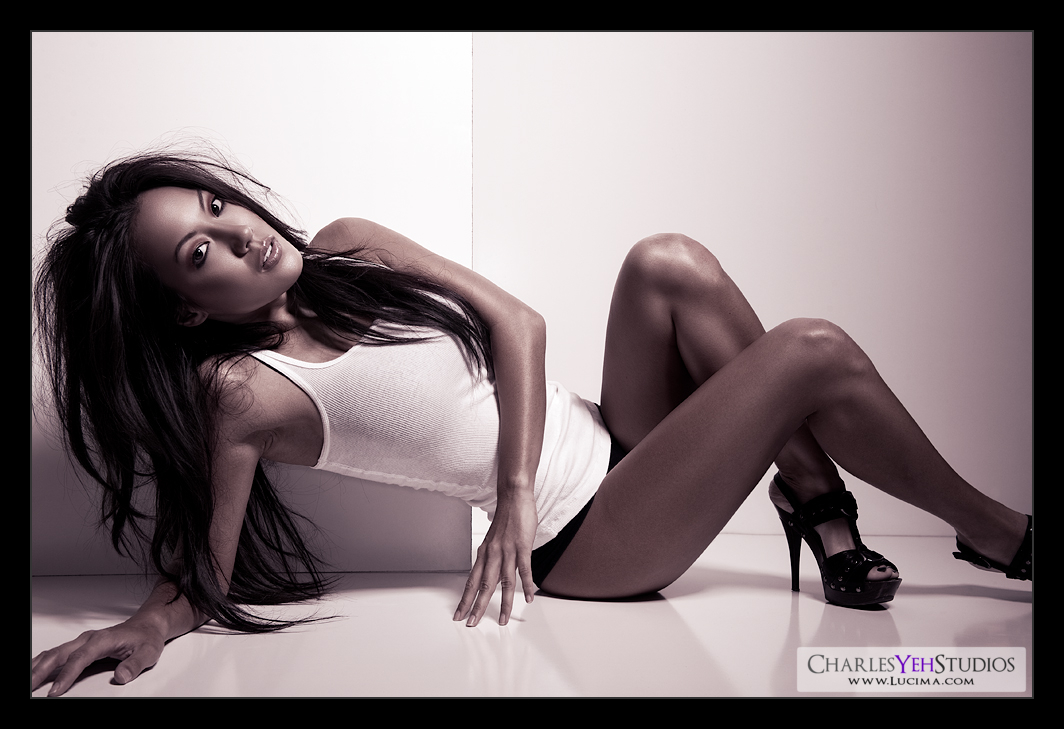
-No new/edit-fill-with white on overlay. So a couple posts back I talked about Amy's interview and how this was one of the techniques she used. I tried it a couple times in my recent pictures but decided against it in this retouch. The technique is good but I did not like how it would exaggerate the highlights in this particular picture. It would blow out my highlights too much and ruin the smooth gradient transition between lights and highlights. I dunno. Maybe I just didn't feel like using this technique today, okay? :) Gosh, do I have to have a reason for everything??? LOL
-Wanted a cooler temp gradient: Fail. Yes total fail. I was going for something bluish. But somehow I wound up with a variant of the purple-orange gradient that I seem to always use in my pictures (lately). Is it played out yet? Are you guys bored of it? This one should be a little bluer. Wrong, it just wound up more purply-red LOL. Oops. Back to the drawing board on that...
-Smoother skin tones and gradients. What can I say? It's the evolution of retouching. I think if there's one overarching element of retouching it's that we're smoothing things out. There should never be sharp transitions between light and dark even when it's on purpose, it should still be smooth. Hard light should on the edges still have smooth transitions. I've really focused in on the softer transitions. Hell I wonder if the beauty dish might have been too hard on the skin but it seems to work well.
- What's that light fall off to the right? It's not banding from camera :) It's just feathering from the beauty dish. Not sure why it's so vertically even up and down the frame? The shutter doesn't move in that direction.
-Orientation of the walls (same as last picture). One horizontal and one vertical farther back.
-Had to move my graphical watermark. It was on her hand and I didn't like that.
-My pictures are getting sharper. I threw everything out the window about what I thought I knew about sharpening. Now I just do it by feeling. In fact I sharpen twice, before resizing and after resizing. Supposedly that's a no-no. Well, too bad. I like it and I'm sticking with it. :)
-The water-like reflection on the ground surface? There's that reflective surface that haunted me in the last picture of Brandy. Fortunately it was put to good use here...
-Lastly it's called "Length" because that's the word that popped into my mind when I saw it. Although she's compressed. She's still so slender and long across the frame. Ahhh, the beauty of making things up on the spot... I think they call it the art of bullshitting LOL :)
Camera: D3/24-70mm f/2.8G @45mm, 1/200th, f/8.0, ISO200
Strobist:AB800 in 40º degree gridspotted beauty dish from camera upper right.
Model/makeup/wardrobe: Brandy Grace

image doesn't work...
ReplyDeleteFixed! Thanks. :) I replaced the picture with another after I made this post.
ReplyDelete