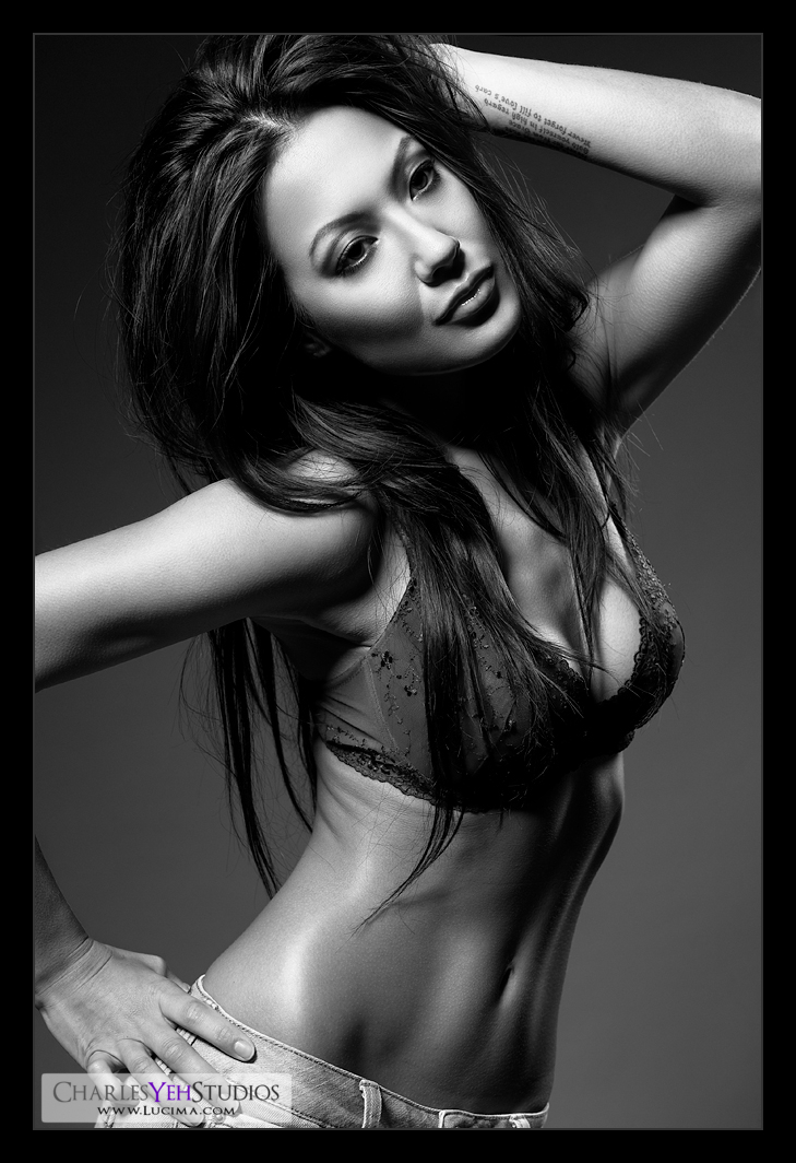
I keep pushing and I keep achieving new heights. I suppose this is the culmination of what I "know".
As I write this, I'm still not sure on the final opacities of some of the layers but I wanted to document the layers that I used so that I don't forget.
Selection process: Nuff said

-Eyeshadow. This is the third time I've drawn in eyeshadow on Brandy
-Global curves and local curves for spot correction, particularly on certain parts of her skin (e.g. face and arms). Pieter Ale from flickr brought to my attention that there were saturation differences between the arms/face and the legs of the last picture of Brandy. In retrospect there was. It didn't have anything to do with the B&W conversion although that might have made it more conspicuous. Local curves correction is a page out of Amy Dresser's book.
-B&W layers one for everything and one for the bra. Both the BG and the bra are blue but I wanted the BG darker and the bra lighter
-Masked B&W gradient map set on luminosity blending. This allowed me to control the contrast, specifically to exaggerate skin tones without messing up the rest of the frame (this is NEW!)
-Selective highlighting to stretch the tonal range of the skin (this is NEW kinda!). I've been using it here and there after Amy introduced me to this technique but for the last picture I actually dropped it. I used it again here and used 2 separate layers with different selection fuzziness to adjust highlights separately for balance.
-Geez, I did a number on her eyes... I can't even tell you all the things I did... like whitened the whites, burned lashes, dodged lids highlights, outlined the lines that extend down and around the eyes (a.k.a. bags) for realness, dodged the eyeball and water line for glossiness... probably more, I just don't remember. LOL.
Everything else is "standard" hahaha whatever the hell that means.
But did I go "too far"??? Maybe.
-Oh by the way, the key to great contrast is "stretching" the tonal range. I might talk about this later.
-One thing that drives me a little crazy is how there seems to be difference in color in her left arm. There's no color. It's B&W. WTF!?!?
Camera: D3/24-70mm f/2.8G @70mm, 1/200th, f/8.0, ISO200
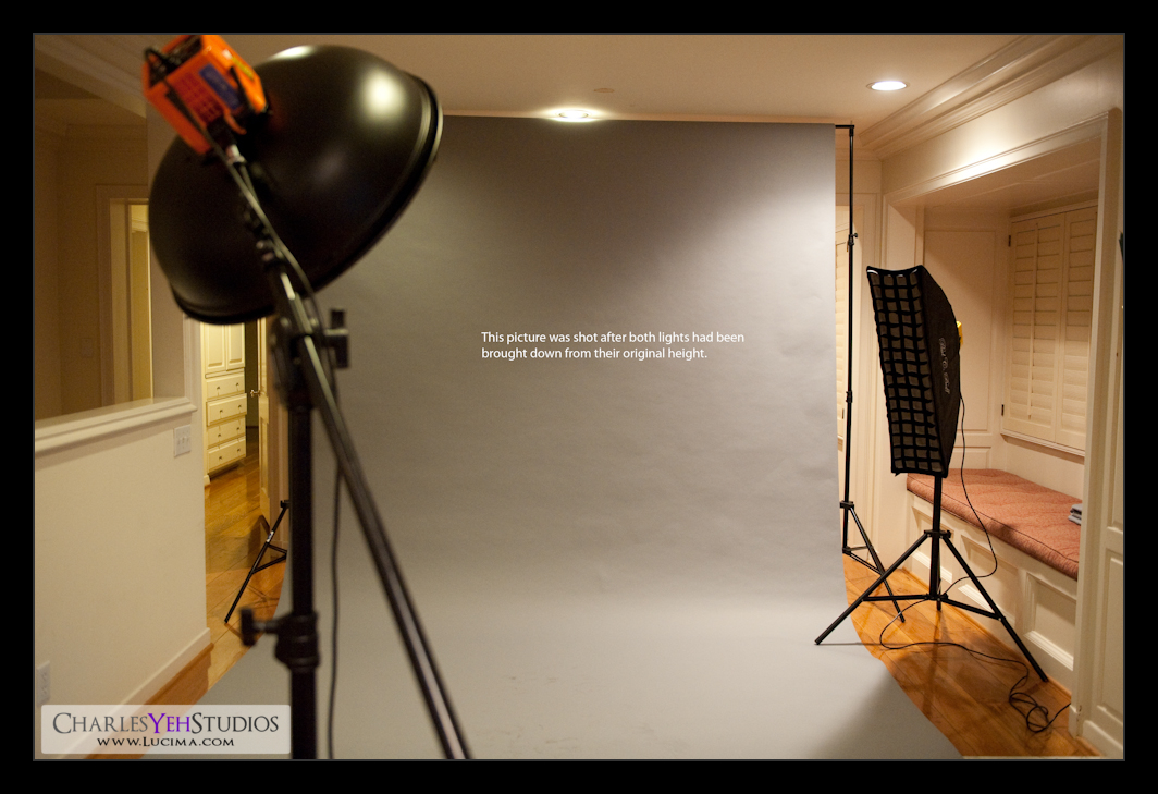
Strobist: 40º gridspotted AB800 beauty dish from camera upper left and AB800 in 12"x36" stripbox camera front right (highlights). See setup picture:

Model/makeup/wardrobe: Brandy Grace

Everything else is "standard" hahaha whatever the hell that means.
But did I go "too far"??? Maybe.
-Oh by the way, the key to great contrast is "stretching" the tonal range. I might talk about this later.
-One thing that drives me a little crazy is how there seems to be difference in color in her left arm. There's no color. It's B&W. WTF!?!?
Camera: D3/24-70mm f/2.8G @70mm, 1/200th, f/8.0, ISO200
Strobist: 40º gridspotted AB800 beauty dish from camera upper left and AB800 in 12"x36" stripbox camera front right (highlights). See setup picture:

Model/makeup/wardrobe: Brandy Grace


No comments:
Post a Comment