
Wow, can't believe it. I'm actually going to flush out the talking points for all of my "placeholders"! Honestly, I don't know if anyone cares because of the technical nature of this blog it's very limited in scope of potential audience. For whom does this blog exist? I suppose just for me primarily to track my progress as we move quickly through the learning lessons of photography.
Sophie was an interesting model to work with. She has an incredibly versatile face that can achieve a lot of different looks. With that said however she looks like a life-sized doll. Throughout her shoot we chose different outfits and modified the makeup a little here and there but it was for the most part pretty consistently themed. The wardrobe was sexy and the makeup heavy as well. Quite the contrast on a girl who has the face of a doll.
Sophie picked this picture out as one of her ten favorite of the 400+ we shot. When I first saw this picture it was as always, the expression that attracted me to it. I spent just over an over or so in the normal phases of my workflow with the blemishes, surface blur, and the highlights and shadows. For the surface blur, I really wanted a little more "doll-like" quality to her skin so I made sure that the texture was nice and even at the expense of seeing each individual pore. With highlights and shadows, I dodged and burned differently this time, opting to view the image from a distance thus allowing me to see the highlights and shadows more easily. The downside of this is that you aren't as exact with your brushstrokes and might go "over the lines" more. The results however seem to justify the means and I might try this again next time. I used to do D&B very close up with the zoom around 100%. This time I was probably at 50% or less.
When I finished the highlights and shadows, I proceeded to edit for effect. This included color, saturation, levels and curves. When I first saw this picture I immediately wanted to do a B&W version because it's mostly B&W anyway. I produced several versions of B&W. First I used the Channel Mixer to produce a 65% red 35% yellow version, the ran a Gradient Map through it. Unhappy with the results, I opted for the Black and White conversion in PS where I individually adjusted channels until I got good tonal range throughout the skin (mostly on the face). I then ran that image through the Gradient Map and achieved better results. I did 2 versions of this technique each with more contrast or less contrast. I think I settled on the version that had more contrast.
Contrast is a funny thing. With black and white portraits, I think that the main focus is going to be that little area of the face. So while we're taught to "not blow the highlights" and "don't lose the darks", I think we can make an exception in this instance. Here's my logic after seeing the work of other fine photographers: The highlights in this image is the wall and some on the face. No one cares about the wall so let's blow that out to get more tonal range on the face. In levels, this meant pushing down the top end from 256 to about 233 or less. For the darks, we've got lots of data in the hair, but where we'd really like to see the extremities of shadows is in the face. I pushed the darks from 0 to about 10. Sure I lost some shadows in the hair but that made the shadows on the face that much darker. Finally I altered the balance (midpoint) somewhat to get just the right mix. Now I don't know if that's the "right" way to do B&W but it was my justification for editing it the way I did. I spent over an hour just playing around with the different versions of my B&W. Oh and finally I pushed the blacks even more back in Lightroom and then threw in a medium contrast tone curve for more contrast. Ultimately, this is probably the punchiest B&W shots that I've ever retouched.
For the colored version, I took a similar approach but not so dramatic. In Lightroom, I pulled the saturation in each channel but mostly the orange to remove the skin color. then played with the color luminance which I've never done before but mostly for pulling reds and oranges. For saturation and vibrance I actually pushed up the red channel that I had previously pulled to get the blush on her face back. Then I pushed vibrance up just a tad to regain some of the coloring since all I wanted gone was the skin color. Going back to Photoshop for levels adjustments, I pushed the blacks and pulled the highlights so the tonal range was compressed to focus on the face.
With both pictures the final product was further edited in Lightroom with some clarity, vignetting, sharpening thrown in for good measure. In both versions I tried to pull a little clarity but then compensated by sharpening. I played with these few versions that I created for HOURS comparing them to each other and to similar pictures I found on the web. Cropping was a huge headache because I didn't like her hand position but I loved the corset so ultimately I settled on both.
With all this retouching, I can feel that my style is shifting again. Only time will tell where it goes.
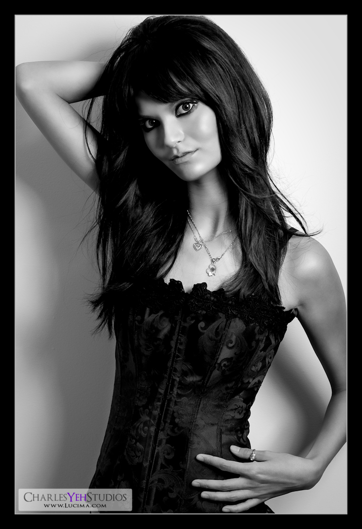
Strobist info: Single AB800 in 22" beauty dish from upper camera right, not gridded (though I kind of should have but I didn't want to lose the blacks on her corset).
Processing: PS CS3 and Lr2
Camera info: D3, 85mm f/1.4D, f/5.6, 1/200th, ISO200
Model: Sophie Marquez
Makeup: Alyssa Fong
No comments:
Post a Comment