I love Christy's expression in this picture. When I ran through the set in Lr, I had to retouch this one.
It's nice when the model has a specific direction in terms of look and feel that she already likes. In this case, Christy likes 40's pinup look and has the looks, wardrobe, and hair to go with the style. So we lit the piano and sat her on top of it.
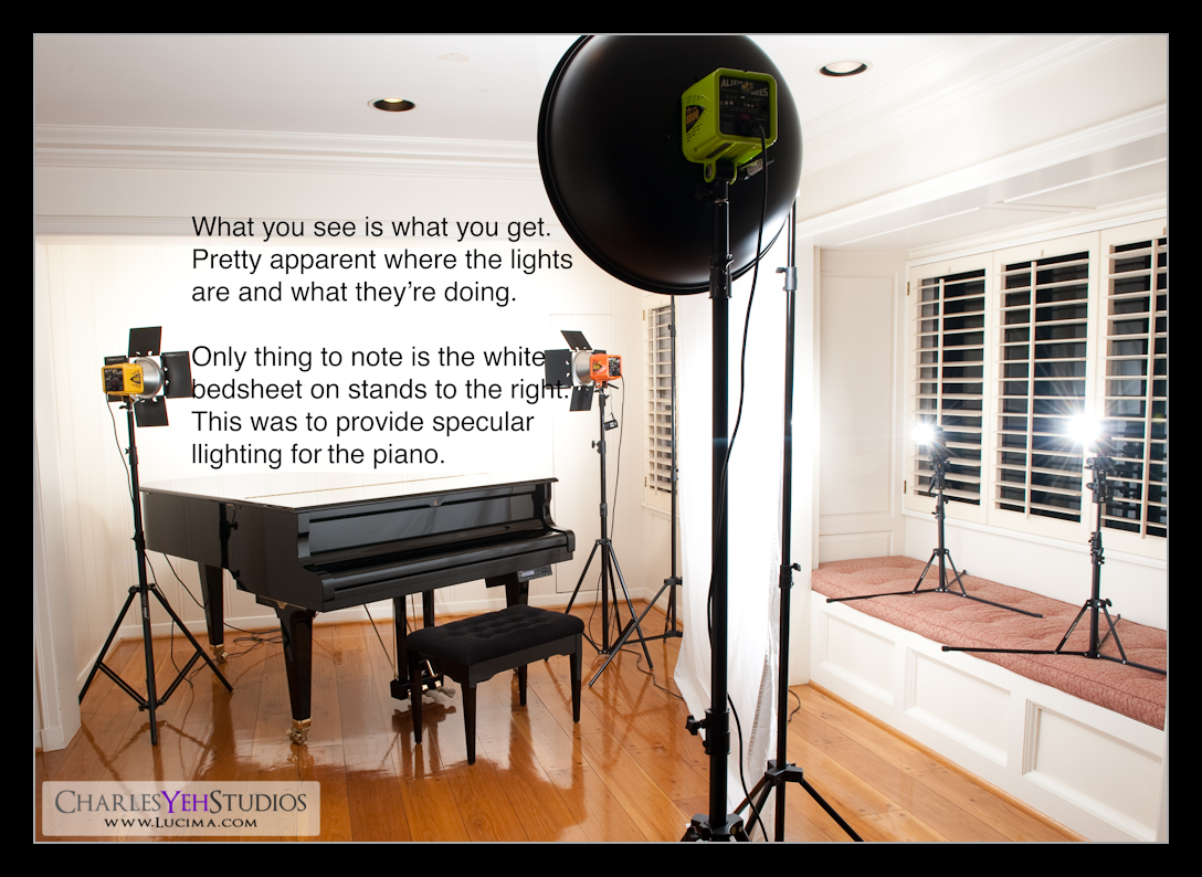
The setup is very unique and it's actually one that I've never done. I've shot lots of things on top of the piano but never a model. My biggest fear is that she might fall through the top of the piano if the lid breaks. Secondly, it's a difficult little place to light because it's in a corner of the room with 3 white walls. Fortunately, the white walls worked for us instead of against us as I put 2 AB800's on each side of the piano to overexpose the walls and blow out the whites. That in turn also provided great soft backlighting for Christy. The piano was lit with 2 SB-800's placed on stands behind a large bedsheet strung up on my background stands. This provided the specular lighting that allowed the black of the piano to be seen. Lastly, we hit Christy with my trusty AB800 in 22" beauty dish from just above the camera. Voila that was our lighting setup.

Retouching was where most of the magic happened for this shot. This is proving to be the case more and more often. I'm an American. I bleed red, white, and blue just like any of you. I grew up here knowing it's "You're Way Right Away" (Burger King) and therefore I also have the same mentality you do when it comes to lots of things. You see, the glass is always half empty for us. Yes, it is. No matter how you try to fool yourself to believing it's half full, the reality is that our culture tells us we need to "keep up with the Joneses" so truly, it's half empty.
I have the same attitude towards my pictures. They're okay. Not spectacular. Just okay. Could be better. Always. And when I retouch a picture and I think I'm done, I often second guess myself in a million ways! Like, did I blow the highlights? Lose the darks? Is the D&B natural? Should I have blurred the skin? Should I have not blurred the skin? Should I have desaturated it more? Saturated it more? Is it convincing? Did I miss something obvious? There are a countless number of ways I can second guess myself. Sometimes it's good. Lots of times it's bad.
In the example of this shot, I actually finished this shot with something a lot less dramatic and then wasn't happy with it and HAD to redo it. My first run through, I wound up with a very plain jane version of Christy in her pinup look but it just wasn't "pinup" enough for me. Even after I uploaded it to flickr and looked at it a bunch of times, I couldn't stomach the fact that "this was it". It wasn't "enough". Even now in its current iteration, I'm not 100% convinced that it screams "pinup", but I'm going to live with it... at least for now. And now you know a little more about me and how I think and why I can't sometimes just leave things be. The effect in this one was a sketch filter in Photoshop. I can't remember what's it's called but the purpose of it is to make it look like it was painted/drawn... much like the pinup girls from the 40's.
Strobist info: AB800 in 22" beauty dish from above and just behind camera. 2 AB800's providing blown background (white wall) and rim/back/hair lighting. 2 SB600's on stands shooting through white bedsheet to provide lighting for piano (not seen) and accidental fill lighting. Triggered by Cactus V4 (I broke a receiver today by dropping it!)
Camera info: D3, 85mm f/1.4D, 1/200th, f/8.0, ISO200
Model: Christy Martinez
Makeup: Alyssa Fong

No comments:
Post a Comment