When we present images we're also presenting ideas. For far too long I would present images one at a time. This was a result of convenience and also not always having multiple images to present an idea.
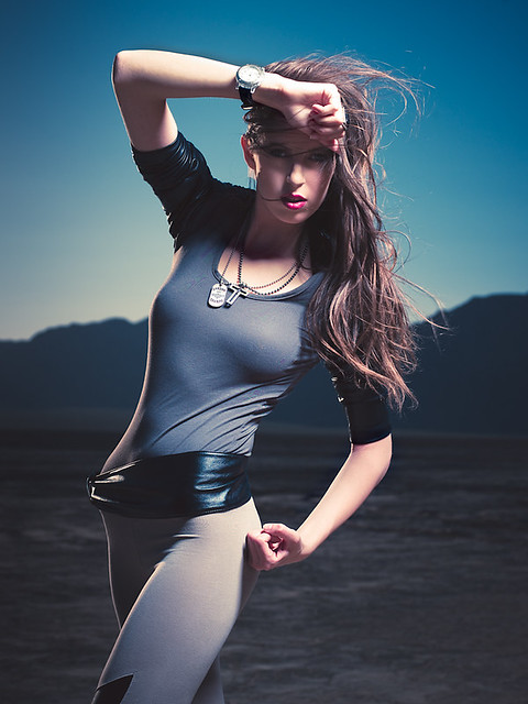
I spent the better part of yesterday redoing my website and filling it with new images. Well, mostly old images but combining them to convey a more powerful message/idea/theme/concept. Take the following for example:

Jenni H3DII-31/HC 80mm 1/800mm f/6.8 ISO100. B1600 in beauty dish from upper camera right, sun from camera front left.
versus...

Now, I don't know if I can verbally explain what's going on here but I'll try.
Anytime you lay out images together side-by-side you'll automatically create themes/ideas/concepts etc. with similarities and differences. The point is this: With 2 points you get a line (geometry). That "line" is value added and represents the idea that you're trying to convey.
Now admittedly I kind of put these two pictures side-by-side because, well, I didn't have another one of Kaley in this set that I could combine with hers and I didn't have another one of Jenni's alone either to combine with hers. But in combining these two together, I broke mental barriers that it's not okay to combine different images of different girls (something I haven't done before). For me, the theme is typically the model so I try not to combine one model with another model. In this spread of images however, the theme is the desert, the wardrobe, and the militaristic theme.
So how do I choose what goes on the left and what goes on the right. I typically look at 2 images and I look for more contrast than similarity. If the images are too similar then there's no point juxtaposing them because you get all of that from either image. What I'm looking for is "value add", how and what does the second image add to the first? Truthfully this is the first time I've verbalized this process so bear with me, it's been a tacit action up until this point. I look for contrast in size, in mood, in color, in light, in angles... all while conserving some theme.
For example, a lot of my spreads will contain a full-body image contrasted with a close-up of the same model. This is an obvious combination because the model and wardrobe are usually the same:

Another example would be same model, different wardrobe different feel like light vs. dark with the more powerful image on the right. Sometimes I like to play with the angles and make the images point either the same way or opposite each other... but usually I point the left image to the right image because that's where you want the viewers eyes to go:

Here's the thing, our eyes are trained to look from left to right. The spread simulates a magazine double-trunk, therefore your eyes start on the left image and end up looking at the right image so your "message" has to end with an "exclamation point". Another thing I do sometimes is to do color vs. B&W:

Or sometimes I do two colorless images with one head chopped off ;P

Honestly, there might be no wrong way to put two or more images together...

Now you try ;P

Howdy Charles,
ReplyDeleteThis is something I haven't spent time on yet. It's true that if you set two images next to each other that you develop a theme rather quickly. I can just imagine how complicated it can become if you're putting together a lookbook.
Thanks for the details. This post is giving me ideas of how to present images to potential clients.