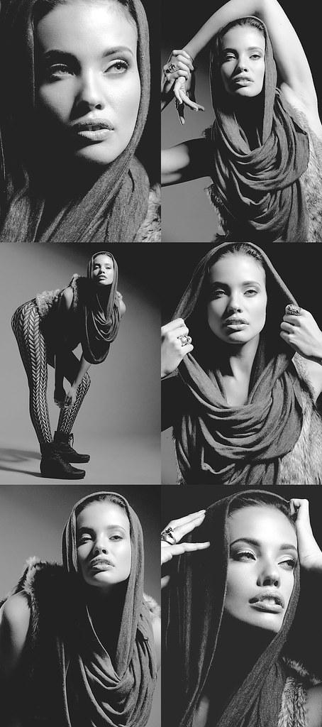
I found many of Stephanie's second set to be quite conducive towards B&W conversion. I tinkered a bit with the first one. I've mentioned that I've been a bit on a B&W craze and so I've been experimenting heavily with different conversion techniques and I came up with this:

Stephanie D3/70-200mm f/2.8G 1/200th f/11 ISO200 @200mm. B1600 in 40º gridded beauty dish from upper camera right. B800 kicker in 20º grid from camera front left. B800 into flag for background light from camera left.
After templating the first one, I decided to do 5 more in the same effect. I ultimately had 6 finished images from the set and I decided to throw them together in a composite image:
Stephanie composite
The composite took me a while to complete. These days it's rare for me to put together composite images unless it's a 2-some or a 3-some but rarely more than that because it takes so much time to retouch each image. That being said, it's a lot easier when your model has good skin and looks as young/good as Stephanie.
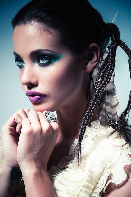
This next one is a prototype from the 3rd set that I'm working on. Let me rephrase; I'm finished with this image but I'm going to work through the 3rd set with the same look and feel as the following image:
Stephanie D3/70-200mm f/2.8G 1/160th f/11 ISO200 @135mm. B1600 in 40º gridded beauty dish from upper camera left.
The irony is that as infatuated as I am with B&W, I'm also very intrigued by the presence of color... more so than before and that intrigue exhibits itself in my recent images; including but not limited to some of the desert pictures that I retouched recently. As a result, the color images that I've retouched recently have been "pushed".
I'll probably have something to say about "pushing the limits" in my next post.


Charles, absolutely stunning. Stephanie reminds me of Adriana Lima with those nice full lips and amazing eyes. You did a great job of capturing them in your B&W and color images. It is a nice treat when you throw a color image in every now and then.
ReplyDeleteLook forward to see some more.
Wayne Jung of Nappsack Photos
Howdy Charles!
ReplyDeleteAs a huge black and white fan, I think your images of Stephanie are exquisite. The highlights and shadows were well thought out and I like that you lightened the shadows in post processing (gamma and offset adjustments, I take it? :) rather than keeping them black.
Your color is wonderful as well. The blue gradient in the background is pretty cool. The composition needless to say is great. Compliments to your makeup and stylist; they did a great job... unless... did you do that too? :)
@Nappsack: Adriana and Angelina I've heard most often about her ;P
ReplyDelete@Tommy: Yup! Gamma and offset. They do different things. I can't really explain the effects but I'm sure you know better than me ;P Wanna know a secret? It's actually not a gradient. It's just vignetting in Lr. :) Thanks again!
Charles,
ReplyDeleteI know you haven't done this in a good long while, but do you think you could do one your strobist diagrams every once in a while? I'd be fascinated to see how you achieve some of your shots.
My mornings generally follow this pattern:
ReplyDelete1. Check Lucima Blog
2. Check price of Paul C Buff beauty dishes
3. Check bank account
4. If no joy yet, goto step 5
5. Repeat step 1 next day
@oneredpanther: In that case I'll try not to disappoint you... ;P I'll try to post more often. I've been behind this month for sure! Beauty dishes don't cost that much do they??? :P
ReplyDelete@Tommy: It's so much trouble and I keep saying that I will but it's just easier for me to describe in words (although I know it's not nearly as helpful for you all) hahaha ;P