The title of this post/shot reminds me of the great Light: Science and Magic: An Introduction to Photographic Lighting (Paperback). I have this book and it's a great asset for beginning strobists for reference, concept, and theory.
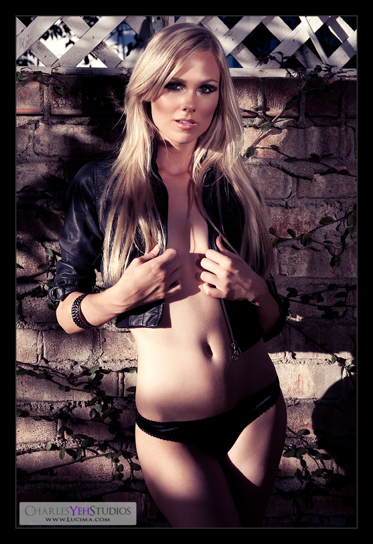
I call this one shadows and light because at 3:45PM the sun was setting through the trees and honestly it was too late to be shooting against this wall. The sun was too low and casting a shadow on Kendall's legs because there was a tall bush that was blocking the sun. The spotty exposure was also a result of the sunlight peeping through the oak tree in the backyard.
How does this shot compare with Kenna: Wall? I think this revision of the wall is better. I managed the highlights and shadows on the face better than the first rendition with Kenna. That's to be expected since I should improve with time. This image is sharper, crisper and less cluttered. I suppose exposing more skin helps helps with the simplicity of the frame.
-The reflector is still finicky and difficult to work with. I had Kendall's boyfriend Yuri help me stabilize the silver reflector since I had it high... I'm talking10-11 feet in the air bouncing light onto Kendall
-I read the histogram this time and as bright as Kendall's abs seem, they're actually not blown. In fact, I didn't blow any part of the highlights. Go D3 dynamic range! Good job me, for reading the histogram!
-Secondly I made sure I had good depth of field. I remembered that the last time I was using too large an aperture and this time I shot f/9.0 which allowed me lots of room to focus-recompose without losing sharpness/focus. The only danger was that I was shooting at 1/125th handheld and it could have been a little slow if I weren't stable. But really that's not pushing teh limits on handheld shutter speed. Another win!
-Didn't killed any blacks on this image because I needed the detail in her jacket and underwear. Instead I had room to kill some highlights on the top end and dropped down to about 240 on the high end.
-Did a little desturation via a B&W conversion at 31% opacity. Primarily however I used a gradient map with the same purple you see in Kendall for the tint and effect. However this time I went with Purple-to-White and blended with Soft Light at 56%, which I feel works out well.
-100% sharpening at .3 pixels was applied after resizing with a little less sharpening on the face (only 70%).
I think this one worked out well... :) live and learn...
Camera: D3/24-70mm f/2.8G @70mm, 1/125th, f/9.0, ISO200
Strobist: Sunlight from upper camera left and silver reflector from camera back upper right.
Model: Kendall B.
Makeup: Kelli Zehnder
Wardrobe: Kendall/Michelle Green

ha! the first thing i thought of was Kenna's wall. i think i might have a hand fetish or something. but, dude (i use dude when i'm being informal) that girl's got some big 'ol hands! sersly, they're larger than mine, and her head.
ReplyDeletenow, i'm not dissing a gorgeous model, nor one with a boyfriend named 'Yuri' (my gf is russian, don't mess with the russians.) i'm just making a point.
too much hands.
i'm reluctant to be at all critical of your work. 'specially since i'm not offering up no blog, and little flickr. and, i'm not worthy to hold your lense cap.
all i can offer is a point-of-view. and, my insight from several seasons of ANTM (see, i told you i'm not worthy).
personally, i blame the reflector.
LOL yeah, sometimes the models have big mitts... the hands can definitely be problematic. Sometimes they can seem manly because they get real veiny because of the light. Sometimes in this case they seem larger than normal. Lighting can be a bad thing when it creates hand shadows.
ReplyDeleteYou're not the first to criticize hand placement in my pictures. I get this ALL the time LOL! I guess it's the "next step" to my retouching. But in all honesty, I'm not sure what to do... Should I liquify her hands? dodge out the shadows? :)
I'll have to think about it some more :)