Thursday, December 31, 2009

Building Walls

They say it's not good to build walls... I beg to differ.

My photographic style requires that I have high ceilings, white walls and corners. The problem is that my makeshift studio has off-white colored walls, low ceilings and no corners. So part of the problem is that I simply need a new place to shoot.

But not everything can be resolved with simply moving to another studio. I would love to be able to shoot with sunlight against white walls. You can do this one of two ways. You bring a wall to the sun or you bring the sun to the wall. Between the two, it's probably easier to move a wall than it is to move the sun.

The problem with bringing the wall to the sun is that I don't have a white wall outside my house. Looking through my flickr, you'll find lots of walls, a brown wooden one, a brick one, the wood shakes along my house, but no white walls outside my house. Besides, even if you find a static one, you're then at the mercy of the sun and thus the time of day.

I realized that I needed a portable wall. Hell I want a portable corner and freestanding so no one has to hold it. I know they exist and I'm sure there are plenty of set construction companies that can make one for me, after all I'm only a few miles from Hollywood. But at what cost?

As I was filling out an online request for proposal (trying to get bids) and listing out all my criteria, I realized I needed to be more specific. So I reviewed the
Kesler Tran video where they shot in the dry lake bed.

As I reviewed the video closely, I started seeing things that I never noticed the first time I watched it. I noticed details in the frame and the screws and metal tie plates that were used. The more I watched, the more I understood how the walls were constructed. So I asked myself, "I wonder if I build this myself?" In asking the question, I started to draw and came up with this:


While this was a good start. I had still too many questions about what actual parts I needed. All I knew is that I had 2 tile boards 4'x8' that I could start with but there are millions of different screws and I didn't know which screws I needed to put the tile board to the frame. What I did know is that I had as much information as I could gather from the video and the next step was to head to Home Depot to get some answers.

3 hours at Home Depot will give you some answers. That said, there were several nice Home Depot employees that answered some pretty important questions. Ultimately my receipt looked like this:
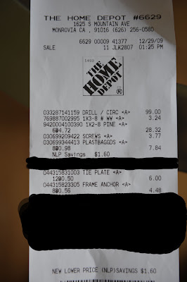


I won't go into the details about which screws I used. Since you now have the receipt, you can use the serial code to find the parts if you so choose. My total cost excluding the drill/saw combo was $53.65. Could it have been done for cheaper? Sure. But that's not the point. I needed wood that wouldn't crack/split upon being screwed into. Also the other important thing I learned is that when it says 1x2 it's really .75"x1.5". That almost screwed me because the screws I bought assumed that the wood was 1"x2".

So I came home and cut the wood to size and assembled the frame. While it was still kind of flimsy, after attaching the tile board to it with the screws, the final product was rock solid. All I needed to do then was to attach the two pieces together with the metal L tie plates and here's the final product:


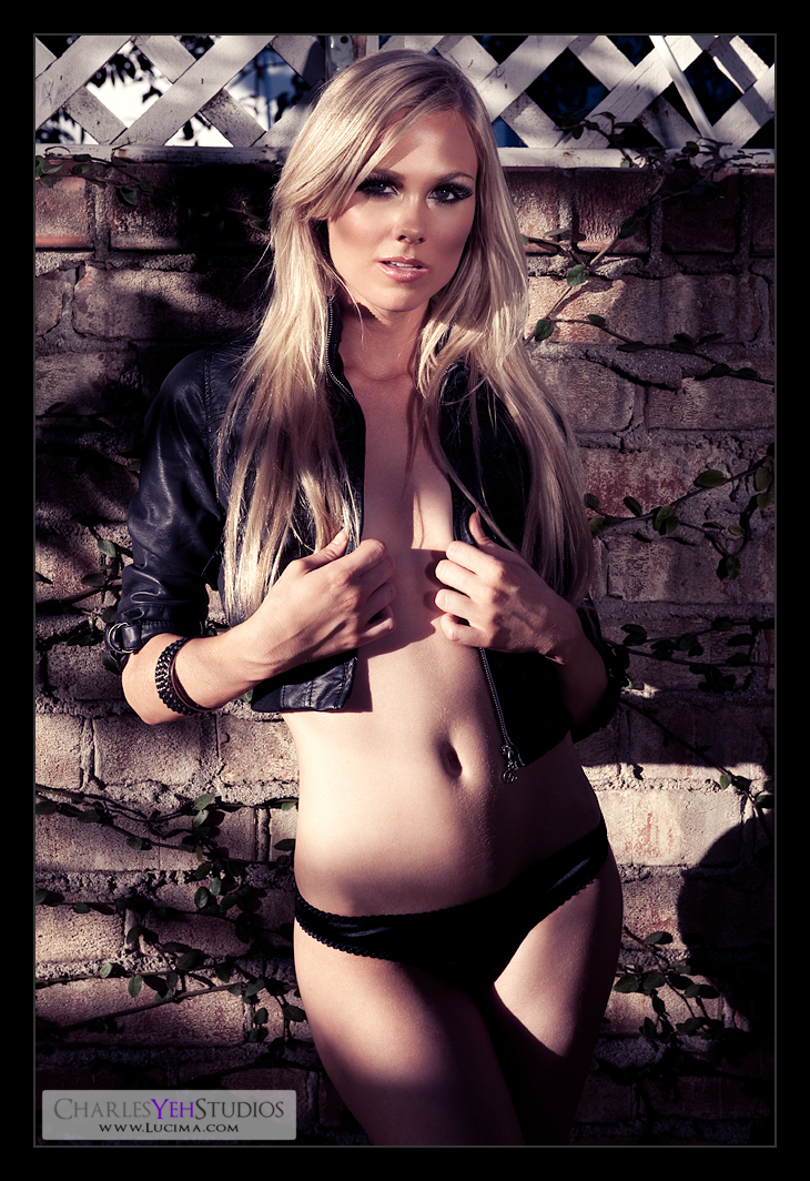
So how will I use it? Kinda like this, but hopefully with a better looking model:


Penelope


I started this picture of Penelope with no other intention than to work through it with my normal approach to things. However halfway through the retouch, I watched the RetouchPro rebroadcast of the interview with Amy Dresser and well, things changed.

To make a long story short, I walked away from the 2.5 hour interview realizing that I knew nothing about Photoshop compared to a seasoned pro like Amy Dresser. The good news is I just saved a bunch of money on my car insurance by switching to Geico. :)

In all seriousness, I was able to understand all the techniques and keep up and I have several new techniques to try out... some of which appear in this picture of Penelope.

I'll go over them briefly on a high-level:

-Dodging and burning with black/white brushes on an overlayed blank layer. I used to do this a while ago with a 50% grey soft light blended layer but for whatever reason it felt tedious and hard to control. Most of you know that my preference is to use the dodge and burn tool directly onto a copy of the image. I know the current retouch stance is to not use the original D&B tools because it "destroys" original data, but I don't care. Amy Dresser uses them, so it's okay. Anyway, I am going back to experimenting with D&B via black/white brushes

-Bringing out the highlights with a (white) color range select (variable fuzziness) and then filling with white. This is a totally new technique that I learned from Amy yesterday and if I remember was even a new technique to her quite recently. Essentially you're selecting highlights by selecting the color white and making adjusting the fuzziness so that it captures as much of the skin tones as you want. Then you fill that selection with white, thus making those areas brighter. Then you adjust accordingly via mask, opacity, etc. This was an interesting new addition to my arsenal. The side effect is that it desaturates the image

-Color adjustments via curves. I've known that Amy does color adjustments via curves, particularly global ones early on in the workflow but I had no idea she did localized color adjustments to even out skin tones on the skin. In fact she sometimes does 20 or so layers of localized adjustments to even out skin tones/colors. I used a global curves adjustment with the master channel to adjust luminosity and then the RGB channels to correct/adjust for feel and color temperature.

With my own original workflow, this image was a little different because of the amount of shadows and the focus on the parts of the face that were lit. I dodged the face extensively to bring out the highlights and also spent a lot of time evening out the skin tones across Penny's cheeks. The lips were also slightly saturated to draw more attention. As usual, I brought out skin texture in the arm and cheeks but this time before resizing. This slightly affected my post-resizing sharpening which was almost unnecessary because of the amount of detail retained and accentuated by the high-pass prior to resizing. Speaking of skin texture, since there wasn't much real estate on Penny's face to begin with, I didn't need to apply any skin filtering.

The biggest challenge was her right arm (our left). By stretching out her right arm across the frame, it was nearly impossible to create a crop that didn't make her look like an amputee and didn't sacrifice the composition of the frame. Ultimately I opted to make her look like an amputee because I didn't want to destroy the composition of the crop. In retrospect she should have dropped her right arm and thrown her shoulders back a little more to be less square to the camera.

The white wooden frame that she's leaning on also made for a slight challenge because I wasn't directly in front of it so the lines don't match the frame of the camera. That bugs me slightly.

Camera: Nikon D3/28-70mm f/2.8G @62mm, 1/200th, f/11, ISO200

Strobist: Single18-20" beauty dish (with silver-lining) monobloc from camera upper left. Reflector board right.

Model/Makeup/Wardrobe: Penelope Ko

Studio: Winson's studio in Shi-Lin

Monday, December 28, 2009

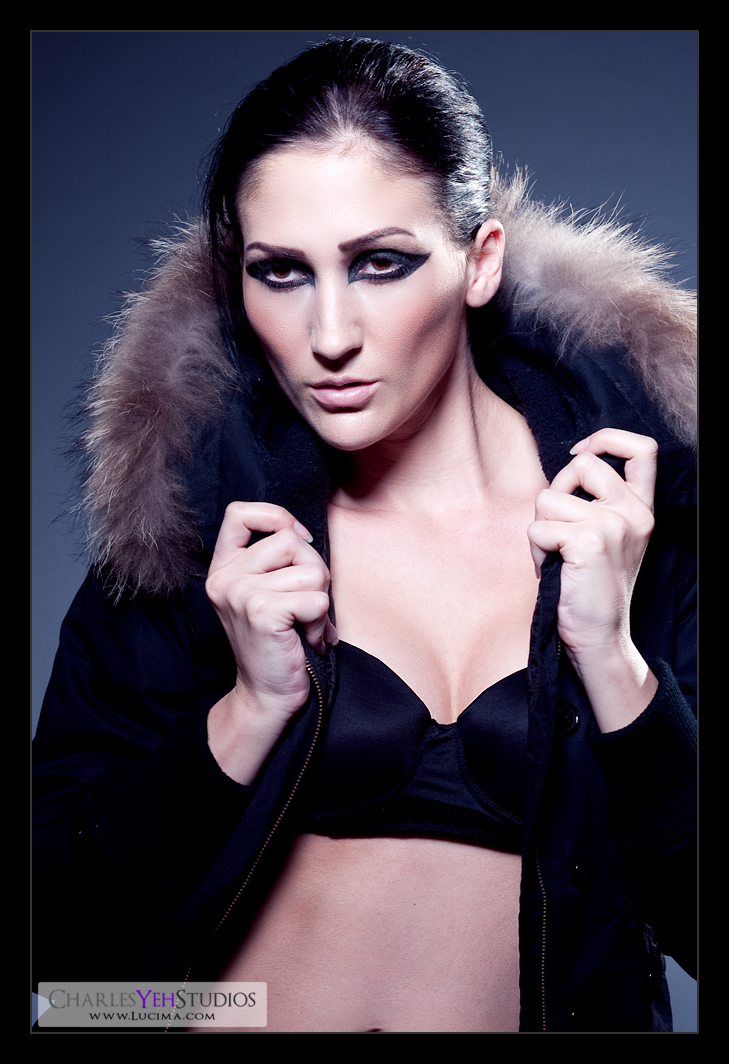
Jaclynn


More info later...

Camera info
: D3/24-70mm f/2.8G @70mm, 1/125th, f/13, ISO200

Strobist: Butterfly lighting from the front via 18-20" beauty dish (with silver-lining) in large wattage pack strobe from behind the camera slightly high. Second strobe from camera front right in grid for higlights.

Model/Wardrobe: Jaclynn Joseph

Makeup: Isabella

Studio: Winson's studio in Shi-Lin

Saturday, December 26, 2009

Jaclynn: In black


Second image in the Jaclynn collection. This is actually a shot from the third set that we did. I purposely skipped the second set for now. Had a hard time getting this shot because Jaclynn didn't like the original lighting we used. But we tried various angles until we wound up with butterfly lighting which she did like. The spill onto the background provided a nice little spotlight effect. I believe the background was white. Jaclynn was standing some 10 feet or more in front of the paper.

Post-processing was straightforward. Nothing out of the ordinary except that instead of using a gradient map with colors, I opted for a color balance that introduced purples and blues for a cooler effect.

I ought to talk about the skin treatment that I've been using. I lightly addressed it in a post back in December but I never fully explained it. At this point, I'm not sure I will but it's really no surprise that I'm bringing out the texture of the skin and pores. That being said, it should come as no surprise that I'm using high pass sharpening to bring out those finer details. That's it. There really isn't any magic to what I do ;)

Camera info: D3/24-70mm f/2.8G @70mm, 1/125th, f/11, ISO200

Strobist: Butterfly lighting from the front via 18-20" beauty dish (with silver-lining) in large wattage pack strobe from behind the camera slightly high. Second strobe from camera front right in grid for higlights.

Model/Wardrobe: Jaclynn Joseph

Makeup: Isabella

Studio: Winson's studio in Shi-Lin

What's a Good Monitor/Display?

I've been reading a lot of reviews and misconceptions regarding what constitutes a good display/monitor. Many people are under the impression that you're overspending for an Eizo and you could easily get something "just as good" with an HP2475w or an NEC2490WUXi2. This post is dedicated to dispelling the "myths" from my point of view.

What is the purpose of a display? As a photographer/retoucher, the display exists only to reproduce the image of what I capture, subsequently process, and occasionally print. It needs to be true to the original image according to a standard via calibration and hold that standard over time (i.e. not fluctuate). It needs to be reliable and gain my trust.

The purpose of a display is NOT to show the most vibrant colors. NOT to show more contrast than that is possible through printing. NOT to show more brightness than industry standards 120cd/m2. Really NOT to show you what you want to see, but what you're supposed to see.

I suppose that's the primary misunderstanding as far as what constitutes a good display. Yes the new displays all use IPS panels. They do provide better viewing angles than traditional PVA panels. Yet, I opted for a PVA panel CG241W over an HP2475w or an NEC2490WUXi2? Am I crazy? Or does it come down to trust? At the end of the day I need to believe that the images I produce can be reproduced by others (assuming they calibrate to the standard as well). Sure the CG241W uses the same Samsung panel as the Dell 2408FPW and several other displays as well. But I know for a fact that the Dell 2408FPW does not calibrate well under 180cd/m2. It's kind of like saying the Audi S8 uses the same engine that a Lamborghini Gallardo uses. Funny, the S8 makes less power and sure doesn't sound as good as a Gallardo. For the record, the S8 does not accelerate faster, does not have a higher top-speed, can not run the slalom faster, does not stop in shorter distances... but it does cost less and seats 5. Perhaps tuning and the other relevant parts of the car are the difference?

If Eizo's could easily be replaced by cheaper displays, they'd be out of business in a heartbeat. There's a reason Eizo has carved out a niche in the medical imaging and photography/retouching marketplace. I tried to live with a cheaper display but the Dell 2405FPW being a 4-year-old display using cheaper parts just couldn't output the type of reliability that I needed. It would band on gradients. Brightness and gamma would fluctuate wildly particularly between the time you turned it on and 30 minutes later. At the end of the day, I didn't trust it to produce images that would reproduce the same on a different display.

Yes, the Apple Cinema Displays look great. Yes, the 27" iMac uses an IPS panel. But, unfortunately the gradients band in Photoshop... and while glossy screens look great they aren't functional for retouching. How could they when there's always a reflection unless you're in the darkest environments?

Anyway, consider this on your next monitor/display upgrade :)

Thursday, December 24, 2009

The Legend: Nanao Eizo CG241W-BK


Some of you know that I had the Eizo CG243W on order from Adorama. The CG243W sports an IPS display, 1.07 billion (with a 'b') colors when using DisplayPort which it has.

Oh and it costs $2239 from Adorama (today's price) and was/is backordered EVERYWHERE.

My main gripe with the CG243W was the price. It replaced the 2-year-old CG241W which utilized a tried-and-true Samsung S-PVA panel and while lacking the DisplayPort connector and therefore a 1.07 billion color palette, was the industry standard as far as top-of-the-line color accurate monitors were concerned. Retouchers and photographers alike depended on this legendary workhorse for their color accurate work.

Pricewise, the CG241W used to cost $2300 but because of the CG243W, Eizo dropped the price to maintain the sales in these units. These units (also backordered nearly everywhere) can now be purchased for about $1900

Is the advancement in technology worth $400 in price? Probably. I've heard great things about the viewing angles for the IPS displays. Would I need 1.07 billion colors? No, but it'd be nice and I'd have bragging rights. Of course that would mean having to purchase a DisplayPort<->Mini DisplayPort adapter for my MacBook 5.1 which unfortunately Apple themselves don't even make. I suppose being backordered for 2 months didn't help either. Hell I went to Asia for a month and came back and still there is no word on when the CG243W will be available.
Between you and me however, I got inside information that Eizo has fulfilled all backorders for the CG243W as of yesterday. So if you're still waiting for your CG243W, you should receive it very soon.

So what led me to purchase the 2-year-old CG241W?

$1,250

Or in other words once I found a CG241W for $1,250 (nearly $1,000 difference from the CG243W), there was no comparison.

But there's a catch. Ohhh there's always a catch.

Basically what happened was, upon returning from Asia I got upset with Eizo and Adorama and being backordered for months on the CG243W. I started calling a few places to see if they still had inventory on the CG241W and discovered that you could get demo units for the CG241W at a discount from the retail price. While waiting for a callback from one of the Eizo distributors, I got impatient and called Eizo myself and talked to Michael (account executive) and suddenly the stars aligned.

They had 1 demo unit of the CG241W in stock.

They are located in Cypress, CA (38 miles away from me).

Oh, and their price was $1,250.

...

I'll be there in 40 minutes!

Wait, but what's the catch??? There has to be a catch.

Demo units are usually units that go on the road to trade shows where Eizo shows off their latest and greatest gear. This unit had "some hours on it" and carried a 1 year warranty instead of the 5 year warranty that Eizo usually provides. Did it make me leary? A little. I figured there'd be some cosmetic defects. Potential of dead pixels. Banding. Maybe there was something wrong with it. Of course, I had a warranty and I could always drive to Eizo and create a shitstorm in person if I so chose... so that made me feel better. The demo units go back to Eizo, and are essentially "refurbished" (examined and tested) and then sold as "demo" because they aren't technically "new" even though they're as good as new. Was this the truth? I would soon find out.

I even brought my computer and portable battery to try out the unit before leaving the parking lot.

Did I test it? No. Here's why.

Upon meeting Todd and Michael over at Eizo, I was presented with a large box... the kind that housed a monitor and could survive a nuclear holocaust. This thing was boxed and packaged well. In fact, Michael exclaimed that this was indistinguishable from their brand new units and the factory had outdone themselves. He would know I guess. Hell, you could shake this box and you would hear nothing move inside. That's good packaging.

So good in fact that I didn't bother opening it in the parking lot, instead opting to test it when I got home. Oh and I left my DVI<->Mini DisplayPort adapter at home. :)

My questions remained unanswered though. The drive home was unbearable. Dead pixels? Banding? Scratches? Defects? Cracked screen? What would it be?

Got home. Opened the box. Packaged with soft foam (not styrofoam). This was the good stuff. The stuff like memory foam but a little more rugged.

Hooked it up, turned it on. Do I see a dead pixel? I dunno, it looks like there might be... whew, it's just part of the snow in the snow leopard background with the SL operating system (OS 10.6).

Put the hood together (no instructions so it took a little bit of trial-and-error but the hood fit well and was a definite go. Now we're cooking!

Scratches? Nope.

Cracked screen? Nope.

Banding (open PS and do some B&W gradients)? Nope

Accessories? Yep

Manual and software? Hmmm, seem to be missing those.

Now, for the real test. Calibration.

To be honest, I did not have an ounce of doubt in my mind that the CG241W would dominate the calibration process. In fact, I "figured out" (again no manual), that the CG241W has an uplink/downlink via USB that would calibrate the display via the internal hardware in the CG241W with the help of the Spyder3Pro. In laymen-speak, simply plug in the USB from the display to the MacBook and then run the Color Navigator software (fortunately downloadable) and with a few settings, you'll get less than 1 DeltaE of variance.

The Spyder3 Pro software can kiss my ass. I say this because I was getting incorrect results using their software during the calibration process. This pissed me off. Particularly because the S2402W-H calibrated so quickly and so well with the Spyder3 software. Hell the Dell 2405FPW did too... but those were both non-wide gamut displays.

So was it worth it?

How could it not be worth it? I paid practically 1/2 of what it was worth 3 months for a new unit. Oh and I ran tests on it. This thing supposedly has less than 0 hours of use when I first got it. The adjustability is endless and I trust that I will get consistent results. When you buy an Eizo, you're paying for the level of trust and dependability of a legendary workhorse.

Oh and the viewing angles on the S-PVA panels are not as bad as what people make them out to be. In fact on some of the IPS panels, there's some color shifting at the extremes still. Besides, the S2402W-H was a TN panel. Now that had poor viewing angles although it was still a good display overall (maybe not for the price though).

Am I in love with the CG241W. Yes. The color saturation on normal sRGB stuff takes a little getting used to though. Hopefully I'll have nothing usual to report in the medium to long-term review of this thing!

LMAO! and it comes with 2 USB slots :) just figured that out right now!

Eizo's CG241W page

Comparison of the CG241W with the CG243W

Wednesday, December 23, 2009

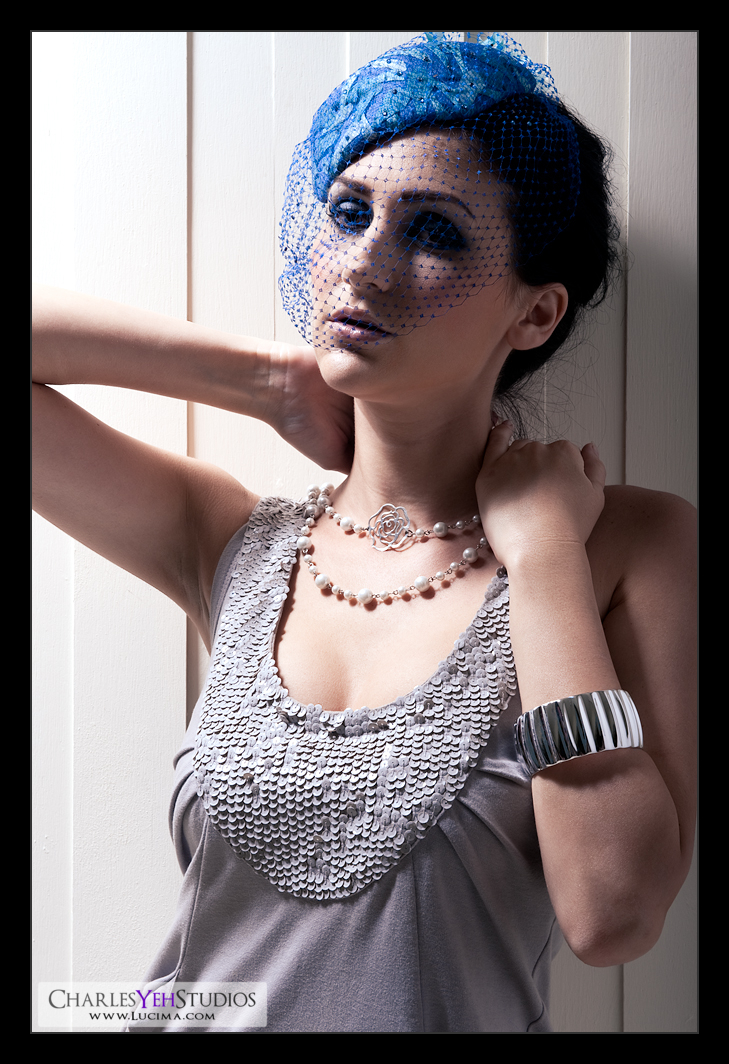
Jaclynn: In blue


I can't really discuss this picture without getting into the background about where this frame came from. I promise I'll keep it short though.

I was in Taiwan from 11/25-12/9 and I was curious to know if there were any models from ModelMayhem in Taiwan. In short, there were several models in Taiwan that were on ModelMayhem, one of which was Jaclynn.

So we set up a shoot but I was nearly 7,000 miles away from my AlienBees and even most of my Speedlites. Fortunately I found a studio for hire/rent and with the help of the owner (Winson), also found a makeup artist at a reasonable price.

The studio was very nice. Small (about 1,000 square feet) but very luxurious as studios go. There were several "built" sets that we were able to use to give my shots a different look. I also had the help and expertise of Winson who aided in setup and also advice and critique. While we had different styles (primarily due to the demands of different industries), we collaborated well and I learned a few things from him as far as lighting and photography were concerned. This made the shoot with Jaclynn that much more worthwhile.

Jaclynn was fun to work with. Energetic and brave. How else would you describe someone that moves to Taiwan without knowing Mandarin and actually winds up staying there (longterm)?

This particular set with Jaclynn utilized Winson's carpentry skills because the background is a fence built from scratch and painted white. The wardrobe determined the color scheme and also the makeup involved, focusing on blue as the primary element of this set. Another thing to note was the lighting coming from very high camera left. This is the highest I've ever lit a model because my ceilings only go up to 8.5-9 feet and Winson's studio's ceilings went up to 11 feet.

Post-processing was different. The screen/net material of the hat forced me to process the facial skin "old-school" style (healing brush) because I wasn't able to run my actions over the entire area of the face. The good thing was that I didn't forget how to retouch. After all, the day after I shot this, I was on a plane going to Guangzhou, China. That was December 9th and in my world, 2 weeks is a night and day difference... this is officially the longest I've been away from retouching (although I did some basic shooting/run-and-gun in China).

That being said, I still went through my usual motions. I ran my levels, gradient maps, desaturation, curves, etc. The truth is that most of the time went into healing stamping all the little blemishes on the skin.

Another thing to note is that Winson's strobes were not syncing properly at 1/200th (unlike my AB800's). That's why there's a little banding on the right of the frame.

Camera info: D3/24-70mm f/2.8G @70mm, 1/200th, f/14, ISO200

Strobist: 18-20" beauty dish (with silver-lining) in large wattage pack strobe from very high camera left.

Model/Wardrobe: Jaclynn Joseph

Makeup: Isabella (I love her work! Maybe I'll talk about this in the next frame...)

Studio: Winson's studio in Shi-Lin

Cost: $77

Sunday, December 20, 2009

No Internet. No Blogger.

Been in China since the 9th. Great Firewall of China has kept me off blogger and all things Google for a while now. The lack of Internet in the more remote places that I've stayed has not helped things either!

I just want to let you all know that I'm still alive. But I'm in Taiwan now and I've yet to return stateside.

I hope I haven't forgotten how to retouch! It has been almost 2 weeks since I've post-processed anything!

Sunday, December 6, 2009

Kendall: Skin texture


This is actually a crop of
Kendall.

If you read this blog you know I'm obsessed with skin texture, details, pores, sharpness and crispness. I revisited Kendall's picture and applied a little "punch" to the skin texture to bring out the details. Click on the picture to see it in the original resolution. I think it shows up well even with smaller resolutions though.

Is this sharp enough for me? I dunno just yet. Only time will tell.

I just realized...

That some of you are reading this blog from a screen that's smaller than in resolution than my posts. I will revert to posting future pics in a smaller width and height in the future... which will require that you click on the picture to see them in the original resolution.

The reason I post in the original size is to get away from the resampling issue that occurs with downsizing for smaller resolutions. But as my pictures get better, they withstand such abuse more readily so it doesn't matter nearly as much. As such, I'll be posting them in a "medium" size for your review :)

Asian High-Key Lighting


I've been in Taiwan for 10 days now and I've noticed that the Asian style of photography is usually much more high-key and with less contrast. This picture was shot by my buddy Jerry in his "Photography/Lighting" class. The teacher set up the lights and each of the students had a chance to shoot with the model.

And it's truly indicative of the style of photography and lighting that you see in the magazines, album covers, etc. In fact the last time I was here a fellow photographer exclaimed that Asian photography doesn't often use hard lighting. Don't believe me? Check out one of the biggest modeling agencies in Taiwan here.

If they only knew that I sometimes shoot with the afternoon sun unmodified :)

Anyway, so I had Jerry send me some of his sample pictures and I tried my hand retouching. You're seeing the results. I cleaned up the skin, the uneven skin tones, drew in the cheekbones a little, sharpened, gave it some texture, played with the levels, corrected the color balance, put in some highlights... that's it. Took me about 30 minutes or so.

Photographer: Jerry Chiu

Retoucher: Charles Yeh

Model/Makeup/Wardrobe: Karen

Saturday, December 5, 2009

Top 10 things for a great shoot

10. Build rapport with the model quickly. Gain trust and and make a connection. Hell, go ahead and flirt with your model a little. Chemistry between photographer and model is important!

9. Establish a rhythm and tempo when shooting. Your model will be able to hit her poses with better when the timing of your exposures are predictable.

8. Show the model how she looks every once in a while so she can adjust her poses. If she's worth her weight in salt, she'll know how to change her poses according to how she appears in the frame.

7. Give the model time to adjust and to get in her own groove. Too much feedback is not good. Conversely too little feedback is not good either.

6. Come prepared. Know the obstacles with both the lighting setup as well as the model before shooting. Know the models facial/bone structure and akin condition and what kind of lighting will be suitable for her (or him). The more you know the better your shots will be.

5. Don't be afraid to experiment. Always leave room to try something different/new.

4. Some of the best captures are the ones that you didn't plan for. While rhythm and tempo are important for the bread and butter stuff it's also important to get the "in-between moments" shots. Those can be magical (or sometimes just tragic when the model is blinking or adjusting inappropriately).

3. Music. Music. Music. Sets a mood and a tempo and a "tuneable" feel. I prefer Taylor Swift but that's just me. Then again, I have Country, Pop, Rock, Hip-Hop, Oldies in my iPhone/iPod.

2. Caffeine. I can't be on top of my game if I'm not floating on another level. And that is just what caffeine does for me. For added kick try a vitamin with lots of b complex for an uber high. I did that during Kendall's shoot and I can't remember the last 1 hour of our shoot.

1. What is the number 1 thing for a great shoot? I dunno really... I came up with 9 so it's your turn to come up with 1 :)

Back to B&W... mostly


There's something powerful and compelling about B&W images that I will seek to reproduce. Perhaps it's that the greats didn't have color and even when they did have color opted to shoot in B&W. Black and white can simplify yet create a depth in an image that ordinarily can not be expressed in color.

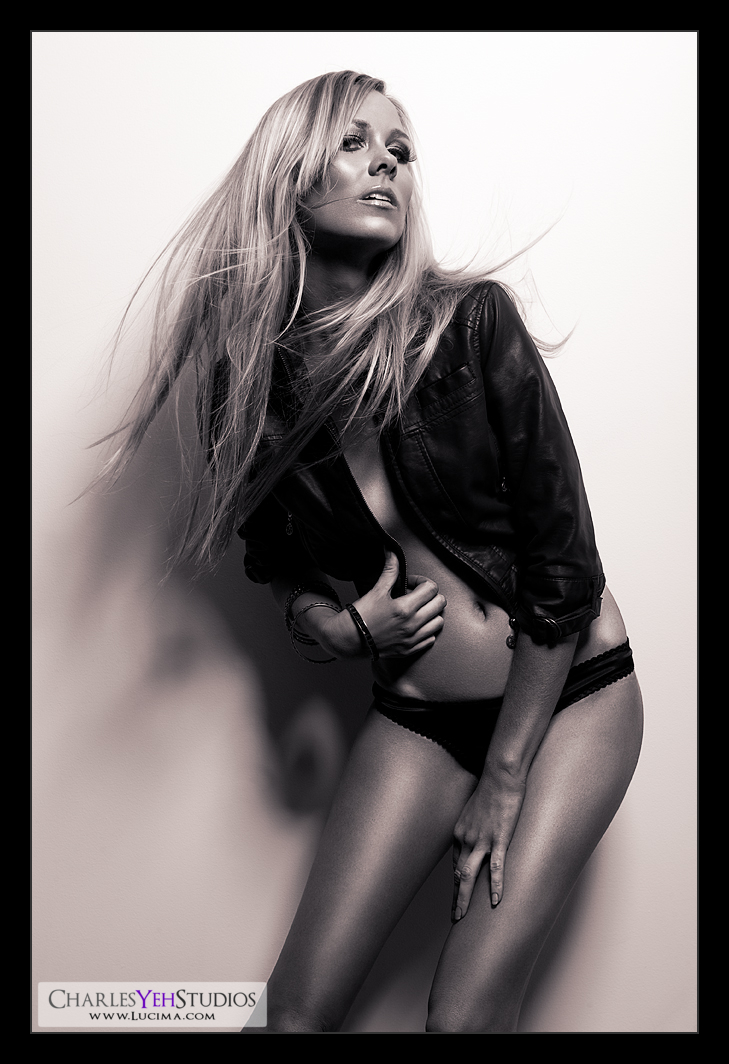
So every now and then I come back to B&W. This time I return to B&W with a slight gradient map that is reminiscent of a sepia tone. The gradient map is Violet, Orange overlayed (blending) at 10% (opacity). I could have stuck with a pure B&W image but I've been obsessed with gradient maps lately so why the hell not?

Aside from the actual image, I post-processed this with 5 layers. Color balance, levels, B&W, and 2 gradient maps.

The first 3 are straight-forward. The only thing particular was that with the B&W adjustment layer I turned down both the red and yellow channels to create a darker tone for contrast against the white wall.

The 2 gradient maps were used differently from one another. The first was B&W gradient map luminosity blended at 66% opacity. The second gradient map was the sepia-ish tone overlayed at 10%. Essentially the B&W gradient map was simply for contrast and to create more punch with the B&W tones, which is why I only needed it for luminosity. The second gradient map was for the tint.

Final processing included sharpening and
adding a touch of noise back to the legs and abs. It's an illusion really to give the skin just a little more texture in an attempt to make the image jump off your display.

edit: After typing the above I got distracted and started googling "retouching skin texture". It occurred to me to try high-pass so I went back and experimented with high-pass output to bring out skin texture. I"ll most likely dedicate a post specifically to this later...

Anyway, as I was saying. Sharpening, noise, etc. are all techniques to bring back texture to the skin and give it a lifelike if not 3-dimensional quality that allows it to "pop". You've heard me say this before but I've always been seeking new methods of making my images "crisp" and sharp. Learning new techniques brings me closer to being satisfied with the image even though we all know there's no way I can be truly satisfied with any one image for more than a day... I'm not easily impressed and when I am impressed, that feeling never lasts for long.

So here you go. The latest rendition of Kendall with some of the most detailed skin textures that I've ever produced in an image.

Camera: D3/24-70mm f/2.8G @62mm, f/9.0, 1/200th, ISO200

Strobist: Single AB800 in 22" beauty dish from camera upper right

Model: Kendall B.

Makeup: Kelli Zehnder

Wardrobe: Kendall/Michelle Green

Thursday, December 3, 2009

Purists Beware

This is a straight repost from Chase Jarvis' blog. One that I should really read more often! I love love love this post. Thanks to Greg for showing this to me in response to my Symbiosis post! I don't see how anyone could argue that Photoshop is "cheating". Idiots.


I just recently overheard a self-described "purist" photgrapher ranting on about how we're all cheaters and that the photographic masters before us lacked our current luxury--even desire--to "customize" (read: manipulate/photoshop) images. It was "...all about the the composition, a beautiful subject, and a properly exposed picture".

I call horse-pucky.

Above: Avedon's instructions to his printer.
FYI Richard Avedon is one of my heroes... Along with Steven Meisel... I mean how could they NOT be my heroes???

B&W and Gradient Maps


Bart's got a good writeup of B&W conversions in Photoshop and touches on the Gradient Map subject.

Bandstop Processing a.k.a. Spatial Frequency Separation


I found this while looking for something else. It's a step-by-step to achieve spatial frequency separation for skin processing, sharpening, etc. that I use on my images. This tutorial doesn't use layers for each of the steps but the result is the same.

Have fun!

Kendall: Shadows and Light


The title of this post/shot reminds me of the great Light: Science and Magic: An Introduction to Photographic Lighting (Paperback). I have this book and it's a great asset for beginning strobists for reference, concept, and theory.

I call this one shadows and light because at 3:45PM the sun was setting through the trees and honestly it was too late to be shooting against this wall. The sun was too low and casting a shadow on Kendall's legs because there was a tall bush that was blocking the sun. The spotty exposure was also a result of the sunlight peeping through the oak tree in the backyard.

How does this shot compare with
Kenna: Wall? I think this revision of the wall is better. I managed the highlights and shadows on the face better than the first rendition with Kenna. That's to be expected since I should improve with time. This image is sharper, crisper and less cluttered. I suppose exposing more skin helps helps with the simplicity of the frame.

So upon rereading Kenna: Wall I am happy to evaluate the second visit to this wall.

-The reflector is still finicky and difficult to work with. I had Kendall's boyfriend Yuri help me stabilize the silver reflector since I had it high... I'm talking10-11 feet in the air bouncing light onto Kendall

-I read the histogram this time and as bright as Kendall's abs seem, they're actually not blown. In fact, I didn't blow any part of the highlights. Go D3 dynamic range! Good job me, for reading the histogram!

-Secondly I made sure I had good depth of field. I remembered that the last time I was using too large an aperture and this time I shot f/9.0 which allowed me lots of room to focus-recompose without losing sharpness/focus. The only danger was that I was shooting at 1/125th handheld and it could have been a little slow if I weren't stable. But really that's not pushing teh limits on handheld shutter speed. Another win!

-Didn't killed any blacks on this image because I needed the detail in her jacket and underwear. Instead I had room to kill some highlights on the top end and dropped down to about 240 on the high end.

-Did a little desturation via a B&W conversion at 31% opacity. Primarily however I used a gradient map with the same purple you see in Kendall for the tint and effect. However this time I went with Purple-to-White and blended with Soft Light at 56%, which I feel works out well.

-100% sharpening at .3 pixels was applied after resizing with a little less sharpening on the face (only 70%).

I think this one worked out well... :) live and learn...

Camera: D3/24-70mm f/2.8G @70mm, 1/125th, f/9.0, ISO200

Strobist: Sunlight from upper camera left and silver reflector from camera back upper right.

Model: Kendall B.

Makeup: Kelli Zehnder

Wardrobe: Kendall/Michelle Green


Symbiosis: Photography and Retouching

Let me preface this by saying that you can be a great photographer without retouching and that you can be a great retoucher without shooting the original frame.

Let me also preface this by saying that what I am about to say is specific to the type of photography I shoot (specifically portraiture and people) and may not translate to other types of photography.

Now, let's get down to business.

Shooting without retouching is like cooking without tasting the food you make. You simply can not appreciate the quality of the food without tasting it and you will not learn how to improve upon what you've done without spending adequate time analyzing and manipulating the image. Retouching is the feedback after the initial point-of-capture beyond a quick glance, allowing you to figure out how you could have made the image better.

Sure you may argue that photographers "taste their own medicine" by looking at their pictures on their computer. But no one stares at a picture for hours... unless they are retouching. And during the course of retouching, you're going to find things that you're not going to find during the initial look over. There have been instances where I spotted a leg of a lightstand sticking into the frame literally moments before finishing a retouch. Imagine all the other things that I catch throughout a retouch or conversely, miss during a quick glance. Retouching begs the question, "how can I make this image better?" and in attempting to resolve the "issues", you inevitably make mental notes for future captures. Hopefully the mistakes of the past are not repeated in the future.

Another benefit of retouching is that you specifically learn how to manipulate light on the human face. Specifically retouching has taught me where the shadows and highlights are "supposed to be". When I first started shooting, I didn't know how light "interacted" with the features on a human face. It wasn't until I had hundreds of hours of dodging and burning under my belt that I knew where the shadows (and highlights) were "supposed to be". Understanding this allowed me to fine-tune my lighting at the point-of-capture so that I could create certain effects in my images. For example, sometimes I want very significant highlights in the subject's skin and therefore have to use harder lighting to create specular highlights in the face. Or sometimes I want to mask the eyes under the shadow of the eyebrows and therefore have to raise the angle of the light higher so create this specific effect. Playing with the shadows and highlights in Photoshop is what allows me to better understand how to light.

But there's one more reason why you should retouch. The world of Photoshop is filled with a myriad of visual effects; some that you can recreate at the point-of-capture and some that are impossible to create with photography and lighting alone. These different effects can serve to push you in exploring the "possibilities" of photography; because by asking yourself "what is possible?" or "is this possible", you might just jump to the next level in your photographic pursuits. Yes, Photoshop can be used to push your ability to think creatively and critically about photography and lighting.

Thus the art of photography and retouching are symbiotic. They revolve around one another and each can further the growth of the other. Together they are synergistic. Together, they just might be greater than the sum of the parts.

Or maybe I don't know what I'm talking about? :)

Tuesday, December 1, 2009

Kendall


Sometime I feel like I make great progress and sometimes I feel like I take a few steps back.

Today was a good day.

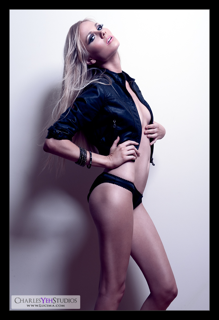
It helps when you work on an image with a bread-and-butter setup. You've all seen this before. The AB800 in the 22" beauty dish from high upper left/right. Oh, but this time I ditched the SB-800 and the RayFlash ringflash adapter as I've discovered that blondes simply don't need it. The blonde hair fills in enough light into the shadows. Combined with the white wall also providing fill, there's simply no need for the on-axis fill provided by the RayFlash with SB-800 when you shoot a blonde.

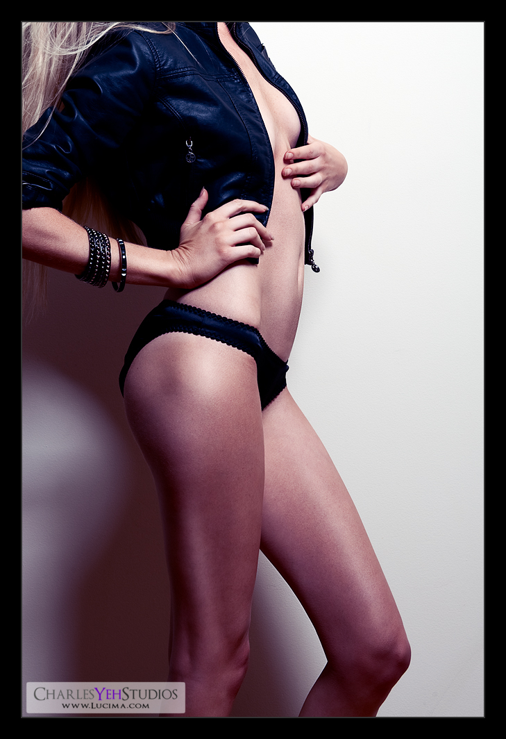
So what's special about this picture? Aside from the unbelievably long legs on Kendall? We turned on the fan to make the hair move, threw on a leather jacket and put on a few bracelets. I like the look, it's edgy. The makeup turned out wonderfully too and really pops in post-processing as well. Hell, I just might do a before and after comparison on this picture and show you what I started with...

For me, this picture was all about the retouching. It was the usual stuff. Levels, gradient maps, sharpness, etc. Nothing particularly special. The big thing was that I applied a purple-to-transparent gradient map with color blending and tuned it to 27% opacity. That's the tint that you see. And if you haven't already read the gradient map write-up, you should... :)

For added contrast I used a B&W gradient map with luminosity blending at 68% opacity. For added kick. I decided not to desaturate this image because the purple-to-transparent gradient map gave the image a certain character that would only be diluted with desturation (I didn't want the skin tones to get washed out).

Sharpness was processed the same way that I did the previous picture (Kendall: In motion). Basically just resizing and sharpening. Nothing special really, but I suppose because the original image was very crisp the resulting resized version is also very sharp with or without sharpening.

I should probably add that the recent images that I've shot and processed have been almost the full-frame of the original picture... that is I'm not cropping down much if any at all. Before I used to shoot and then crop down something like 25-75% of the original frame. I suppose my composition has gotten better at the point-of-capture, rather than waiting until post-processing to (re)compose the frame.

Camera: D3/24-70mm f/2.8G @56mm, 1/200th, f/9.0, ISO200

Strobist: AB800 in 22" beauty dish from camera upper right

Model: Kendall B.

Makeup: Kelli Zehnder

Wardrobe: Kendall/Michelle Green

Monday, November 30, 2009

Kendall: In motion


Taking a break from lingerie. You can only retouch so much lingerie before it gets tiring. Really who wants to look at pictures of beautiful women in lingerie all the time? Surely you guys must get tired of this type of stuff too? :)

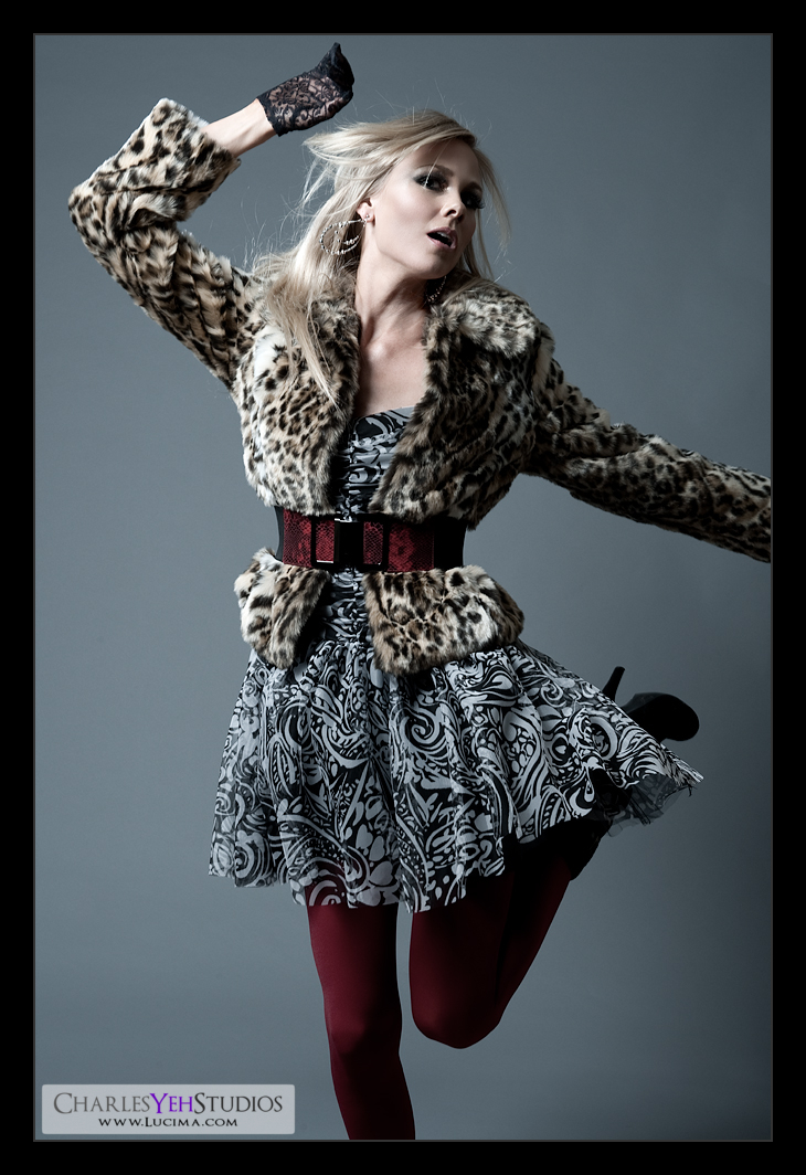
Stylistically this should look familiar. It's shot the same way that I did Tricia Jo's Hard Rock set. Lighting-wise it's an AB800 in a 28" Apollo Westcott softbox from camera upper left and an AB800 in 20º gridspot from camera front left for hair increased contrast from left to right (in the frame). I don't remember why I originally shot Tricia Jo with this setup but it worked in that set and it works in this set.

Wardrobe-wise this is just as fashion forward as the Hard Rock set. Michelle really went to the pushed the envelope on this one and I love the look. It's just really well put together. The leopard spots work really well too as does the material because the fur shows up really well in the frame.

Retouching-wise there's really nothing special. A B&W gradient map (normal blending) with 50% opacity provided both the increased contrast as well as the desaturated effect. After outputting to 1000 pixels on the long-end I sharpened the whole frame while slightly sharpening the skin/face.

I guess I should talk about the dynamics of this frame. We had Kendall spin on the count of 3. Setting the D3 to continuous focus and ensuring I had good depth-of-field (f/9.0) I focused on the back of her head. As she spun, I waited until her face was visible, and hoped that the D3 follow and capture the frame in-focus. Of course the D3 never fails, only the operator ever disappoints. At 1/200th there was slight motion/focus blur, but nothing more than I'm used to as far as variance in focus is concerned for my shoots within the studio particularly at f/9.0. We did this over and over again until she was dizzy. Then we did jumping frames. :)

I suppose I could have made this frame better by using f/11 to get a more forgiving depth-of-field when it came down to focusing but f/9.0 is pretty good.

Camera: D3/24-70mm f/2.8G @56mm, 1/200th, f/9.0, ISO200

Strobist: See above

Model: Kendall B.

Makeup: Kelli Zehnder

Wardrobe: Michelle Green

Sunday, November 29, 2009

Kendall: Sunkissed


Jetlag really kicks in around this time. After all it's 6AM in Los Angeles which would meant that I pretty much pulled an all-nighter.

I was really excited about this set and actually skipped 2 sets to retouch this picture. As an aside this is the first picture that I completely retouched with the Eizo S2402W-H.

The reason for the excitement was that this picture was shot with only ambient light. And if you've been following this blog you know it's a big change for me to go outside the studio and shoot with ambient light.

That's not to say that there wasn't any manipulation of the ambient light. In order to expose Kendall properly, we used a white reflector (white satin backed with silver) from camera right to bridge the exposure gap between the background (including the sun) and Kendall's skin. This meant we had to put the fill card right up against Kendall to give her as much light as possible. And as we know from strobist 101, putting the reflector up close against Kendall also gives us the added benefit of creating a relatively large light source thus providing softer light, which is what I wanted for this shot. Unfortunately, putting the reflector so close to Kendall meant that I was limited in the angles I was able to shoot, particularly to the right.

My other limiting factor was the sun and the backdrop. I used f/2.8 to attempt to blur the background. Well, that was a fail because it wasn't shallow enough at that focal length to completely blur out the background.
And the reason I used 45mm focal length was because I wasn't smart enough to step farther back and use a longer focal length. I needed to capture Kendall's entire body but I forgot that I could have gotten shallower depth-of-field with longer focal lengths at the same aperture. This is why you can identify the tennis court in the background. This really pisses me off. The more I think about it the more I can't forgive myself for missing this detail. Of course, had I really gone with a longer focal length, I would have had trouble with sharpness and focus-recomposing but that's not the point. The point is that I missed this at the time of the shot. Unbelievable.


Edit: Even though telephoto lenses appear to create a much shallower depth of field, this is mainly because they are often used to make the subject appear bigger when one is unable to get closer. If the subject occupies the same fraction of the viewfinder (constant magnification) for both a telephoto and a wide angle lens, the total depth of field is *virtually* constant with focal length! (Source)

But don't forget that the perspective changes with distance so when you stand farther back and use a longer focal length (assuming the subject occupies the same amount of the frame), what you'll get is less background, which can be more appealing depending on your compositional goal. In my case it would have reduced the "clutter" in the back and while the background sharpness would have remained the same it would have felt "cleaner" which is something that I would have liked...

Actually this was not the angle of the backyard that I wanted to use. I would have liked to shoot with the sun directly behind Kendall because that's the angle of the backyard that is probably most flattering. The problem is that you can't shoot directly into the sun. Even in this frame, I was battling the flaring with the sun coming down from upper camera front left.

WIth those things being said, I feel like the frame was acceptable as a starting point for retouching. The flaring makes the frame a little hazy and I had to correct for that by adjusting levels (15/240) and increasing the contrast with a gradient map. Only this time I didn't use a B&W gradient map.

Actually it was kind of dumb-luck the way I applied this gradient map today. I think I had a skin tone selected as the foreground color in my color palette. So when I chose a gradient map adjustment, I was offered a default Foreground-to-Background gradient map using my selected color as the foreground color and white as the background color. The foreground color was a coffee-like color and when I selected Overlay blending, I got this incredible haze removal effect with the final effect being that the image increased in contrast in all the right places. As an added benefit I got a nice warm tone to the image that added to the effect of the shot.

Sometimes you get lucky. Because I need luck to make up for forgetting important details.

I decided to make this image one of my more "colorful" ones so I bumped the vibrance and saturation. I bumped the curves up because it was overall a tad dark.

Lastly, my output resolution sharpening included a simple resize and then spatial frequency separation sharpening with the low frequency layer set to 45%. No gaussian blur prior to resizing because I wanted to try something different and see if it would make a difference. In this image, there were no added artifacts introduced with the light amount of sharpening that I did after the image resize... or at least not to my eyes.

And that's it. :)

Camera: D3/24-70mm f/2.8G @45mm, 1/3200th, f/2.8, ISO200

Strobist: White fill card from camera right

Model: Kendall B

Makeup: Kelli Zehnder

Wardrobe: Kendall/Michelle Green

Saturday, November 28, 2009

Kendall: Fireplace


Photographically-speaking I really botched this picture with Kendall at the fireplace.

The idea started with a bear and a couple Speedlights (Nikon strobes). When I lit the bear, being that it was only a 18"x12" object, I could really control the light and focus it onto the bear without spilling it onto the side of the fireplace. Thus I was able to keep the sides of the fireplace dark while fully lighting the bear.

Not so with a 5'9" model with long legs.

I lit Kendall with an AB800 with 7" reflector from camera upper right. I also used another AB800 with 20º gridspot from camera front left as a hair/side light. Lastly, in typical strobist fashion I lit the white granite of the fireplace with a SB-800 with a diffuser dome placed behind Kendal. This also acted as a rim light for Kendall so I got double-duty out of the SB-800.

The dilemma with the lighting setup is that it was a compromise between lighting Kendall and then not spilling the light onto the fireplace. The problem is that I didn't do either properly. I spilled the onto the sides of the fireplace anyway but I really didn't light Kendall properly.

So I spent a little more time in post-processing than I had anticipated in order to save the image. I really have to remember the size discrepancy between a bear and a full-sized model. I've said this before but apparently I don't listen to myself and therefore repeat the same mistakes. I think I last said this in one of the posts regarding Tricia Jo's picture...

Another challenge was that the fireplace was so reflective that the strobes were annoyingly apparent in the granite but not obvious enough to identify the type of light modifier I used for the image. On that note, I really ought to take more pictures of lighting setups but when I'm shooting, but I always forget. Things are so dynamic that the setup usually changes throughout the set anyway. The reflective nature of the granite meant that I had to be wary of placing the lights in such a way that it would reflect directly back into the lens, thus causing a large specular highlight in the granite and even worse, cause flaring.

The "win" for this picture was how well the white granite lit up with the SB-800 behind Kendall. Completely hidden by Kendall, the SB-800 provided good rim-lighitng and good fireplace lighting from the back.

Another bright point about this picture was that I used the B&W adjustment differently. Today, I tuned it as I usually do for the skin tone but then decided to keep the image in color and added a tint (color). I never noticed the "tint" feature but there's a checkbox next to the words "tint" in the adjustment where you can select a color to tint the entire image. I found thisvery interesting and basically used it as a gradient map instead of a regular B&W conversion. I set the blending to "overlay" and the opacity to 60% after choosing a skin-tone/color I'd used earlier during post-processing. The result is a tint that's not overtly obvious but adds something different to the picture.

Camera: D3/24-70mm f/2.8G @42mm, 1/200th, f/9.0, ISO200

Strobist: See above.

Model: Kendall B

Makeup: Kelli Zehnder

Wardrobe: Kendall/Michelle Green