Friday, July 31, 2009

Rant on Equipment

$10,000 and 30 lbs. of equipment.

That's what I dragged out to Kauai and Oahu over this past week. How many times did I use it? Once. Twice maybe. My camera saw the light of day maybe like 3 times. Ultimately I could have ditched the 3 stands I brought at home.

30 lbs. of equipment traveling over 6000 miles.

What did I bring you ask? Off the top of my head they are as follows:
  • D3
  • 24-70mm f/2.8
  • 85mm f/1.8
  • 14-24mm f/2.8
  • 50mm f/1.8
  • 3 SB-800's
  • 2 umbrellas
  • 3 Manfrotto Nano 001B lighstands
  • 1 tripod with medium sized head (Giotto 1301)
  • 1 gel pack
  • 1 DIY gridspot
  • 1 Cactus V4 trigger and 4 V4 receivers
  • 1 Phottix Cleon N8 remote
  • 1 Rocket Blower
  • 1 set of spare AA batteries
This does not include the Macbook, Wacom tablet, etc. which I did use.

So in a conversation with one of my buddies traveling with me, I began talking about how primitive photography was as far as how much equipment is necessary to create the shot. The more I thought about it, the madder I became at how backwards this art/hobby/whatever is. I mean the personal computer now does 1 gajillion times what it did 10 years ago 1 gajillion times faster at 1/gajillionth of the size. Why the hell can't we do the same thing with imaging and optics? I feel like a caveman lugging around 4 lenses and one ginormous pro-body. It's heavy. I'm tired. This sucks.

Of course, if you think about the leaps and bounds that we've made with consumer and especially digital cameras, we shouldn't complain. Also the strobist movement is changing the landscape of what was traditionally limited to in-studio photography so in that respect, the times are changing. Already we are seeing changes to the equipment that is being sold with the manufacturing of adapters for on-camera-strobes and what not.

That being said though, the compactness I'm talking about will perhaps never be realized in my lifetime. I'm talking about just being able to point to a spot in mid-air and saying, "I want x stops of light coming from here, in y direction, with z softness" and voila! That light would be there. No cords, no batteries, no light modifiers. It would just "appear". Oh and of course be synced with the shutter at 1/10,000th of a second. Actually there would no longer be a shutter. I would just hold the index finger and my thumb in an L with both hands in the shape of a frame and say, "click" to take the picture. The strobes in their respective positions would fire in-sync, with no delay on refresh rates, and the pictures would download into an external hard-drive in my pocket (or internal one in my fingers).

Post-processing would consist of drawing on an imaginary tablet that would project in front of me in the air that would move with the position of my head/neck. Everything would be done "virtually" without equipment. All I'd have to do is be there and I'd be able to capture the shot. Sure, I'd still need to know-how and skill to produce these pictures but the equipment would all be virtual...

Wouldn't that be just perfect.

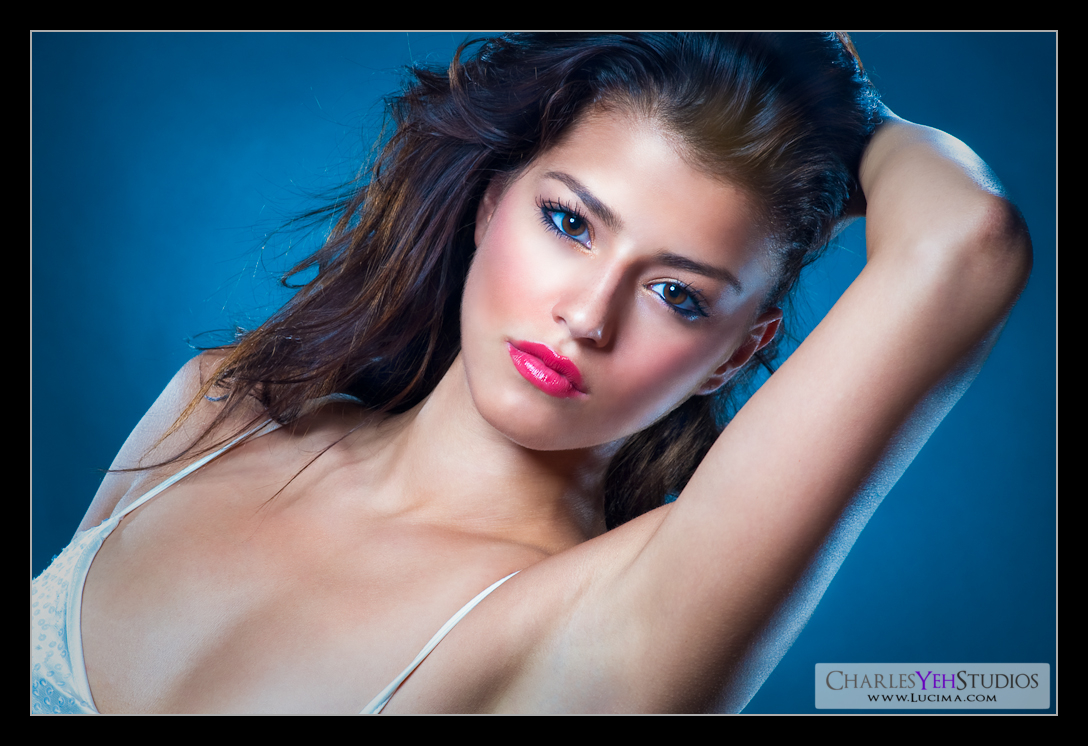
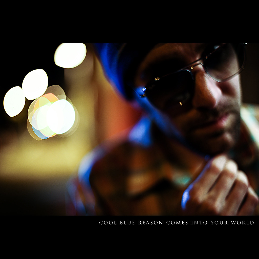
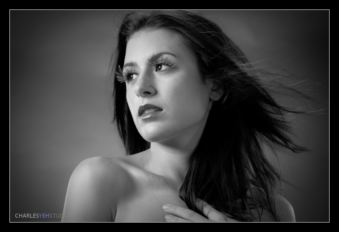
Mladenka: My Blue Muse


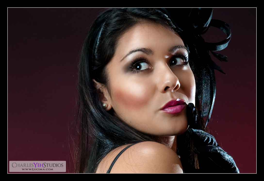
The thought did cross my mind that some of you might be tired of seeing pictures of Mladenka... then I realized that was crazy. No one could ever possibly be tired of seeing pictures of Mladenka. I posted this picture up on my Facebook Wall and mused, "Seriously, sometimes I wonder what I'd do if I were this good looking..."

In any event, this picture is actually a close relative of
Nobody's Perfect Right? The only difference is that we removed the red gel and changed the white balance a tad for a cooler/bluer effect. This is one of the tricks in my bag that I use somewhat regularly. I discovered this trick during a regular shoot where the gel on the background flash fell off and suddenly there was this cool blue on all my pictures. At first I couldn't figure out why this was happening (and during the shoot didn't want to look like I was clueless to what was going on) so I kept shooting with the blue tint/hue. Later on, I realized that with this particular body-lens combination (D3 with 85mm f/1.4) and flash-background combination (bare flash on "black" background), the D3's auto-white-balance was thrown off and corrected at 3500K. This provided the blue tint that gives the picture(s) this blue hue.

So that explains the blue! In post-processing I bring out the blue with saturation and what not which is why there's a slight tint of blue in the white's of Mladenka's eyes. Fortunately it's not obvious enough to be obnoxious although there was one time that I purposely max saturated the blue tones to give the
model blue eyes. Usually I use this trick to create a "cool feel" to the picture and in this particular look, Mladenka delivers the perfect look. The skin is actually resaturated to bring back the orange/yellow tones that were lost with the white balance adjustment. Sometimes I'll do this and sometimes I won't it just depends on what the photo calls for.

Again this picture as with most of my recent additions have had a huge focus on highlights and shadows and creating that traditional glamour look. It's basically really training for my brain to understand how light is "supposed" to reflect off of the model's face. Putting in highlights where they're "supposed to be" and putting in shadows where they're "supposed to be". For a discussion of "supposed to be" read up on the previous few posts.


In retrospect, the dodging and burning of highlights and shadows during retouching still frustrates me. It frustrates me because I'm not 100% sure where they're supposed to be. If I just bring out what I see, then it looks choppy and gritty. Only by having a vision of where these highlights/shadows are supposed to be, can I create the smooth glamoureque pictures that I want. Because sometimes highlights and shadows are by-products of lighting and actually in the "wrong" places. When they're in the wrong places they are uncomfortable to look at. Thus retouching with the vision of knowing where they ought to be is the key.

Strobist info: Main light is an AB800 in a 22" beauty dish with 20 degree gridspot coming from upper camera left. 2 AB800's as kickers/rim lights left and right about shoulder high with barndoors. 1 SB-800 hanging overhead in a Lumiquest SB-III (camera upper front between Mladenka and the background). Lastly an SB-800 between the background and Mladenka, on a stand shooting directly into a black background. Pretty much my typical bread and butter setup :) The blue is from white balance settings. Triggered with Gadget Infinity (Cactus) V4 with a 98% success rate.

Camera info: Nikon D3, Nikkor 85mm f/1.4, 1/160th, ISO200, f/10

Processing info: PS CS3 Lr2.0

Model/Makeup: Mladenka Grgic

Thursday, July 30, 2009

The Art of Touching without Touching

The Mladenka Timeless picture did not have enough contrast between highlights and shadows. Let me start from the beginning and give you a better understanding of what is happening when I process pictures.

When I do these photoshoots, I'm primarily concerned with a) exposure b) creating 3-dimensionality with highlights and shadows. Exposure is always the first concern, everything else is secondary. Of course these are not the only two factors that cross my mind in a shoot. Lots of factors can affect the final product. For example, the lights are positioned such that they create certain angles of highlights and shadows. Once the model moves her face/body however, those angles change and so do the highlights and shadows. With that said, I encourage the model to move naturally within a limited amount of "degrees of freedom" such that the light is still effective in the way that I've set them to be.

When I post-process, it makes my job easier when I choose pictures that have the highlights and shadows at the angles of the original light setup. This makes for easy post-processing because everything that should be there is there and in all the right places. The parts of the face that should be lit are lit. The parts of the face that should be dark are dark. Thus dodging and burning is a breeze. I don't have to create bone/cheek/facial structure where they may or may not exist or even exaggerate facial features that aren't already exaggerated by light. Occasionally however I choose a picture that is less than perfect in all the aspects that I've described above for whatever reason. Perhaps I liked the pose, perhaps I liked the facial expression. Then I process regardless of the ideal conditions of lighting and well, you get what you get...

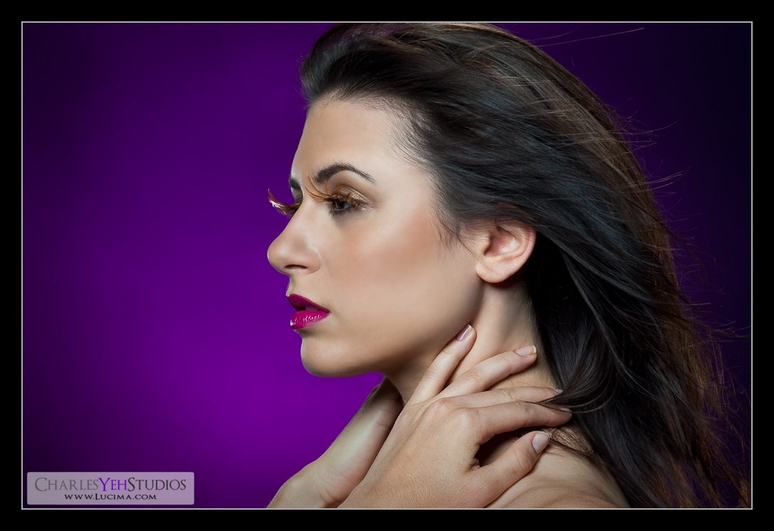
This was the case with Mladenka Timeless. The picture was not the ideal picture I would have chosen to process based upon technical aspects. There are other pictures from this set that would have been easier to post-process based upon the existing highlights and shadows. I chose this one because it was one of the few pictures where we had the fan on for hair effects. Unfortunately we couldn't shoot more with the fan because Mladenka's eyes are very sensitive to 40MPH gusts of wind and actually start tearing which is no good for makeup and no good for pictures. So I choose a less than ideal picture to process based upon feel and effect.

In retrospect and to be completely honest, I'm not satisfied with the retouching. The problems with the original picture with lack of contrast still exists in the finished product. Furthermore as I mentioned in the second previous post, I had a lot of trouble figuring out where the highlights were supposed to be and how much of those highlights I wanted to bring out. I went through many iterations of the dodge and burn layer when I got to that step during retouching. Ultimately I settled on something that to me was natural. Looking at the original you would probably agree that it is a natural look although if you really look closely certain portions of the highlights and shadows are "moved" and sometimes more pronounced in the finished product.

Ultimately however here's my philosophy behind retouching: You attempt to retouch without it being obvious that you've retouched the picture. In other words, "the art of touching without touching". Yeah it sounds like some Zen Buddhism or Confucian saying but the finished product should have some semblance of naturalness and the original image. With Mladenka Timeless, this is one of the rare occasions where I've posted the original picture. I don't post the originals on purpose because sometimes I really push the "license to retouch" by altering a lot of the original image and therefore do not with anyone to do any side-by-side comparisons. That being said, I must reiterate that if it looks like it's been obviously retouched then I've failed. It should look natural. Sure, no one has skin like that, but I try for the most part to still leave pores on the model's face. Sometimes I fail. Sometimes it's too smooth and perhaps lacks texture, but for the most part these are concerns that enter my head when I'm post-processing.

Did I overdo the smoothing? Did I miss some highlights and shadows that could have been pushed and made more pronounced? Did I overstep the "license to retouch"? This is one of the rare chances where you both the original and the finished product to compare. You decide...


Wednesday, July 29, 2009

Mladenka Timeless Feedback

I got some feedback regarding my newest pictures from my brother who is a great retoucher himself. In particular he found "Mladenka Timeless" good but missing some detail in the contours of her face. His exact words were "I would've not blurred her face so much... it's distracting from such a beautiful pic already... yeah, it's distracting that I can't make out the contours on her face very well".

Since I'm still learning about post-processing and am sensitive to (but appreciate) all feedback I receive. I needed clarification and wanted to learn more behind my brother's response to seeing "Mladenka Timeless". Here's my email to him which reveals some of the Photoshop techniques I use to achieve the final look.
Hey tell me more about what you were saying on IM about how it's too smooth? Because I'm doing a new smoothing technique. In Taiwan I was using Gaussian Blur but now I've opted to use Surface Blur which gives more of a, "surface blur" which yields the effect of creating a smoother skin texture. On the other hand it might be because of the B&W treatment and the subsequent contrast done in Lightroom. In Photoshop I always process for the main glamour look and then in Lightroom I do the color processing. I suppose I shouldn't break up the different effects and should process in 1 program for the finished product but I find that processing generically for glamour in Photoshop then gives me lots of options as far as final processing in Lightroom. I'm going to upload the Photoshop results to flickr and tell me whether or not the contours that you were originally looking for are there...
Here's the uploaded picture on flickr. All I did was take my Photoshop-processed picture and then adjust for saturation and crop. These are how much pictures usually look coming out of Photoshop and into Lightroom:


Does it answer the missing contours? Or perhaps my treatment in Photoshop is still at fault for removing too much contrast between shadows and highlights? I might have to upload the original picture.

Tuesday, July 28, 2009


If I spend any more time on this picture. It really will be timeless. :)

At least that's what I said on my flickr blog. And it's true. I must have done and redone x5 the dodge and burn layer on this picture. Total time spent on this picture was probably in the vicinity of 5-6 hours.

I've been talking about this in my previous posts how I've changed the way that I'm processing shadows and highlights. Coming from a non-artist (one that draws) background, I now realize that all shape and three-dimensionality is created by light and dark areas on the face. Essentially what I realize now is that bone structure can be either accentuated or even recreated/defined (where it doesn't exist) with the addition of highlights and shadows. Prominent cheekbones and good blush makeup can be created via post-process. For me as of right now this primarily means with dodging and burning.

What makes this difficult for me however is that I must visualize in my mind where the highlights and shadows SHOULD exist on the face before I start processing. Now this is easy if the model's face is already well defined and the lighting is perfect. Then all I have to do is simply exaggerate those highlights and shadows already in existence. If however the lighting is not perfect and/or the model's bone structure is different from the high-cheek-bone-ideal, then I have to "decide" where the highlights and shadows should appear.

That's where the time, experience, vision, artistry, etc. takes place. I'll be the first to admit. I'm none of the aforementioned quality traits. Which is why I have to put in plenty of time to learn this entire process, to master the the way it works. This is the process that I could not verbalize in earlier posts. Every model, lighting condition, and thus image is different. Then you have to consider the photographer's vision. All of this affects how the highlights and shadows are brought out on the picture and thus how the dodging and burning should occur. Ultimately every retoucher/photographer's style will be different. My focus has been on creating that "almost" traditional glamour with emphasis on smooth and shiny skin. That's it!

Strobist info: Single AB800 in beauty dish with 20 degree grid from just above the camera. Then there's a small 28" Westscott Apollo Softbox that's providing fill from lower camera right. Which is why in post-processing I found that the shadows on the right side were slightly different than those on the left. Should have noticed that sooner because it answers a lot of questions. Triggered by Gadget Infinity (Cactus) V4 with a 98% success rate.

Camera info: Nikon D3, Nikkor 24-70mm f/2.8G, 1/160th, f/8.0, 70mm, ISO200

Processing: Lr2 and PS CS3

Model: Mladenka Grgic

Makeup: Mladenka Grgic

Random Thoughts

I suppose I should address several issues that are on my mind, in no particular order.
  • First off, welcome Maggie, Mladenka, and Ted to the blog. I hope your stay here is pleasant!
  • Sorry for the recent lack of posts. I have been busy retouching and also I've been in Kauai and Oahu.
  • I'm really really bad at remembering to take setup photos. I should really punish myself for doing so and then draw a diagram of how the shot was set, but I'm too lazy to do that too. I promise over time, I'll get better at remembering to take setup shots!
  • I've been pondering the whole highlights/shadows on the issue of retouching and have further insight to share with you all.
  • I think I had more insight but I'm really just too tired tonight. I will have more posts soon.

Wednesday, July 22, 2009

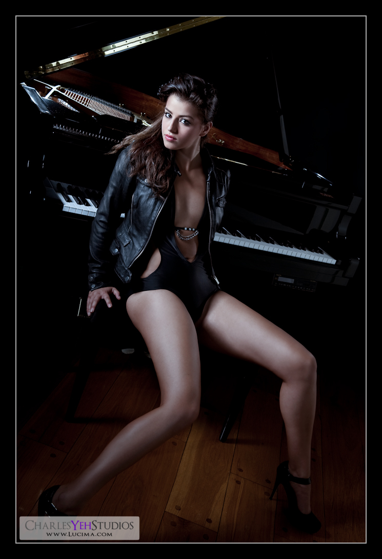
Classy vs. Edgy


When I was testing the lighting for this set I told Mladenka I felt like this was an exam. I felt like I had progressed to a level of strobism that required me to demonstrate what I understood about controlling light.

In my last post, I mentioned how reluctant I was in the past to shoot with the piano because it was so close to 3 white walls. Thus controlling spill was the biggest concern on my mind for this set. The second most pressing concern was actually creating the semblance of the piano. The piano is highly specular because it's glossy black. You know from
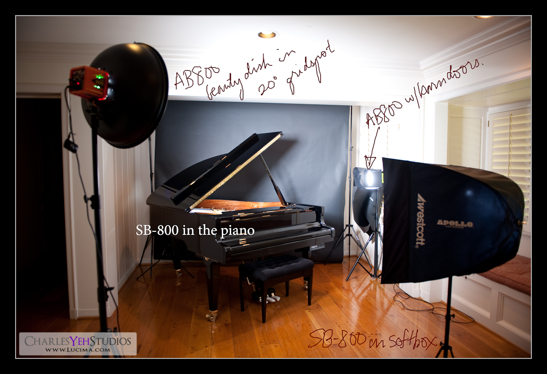
Lighting 102 that you can't light a specular object with just light alone. You must light with the reflection of the light source. Well I didn't do such a good job of that. I had only 30 minutes to set the shot and shoot it so I failed in that respect. Instead, I decided to create the semblance of the piano from inside. Since the top of the piano was open, I shot an SB-800 (on a stand) into the piano to light the "innards". Fortunately this didn't spill much if any light into the black background.

The main light was a 20 degree gridded 22" beauty dish on an AB800. This has become my favorite main light. Not only does it allow for tight light control but also provides the added benefit of light falloff around the edges where the content is not as important. While I could have used a 10 or 20 degree gridded 7" reflector, the light from the beauty dish was just soft and hard enough with control to achieve the edgy effect we were looking for.

Ultimately we created a shot that was both edgy and classy. Mladenka's wardrobe, make-up and the piano all promoted the look and feel for the shot. Thus retouching was pretty straightforward. Strangely however when I say "straightforward" I realize that this means very little to the audience and even stranger, while I know it's straightforward I'm not sure I can put this into words. My retouching process/workflow has changed recently to embody certain techniques that I can't verbalize. Mentally I think I'm making a breakthrough in terms of envisioning lighting and thus highlights and shadows. My basic process still exists; removing blemishes, adjusting levels/curves/color, adding highlights and shadows, but there has been a shift in the way that I do my dodging and burning. When I get better at this I might try and verbalize what I do but it's a little advanced and a little outside my mental capacity to explain what I'm doing. All I can say for now is; it just happens.

Strobist info: Main light is an AB800 in a 22" beauty dish with 20 degree gridspot coming from upper camera left. AB800 in barndoors from camera front right as kicker/rim light. 1 SB-800 on a stand from camera front left shooting into the piano and also providing rim lighting on Mladenka's back. 1 SB-800 in 28" Westcott softbox for fill. Black background literally touching the piano. Oh and I left this out of the diagram but there's a huge piece of black paper taped to the AB800 on the back right to eliminate spill. It's basically an ugly flag.

Camera info: D3, 24-70mm f/2.8G, 1/200th, f/16.3, 42mm, ISO200, triggered by Gadget Infinity (Cactus) V4 with a 98% success rate.

Processing: Lr2 and PS CS3

Model: Mladenka Grgic

Makeup: Mladenka Grgic

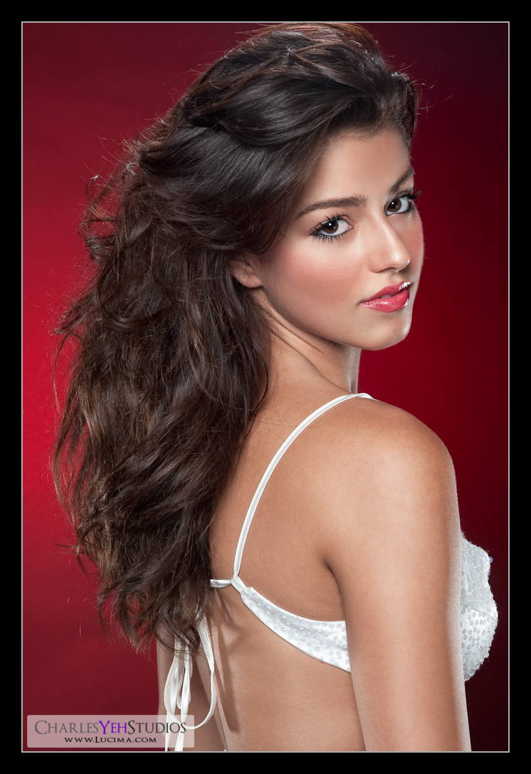
Nobody's Perfect... Right?


Wrong. I'm sorry to tell you this, but you've been lied to your entire life. You see, all those times people told you "Nobody's perfect" as an excuse for whatever they failed to do... well, it was exactly that; an excuse. I say this because I now know perfection exists in the world. Her name is Mladenka. :)

Of course the picture was retouched but the entire experience of shooting Mladenka was simply phenomenal. She was a consummate pro, giving me stellar looks every few seconds and really knowing her body position and facial expressions. The entire shoot lasted just about 5 hours and we shot over 1,200 frames. That's a lot of frames. Hell that's a personal best for any one shoot. I think the Nikon D3 has a shutter life of only 150,000 actuations and my camera has already has 20,000 actuations. That's like 20,000 miles on the odometer LOL!

Anyway, I can't say enough good things about Mladenka. She's obviously gorgeous but at the same time completely professional, down-to-earth, easy to work with, patient and most importantly gives me a high percentage of
usable frames. I think at the end of the day, what it really comes down to is this, "How many frames are useable?" which is to say, "How many frames are actually worthy of post-processing?" One of the first things I do when I finish a shoot is to trim/delete all the frames that can't be used. These include frames where I'm testing the exposure, strobes misfire, poor composition (something in the background), accidental camera adjustment (exposure, focus, white balance), the model blinks, the model gives me an unusable look, etc. Sure most of the deleted frames are my fault to begin with but if the model provides me with great looks at a high batting average, then there are a lot less frames to delete! In fact, Mladenka gave me so many good looks that I had to be ultra careful about shooting on a roll (where I don't glance at the back of the camera) because if I don't nail the exposure, composition, etc. then 30+ frames go by and they're all bad because I missed something critical. Basically she put a lot of pressure on me to be at my best today but I think I delivered.

Looking back at the shoot, it was also unique that I "went with the flow". Usually I like to have all the ideas and lighting setups pre-planned but today, I wanted to just "let loose" and "see what would happen". Lately my favorite line has become, "I'm not exactly sure what's going to happen when we do this but..." The reason for this is because I need to push myself to do something different. I've talked about this before in
a previous post where everyone on every shoot ought to try something that's outside his/her comfort zone to push him/herself to grow. Lately I've felt like I was stagnating which is why I've been pushing myself to retouch differently (softer and more glamour-like) than before. So today while we did a lot of the tried-and-true/bread-and-butter lighting setups, we also shot outside my comfort zone. For our final set, we incorporated my baby-grand piano in the set which is something that I've been unwilling to do in previous shoots. I simply can't think of many sets more challenging than trying to light a glossy black piano tight while trying to control spill against a corner with white walls. However if this were a strobist exam, I feel like I passed or at least got a B+ because there will always be some lighting genius on flickr that invents some incredibly creative lighting technique for the situation.

So for now just sit back and enjoy the picture. There will be many more to come. Stay tuned!

Strobist info: Main light is an AB800 in a 22" beauty dish with 20 degree gridspot coming from upper camera left. 2 AB800's as kickers/rim lights left and right about shoulder high with barndoors. 1 SB-800 hanging overhead in a Lumiquest SB-III (camera upper front between Mladenka and the background). Lastly an SB-800 with a red gel between the background and Mladenka on a stand shooting directly into a black background. Pretty much my typical bread and butter setup :)

Camera info: D3, 24-70mm f/2.8G, 1/200th, f/10, 62mm, ISO200, triggered by Gadget Infinity (Cactus) V4 with a 98% success rate.

Processing: Lr2 and PS CS3

Model: Mladenka Grgic

Makeup: Mladenka Grgic

© charles yeh 2009

Monday, July 20, 2009

Skin Tones: Nikki Limo


Revisiting one of Nikki's pictures from her shoot and this time retouching in the same manner and fashion that I've been processing for Lauren's shoot. This time I took extra care to remove bothersome highlights and shadows and only bring out the highlights that should catch/reflect the light. Unlike my old processing, I did less with the burning but still retained a healthy shimmer/glow in the skin.

This follows with my current stage of glamour retouching; creating that healthy, perfect looking skin while still retaining texture and pores and really pushing the highlights in the right places to accentuate facial contours and definition. Whereas before I did not differentiate between highlights and shadows (basically I'd brighten all highlights and darken all shadows), now I am picky about what theoretically should be a highlight and what should theoretically be a shadow. Every person's face is different, following the bone/facial structure the camera will capture highlights and shadows that may not exist in faces of others. Add to that the complexity of expressions and unevenness of skin and flesh and then lighting, and you have a recipe for disaster. I think this is where artists (i.e. people that draw) have the edge because they envision the three-dimensionality of a person's face based on highlights and shadows and thus see these things in their mind's eye before realizing it on whatever medium they play with. I suppose this is where having a theoretical or technical understanding of this stuff comes into play.

Coming back to the picture, Nikki has great skin and is actually disarmingly stunning when you meet her in person. When you first see her, you can't help but marvel at how good-looking she is, but after you talk to her you're immediately disarmed by her down-to-earth charm and personality. There's simply something about her that puts you at ease even in the midst of a lingerie shoot like this.

Strobist info: 1 SB800 in Apollo Westcott 28" softbox camera slight upper but mostly left. 2 kicker/rim lights SB600's from right and left of camera, 1 SB-26 hair light from the top, and 2 SB-800 background lights front left and right with red gels.

Camera info: D3, 85mm f/1.4G, 1/250th, f/9.0, ISO200, triggered by Gadget Infinity (Cactus) V4.

Processing: Lr2 and PS CS3

Model:
Nikki Limo


© charles yeh 2009

Sunday, July 19, 2009

The Softness of Glamour

Up until recently I've only only explored a small part of that which I call glamour. As a little bit of history, when I first started getting into studio photography it was all about creating edgy, hard, high-contrast, punchy pictures. This picture quintessentially marks the beginning of that discovery:


Since then however, I've been "looking around". I've been looking at the work of my peers, my idols, and others around me and I suddenly realized that I've only merely scratched the surface as far as what I think I know about glamour photography. There's so much more that can be done that I can try.

As a result, I've gone back to previous shoots and with this new perspective, post-processed some old frames differently. Here are the results:


There's a significant decrease in the exposure difference between highlights and shadows in these post-processed pictures. I processed these for a more traditional glamour look that expresses a more natural and softer feel (and lighting) than the original images for the same sets. The skin was ultra-processed for retaining natural skin texture while promoting flawlessness. Each picture probably took me on average 2 hours to produce with most of my time spent addressing the texture and flawlessness of the skin and very little time promoting highlights and shadows.

You can read more about these individual pictures here and here.

Wednesday, July 15, 2009

And how would you like that done?

Medium rare.

At least that's how I typically like my steaks done. But we're not talking about steak. We're talking about ambient light.

The problem with ambient light is that unlike (I typed unlight the first time LOL) flash, you can't really do much to control ambient light.

Or can you?

Sure, you can't really tell the sun "Hey, we're trying to do a photoshoot here, would you mind shining from a 45 degree angle from camera upper right? Oh and while you're at it can you give me a 1/250th exposure at f/2.8?" On the polar opposite of the spectrum you can't really make the cathedral candles any brighter or ask the priest to burn several hundred more because it's "too dark".

The question that I'm going to answer is "or can you?"

What you do have control over is how that light manifests itself through the lens and onto the digital image on the back of your camera. With regards to ambient light and nothing else, you can choose how bright and/or dark you want the foreground (subject) or background, but most likely you can't have both. With one light source, your background will likely have a different exposure than the foreground (subject) and therefore you must choose one or the other and not both.

We can do a simple mental exercise for a demonstration. If I stand with my back against the sun and ask you to take a picture of me one of two things can happen. The camera (or user) might expose for my face and white-out the background (sky/sun). Or the camera (or user) might expose for the background, where the sky will appear blue but my face will be completely black. Why does this happen? Because the bright summer sky requires a different exposure than my face which happens to be in the shade (remember my back is against the sun). The difference between the two will likely be several f-stops hence making one too dark/bright in any given frame.


As a caveat, if our background is not the sky but instead some nearby objects like trees, grass, and rocks, then we can hopefully expose for both at the same time without too many f-stops difference between foreground and background


With multiple light sources (read: strobes) you can now answer the question on the title of this post, "And how would you like that done?" Because with your own controllable light source, you are now able to mix and match the exposure of your foreground/subject with that of the background. Here are some examples:

In studio, I do not require any ambient light. Typically ambient light in my studio takes the form of window light through a closed shutter that might have a green tint to it because of the grass reflecting the light. Regardless, I have 11 strobes in my studio and I do not require additional light thank you very much. So the answer to the title question is, "I don't want any ambient light, thanks" Hence, I drown out all ambient light with a small aperture (f/9 or smaller) and the fastest shutter sync speed my camera can handle (1/250s).

When I'm outdoors however and shooting into the sun, I'm typically trying to preserve the colors of the background without taking any attention away from my subject. In this case, I usually underexpose the background by several stops so that the sky looks blue (otherwise the sky will look white like we talked about above). So the answer to the title question becomes, "I want a darker background". I accomplish this by putting a strobe (usually) at full power close to the subject so again I can use a small aperture with the fastest sync speed my camera can handle.

The last example I will provide is when we're shooting in the dark in some dungeon, cave, cathedral or wherever you might be where it's poorly lit. In this instance, you're likely trying to preserve all detail in the background and therefore must really open up that aperture and slow down the shutter speed in order to get as much light into the camera as possible. Unfortunately the drawback of a slow shutter means that we're not susceptible to motion blur so we're now either forced to use the tripod or increase the sensitivity of the camera (ISO) to the point where we can hand-hold the shot. Fortunately in darker environments the subject is just as dark as the background so we have a choice of whether or not to use additional sources of light. If we decide to use additional light, we must be aware not to let the light spill into the background and change the exposure. Our strobe light will likely only spill onto a portion of the background thus changing the exposure for only a portion of the background. We must also be aware to turn down the power of the strobe so it does not overexpose the subject with regards to the background. The answer to the title question then becomes, "Enough light to match the ambient exposure" because we are trying to preserve the background with ambient light.


These are just a few examples on how you would utilize the ambient light to your advantage. Obviously the choice to add light sources is a luxurious option to have when you're shooting with ambient light and gives you a lot of advantages to create different looks and outcomes!


Tuesday, July 14, 2009

www.lucima.com gLamour page

ShowIt 2.0 has new features such as Share on Facebook/Blogger/Twitter etc. that I'm experimenting with right now: gLamour

Sunday, July 12, 2009

Lauren Marini


I really ought to have a better habit of posting updates and thoughts after my shoots but I don't. In my defense, it was only yesterday that we shot Lauren in her "portrayal of magenta" and "airy/dreamy in blue" (can't think of a better way to describe the theme/style of the shoot). Furthermore after shooting yesterday, I was out of the house the entire day and much of today as well.

In any event, I sat down in front of the computer earlier today to look through some of the files that were importing into the Macbook. Liking what I was seeing early on in the import, I chose to process two of her pictures. I suppose I should really wait until I finish processing the rest of the pictures before I draw any conclusions but since I've been exporting the finished product to flickr and directing some traffic to this blog, I guess I ought to provide some content to the audience.

It's been a couple weeks since I've shot in studio and several things have changed. Firs off, this is the first time I've shot with my second and third AB800. Barn doors and grids on the AB800's make for an easier time controlling light. That said, as kicker/rim lights it's still hard not to get flare into the lens with the angles that I'm using. Anyway, as this particular shoot did not require the full-length body shot, I had the luxury of placing an SB-800 on a stand behind Lauren (out of view) to provide a good blob of magenta (gelled) light. Thirdly my taste in post-processing has changed a little as I'm moving away from the hyper-realism and punchy look that most of my pictures have had in the past and moving towards something a little more organic and natural. This is reflected in my use of B&W and less colors during post-processing. You can also see that the ratio of stops between main light and fill light, isn't as big as it used to be. That is to say that even though the main light is coming from a different angle as the fill light, they are closer in exposure thus providing more even lighting. Oh and did I mention I got a wind machine? It's actually a Lasko Pro Performance fan that doubles as a paint-dryer and a photographer-cooler. Lastly there have been other subtle changes in my photography such as wanting to do something a little different with every shoot and making variations to existing set setups.

Working with Lauren was a breeze because she's used to being in front of an audience (theater). In fact she was giving me enough different looks where I didn't have to provide much direction; which is probably my biggest weakness to begin with. The shoot went by in the blink of an eye and we shot two completely different looks as you will see here... as soon as I finish processing the rest of her pictures ;)

Lasko Pro Performance High Velocity Utility Fan


Definitely one of the most versatile pieces of equipment in my studio is the addition of the Lasko Pro Performance High Velocity Utility fan (say that fast 3 times!). Purchased from the Home Depot, the Lasko fan is great for drying paint, circulating air at incredible velocities in large rooms, and last but not least blowing hair.

While I was initially unsure whether the fan would be as natural as an outdoor breeze for blowing hair, I am now assured that it is more than capable of doing so. Furthermore the power and directionality of the fan provides for function over a variety of distances. At the lowest (of 3) setting(s), it is more than capable of moving hair naturally at 6 feet. In fact at the lowest setting, it can still more than blow out a model's contacts if moved too close.

As it's in the name of the fan, the Lasko "Utility" fan is also great for keeping the photographer cool during sets that don't require the use of the fan on the model. I work up a sweat on every shoot and having the fan pointed towards me makes me a cool and happy photographer, the byproduct of which is more patience towards my lights and what not.

Overall for the price, highly recommended for all uses!

Wednesday, July 1, 2009

The Ultimate Mac Setup for Photographers (50 Apps)


This is a pretty comprehensive list of applications for photography work on Macs. Click here for more information!