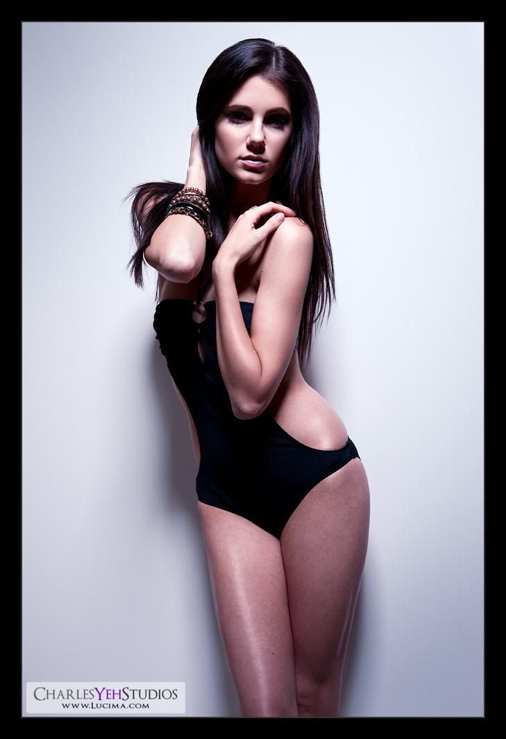
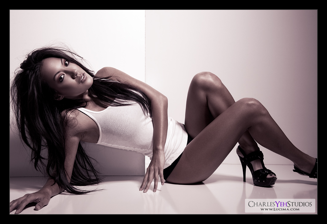
Saturday, January 30, 2010

Anneliese: Leeeeegs


There are 5 E's in "Leeeeegs".

:)

Camera: D3/24-70mm @58mm, 1/200th, f/7.1, ISO200

Strobist: AB800 in 40º gridspot from camera upper left

Model/Wardrobe: Anneliese Nicole

Makeup: Kelli Zehnder

Hair: Michelle Green

Friday, January 29, 2010

Brett: Brighter


Not processed as well... well based on hours at least... I got discouraged and maybe shouldn't have started on this one... Fortunately the suit made it so I didn't have to work the skin tones as much... I started with lemons on this picture. Totally my fault, must have focus-recomposed poorly or something because the face is out-of-focus compared to the arms and jewelry. Must have front-focused or something.

Camera: D3/24-70mm f/2.8G @70mm, 1/200th, f/7.1, ISO200

Strobist: AB800 in 40º gridspotted beauty dish from camera upper right

Model: Brett Harmon

Makeup: Kelli Zehnder

Hair: Michelle Green

Wardrobe: Angelina Scantlebury

Brett: The Look


There is nothing that needs to be said about this image that Brett doesn't already say.

Camera
: D3/24-70mm f/2.8G @62mm, 1/200th, f/8.0, ISO200

Strobist: AB800 in 40º gridspot beauty dish camera upper right

Model: Brett Harmon

Makeup: Kelli Zehnder

Hair: Michelle Green

Wardrobe: Angelina Scantlebury

Brett: Preview


150%.

Gah. I love this face... unbelievable!

Thursday, January 28, 2010

Building Bridges

This is not a post about building an actual bridge (see Building Walls reference). Although that would be very cool, I think it falls outside of carpentry and perhaps into masonry.

No, this is about building bridges to your model. Maybe it's different with other photographers (but somehow I doubt it...) but during shoots, I don't get to spend much time with the model. She gets here, we chat for at most 20 minutes and off she goes into makeup, hair, wardrobe and I don't see her until hour(s) later. We shoot for maybe 30-45 minutes and the process is rinsed and repeated until we finish all the looks. At the end of the day it adds up to maybe 2 hours of non-continuous time spent.

Why is this important? Because the connection between the photographer and the model is critical. It's the same with any "performance" related field, such as dance, music, or even public-speaking. As an example, one of my long-time heroes Conan O'brien says that there's a great interview to be had with everyone (i.e. even non-celebrities). which is to say it's the host's responsibility to create that interview by drawing out the incredible stories, or the "interestingness" (in flickr terms) out of that guest.

But there must be a connection.

Sure, if you watch ANTM enough you get the reverse perspective where the models need to inspire the photographers (according to my wife, you hear about this all the time from Nigel), but you can't control the model. You can only facilitate this connection.

What connection? It's the same connection that you get when you meet someone and sometimes you just "click". But unlike random meetings with strangers, as a photographer you
have to "click" with the model. To make matters worse, there isn't much time.

I'm not going to define "clicking" or "being on the same wavelength" or what I call "a connection" because I can't really put into words what "it" is. Perhaps "it" is
je ne sais quoi at its essence. But that level of "communication without words" and that energy can make a good shoot fantastic.

Talk to your models. Find out what makes them tick. Find a way to draw their personalities out into the frame. Or find a way to use the knowledge you acquire (through conversation) to accentuate their poses and their expressions during the shoot. Do I know the answers? No. I can only tell you that there are times when I'm definitely on the same wavelength and there are times that I'm definitely not on the same wavelength as the model. The times where we don't "click" leaves me feeling disconnected and bothered. I can't explain it fully but the experience is deficient and I need to remedy it so it doesn't happen again.

Do I truly think you can always "click" with every model? No, however I do think that as a great photographer you can "extract" the most out of the model during the shoot. It takes a special photographer to do this and therefore the photographer's skill is not always with the lighting and the traditional photographic elements but also in their ability to interact with people. I think I'm good with people, but I can be better with models.

If I had to come up with a short list of things that might contribute to the connection here it is:

-Pace/tempo. Getting in tune with the model's tempo. Some of them like shooting quickly and some slowly.
-Energy level/temp. Some models are high frequency and others are more demure and on a lower frequency. You gotta "tune in".
-Comfort level. The model has to be comfortable with the photographer. I don't know how to expedite this in the time frame though.
-Preparation. I suppose any sort of preparation is good. Talking to the model beforehand or by email before the shoot will give you a head start. I should probably do this.
-Models get tired and they need breaks. I often see models "drift off" towards the end of the shoot because they have to work with everyone and they're "on" all the time. I should probably give them a breather now and then.
-Verbal communication. I do this a lot and I'm not sure if it's appreciated but I'm constantly "pinging" the model to get feedback on what they think and feel. Much in the same way that women are always asking "What are you thinking?" and "How do you feel?"

You know what? I don't have all the answers. In fact, I don't have many answers at all... I'm going to beseech the experts and return with some results later.

This is why my retouches average 5-6 hours...


This is a 200% crop... not 100%. 200%. I might post today, but I'm backed up with retouching... Crap, this is a screenshot of my workspace. If you have a wide-gamut monitor, it's going to appear saturated. The picture itself does not have a sRGB profile attached. If the colors look good, then disregard this message :)

Anneliese and Rebekah

Anneliese: Almost


I should have just made it B&W, no point leaving it slightly color because now it just look like her skin has no color. Fly-away hairs are killing me but impossible to retouch due to the gradient background. One or two I can do but too many with this hair style. Next time we'll just do a cleaner hairstyle.

Camera: D3/85mm f/1.4D, 1/200th, f/7.1, ISO200

Strobist: AB800 in 40º gridspot from camera upper (slightly right)

Model: Anneliese Nicole

Makeup: Kelli Zehnder

Hair: Michelle Green


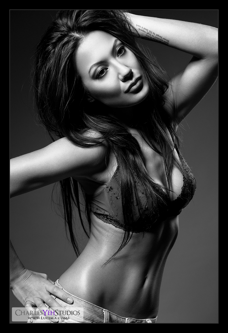
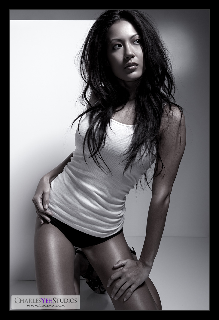
Anneliese: Return of Color


No levels adjustment. Full tonal range on frame. I love this picture.

Camera: D3/24-70mm f/2.8G @70mm, 1/200th, f/8.0, ISO200

Strobist: AB800 in 40º gridspot from camera upper left

Model: Anneliese Nicole

Makeup: Kelli Zehnder

Hair: Michelle Green


Rebekah: Blue


2 days. Influenced by Anneliese's Return of Color. Originally more desaturated. Came back with more color. Original crop.

Camera: D3/24-70mm f/2.8G @48mm, 1/200th, f/9, ISO200

Strobist: AB800 in 40º gridspot beauty dish camera high (slightly right?)

Model: Rebekah Davis

Makeup/Hair: Kelli Zehnder

Tuesday, January 26, 2010

Munki or Spyder?

Found this while looking up the differences between the XRite ColorMunki and the Datacolor Spyder3. Thought you guys might be interested if you're thinking about monitor/print calibration.

Got the ColorMunki today. Needed it for verification of the Eizo. Looks like the Eizo's fine. The problem is with the sensors and their subtleties. I'll think about this some more and might perform a few more tests but for now, I like the ColoMunki a little better.

Anneliese: Stunning


I can't blog about this now but I need to put this up because otherwise I'll be backlogged. Soon...

Camera: D3/24-70mm f/2.8G @70mm, 1/200th, f/7.1, ISO200

Strobist: AB800 in 40º gridspotted beauty dish very high right. Foam board above model for feathering/shadows/reflection blocking...

Model/wardrobe: Anneliese Nicole

Makeup: Kelli Zehnder

Hair: Michelle Green

RadioPoppers JrX: Medium-term update

Here's an update on the RP JrX's performance to date.

I had 2 misfires after a lens change where I got mis-synced shutter action. One frame was all black and one frame was partially banded. The third and subsequent frames turned out fine.

Yesterday I had 1 misfire in the middle of a set. Somewhat random. No incident that I can think of triggered this misfire.

Total: 3 misfires. I think I've shot 1,600 frames since I've gotten them. It's not perfect, but I suppose I can live with it :)

Oh and no more issues with power settings on adjustment knobs. I guess it was just a matter of forgetting to dump power after decreasing power.

Monday, January 25, 2010

What to do with a n00b model?

I got a question from a flickr fan asking how to work with newer (read: inexperienced) models.

The truth is, I don't know.

That's the disclosure that I'm obliged to provide before going off on my long spiel about what to do. But as I'm writing this, I'm still drawing a blank.

So I posed this question to Anneliese during our shoot today and she replied that one photographer (I'm assuming that she shot with) said he'd put the model on a chair instead of having her stand in order to limit movement.

To further go reveal how little I know about this topic, I have 3 fashion photography books, one of which is specific to posing techniques (it's actually called
Positing Techniques for Photographing Model Portfolios)

A good photographer will "extract" the most out of a new/inexperienced model. For my purposes, I don't have time to work with inexperienced models. I just get frustrated and bored.

But assuming I did have to work with another new model, these are the things I would try.

-Give them a list of emotions: Happy, sad, upset, frustrated, etc. It helps the model break out of their "same face" range.

-Give them something to interact with. A feather. A scarf. Jewelry. It gives them focus and provides substance to an otherwise dull and monotonous shoot.

-Give them examples. I always try and have 3 "canned" poses that I can show the model. Otherwise, I'll show them the actual picture I want them to mimic. I haven't had to do this lately, but I'm sure this will come in handy with the newer models.

-Give them music. Turn on the tunes, tell them to relax, and get their groove on. Sometimes their limited range is an issue with their comfort level and confidence in their posing techniques. Sometimes music allows the model to relax and just "go with it".

-Give them alcohol. If all else fails and they can't relax. I've got a couple of bottles of scotch whiskey that I keep just for this purpose :) All jokes aside, I actually think this would work. Fortunately I have never had to resort to this technique. But seriously, I could see this happening... LOL :)

A newer model is not a "problem" but rather a challenge. If you look at it in this perspective, then you won't get frustrated. Everyone starts somewhere and the key is to get the best/most out of every model that you work with. It's easy when the model has years of experience like Brandy, Rebekah, and Anneliese (to name a few... that happen to be the last 3 models I've worked with). But there's a great shoot to be had with every model, even those that are just starting out. You just need the right perspective and help them give you their best!

Remember, keep it fun! :)

Sunday, January 24, 2010

Rebekah: Coppertone


I was going to name this "Bottleneck" because I realized that I was stunting my own growth as a retoucher by providing myself lesser quality photography.

I paid a little more attention this time around.

I'm going to skip the retouching elements this time and talk more about the photographic elements of the shoot and of the picture (and pictures that will soon follow).

First thing's first. I found a high ceiling. I've been talking about the limitations of the 8'6" ceiling and how it's difficult to achieve certain angles and distances with the lower ceiling. Well, we have a staircase that leads up to the second floor and there's a small section of the hallway that's exposed to the staircase's high ceiling. Add a "
wall" and voila, a new set.

The great thing about these walls is that they're portable. With 2 walls the combinations of mixing and matching are endless. The only downside is that they need to be locked down with a heavy duty stand and Super Clamp, otherwise they threaten to fall on Rebekah. Actually about 0.4 seconds was all that separated Rebekah becoming a victim of another white wall massacre. Fortunately I have good reflexes.

I've been "seeing more" when I'm shooting. First of all, I'm shooting slower. More deliberately. Less frames. Better yield. It of course helps to have a world-class model. Rebekah is awesome. Love working with this girl. Fun, upbeat, and spot on with her looks and poses. We need to bring her back for Round 2.

Anyway, where was I? I'm looking for "more" when I look through the viewfinder. Shadows and highlights not only in certain places but also in a certain ratio. I don't use a lightmeter (even though I have one) so I'm not setting my lights up by math. I set them based on feel and this provides me and the model with more dynamic range of motion. While I don't like limiting the model's range of motion, I find that with my current level of experience I will keep her in a certain place so that the light falls on her exactly as I want it to. Another something different that I do now is that I request the model to hold a pose that I like so I can capture a few of the same shots but usually composed differently. This usually means a full length and a close-up. Overall I feel more specific and deliberate in my shooting. I don't shoot nearly as fast either. I've slowed down my rate of capture because I'm spending more time composing which is both good and bad. The good is that I'm getting what I want. The bad is that I'm throwing the model off her rhythm/tempo which is critical. In fact, if it weren't for their level of skill, we'd have a lot less to work with because I'm directing so much.

Actually I don't like directing at all. At least I never used to do this. But with what I'm "looking for" it needs to be a specific angle/look/pose/etc. But I truly believe that shooting deliberately has increased the yield dramatically. I define yield as "useable pictures". What's a useable picture? Hell if I know. Everything I do is arbitrary anyway if you haven't discovered ;) To me a useable picture is one that I would potentially retouch.

I have about 60 from Rebekah's first set. Look.


I wish I could retouch faster. But I'm averaging more hours lately because of the new direction. I call it a new direction because it feels like we've been course correcting (LOL "we"...) for a while now. You'll see it based on the trend of the last few pictures.

And I could every one of the last 4-5 pictures "Culmination" because every picture is a culmination of pretty much everything I know in Ps.

But I promised that I wouldn't go into retouching for this picture because it's important that I address all the photographic elements that are coming together. Mental note. Beauty dish is nice but it's not going to light the whole body at working distance. Which means you're going to need to bust out the softbox or something if you want to light the entire body. Otherwise, live with the light falloff.

Speaking of lighting the entire body. I shot most of Rebekah's frames around half body rather than full body. Sounds like a waste when at 5'8" Rebekah is 5 feet of pure legs. But as I told her, my gut instinct is that everything that's important feels like it can be captured with a half body frame. I hope I'm not off track here... it just feels better and feels right. I can't explain it. It composes much better in the viewfinder/frame too. I'm not crazy.

What incredible range. Props to Rebekah for being one of the 3 best models I've ever worked with.

Oh and about the shadows. I think
Ender Nygen said that an easy way to make a picture more interesting is to just not light all of it. :)

Ah hell, how can I not talk retouching... goddamnit. Here it is in notes form:

-No crop. This is how the shot was composed.

-Used 2 curves layers for D&B a la Amy Dresser style via her interview a while back (not the most recent one). One curves pulled up and one curves pulled down. Then mask and brush.

-Didn't kill as much highlights as I could in levels because the highlights were getting too bright. Levels = 2/244

-I burned highlights again in the nose in particular.

-I "auto-tuned" my B&W conversion layer for reds and yellows. I was going to do something close to that anyway, so I figured I'd give "auto" a try. I kept the computer's decision.

-B&W luminosity blended gradient map for contrast. Masked for skin only.

-New-edit-fill-white-overlay-masked. I've talked ad nauseum about this technique. Not going to talk about it here.

-Color blended layer of orange bucket filled layer. Opacity about 25%.

As I said in the last post. Pulling the dynamic range in the skin tones will give you a better image especially when it's a monochromatic image.

Camera: D3/24-70mm @70mm, 1/200th, f/9.0, ISO200

Strobist: AB800 in 40º gridspot beauty dish from camera high right

Model/wardrobe: Rebekah Davis

Makeup: Kelli Zender

Saturday, January 23, 2010

Brandy: Culmination


I keep pushing and I keep achieving new heights. I suppose this is the culmination of what I "know".

As I write this, I'm still not sure on the final opacities of some of the layers but I wanted to document the layers that I used so that I don't forget.

Selection process: Nuff said


-Eyeshadow. This is the third time I've drawn in eyeshadow on Brandy

-Global curves and local curves for spot correction, particularly on certain parts of her skin (e.g. face and arms). Pieter Ale from flickr brought to my attention that there were saturation differences between the arms/face and the legs of the last picture of Brandy. In retrospect there was. It didn't have anything to do with the B&W conversion although that might have made it more conspicuous. Local curves correction is a page out of Amy Dresser's book.

-B&W layers one for everything and one for the bra. Both the BG and the bra are blue but I wanted the BG darker and the bra lighter

-Masked B&W gradient map set on luminosity blending. This allowed me to control the contrast, specifically to exaggerate skin tones without messing up the rest of the frame (this is NEW!)

-Selective highlighting to stretch the tonal range of the skin (this is NEW kinda!). I've been using it here and there after Amy introduced me to this technique but for the last picture I actually dropped it. I used it again here and used 2 separate layers with different selection fuzziness to adjust highlights separately for balance.

-Geez, I did a number on her eyes... I can't even tell you all the things I did... like whitened the whites, burned lashes, dodged lids highlights, outlined the lines that extend down and around the eyes (a.k.a. bags) for realness, dodged the eyeball and water line for glossiness... probably more, I just don't remember. LOL.

Everything else is "standard" hahaha whatever the hell that means.

But did I go "too far"??? Maybe.

-Oh by the way, the key to great contrast is "stretching" the tonal range. I might talk about this later.

-One thing that drives me a little crazy is how there seems to be difference in color in her left arm. There's no color. It's B&W. WTF!?!?

Camera: D3/24-70mm f/2.8G @70mm, 1/200th, f/8.0, ISO200

Strobist: 40º gridspotted AB800 beauty dish from camera upper left and AB800 in 12"x36" stripbox camera front right (highlights). See setup picture:


Model/makeup/wardrobe: Brandy Grace

Friday, January 22, 2010

On Sharpness...

I got a message from a flickr member inquiring how I achieve the level of detail and sharpness in my pictures, such as these two:


For reference, I didn't even shoot the first picture :) But this doesn't make a difference regarding sharpness for what I'm about to tell you.

The clarity and detail from my images come from 1) Point-of-capture and 2) Retouching

Point-of-capture

This is fundamental. If you don't do this right, you'll be starting with lemons in Photoshop and no one wants lemons in Photoshop because then all you can do is make lemonade and no one wants lemonade :) Here are a few pointers to help you achieve sharpness from the camera:

-Stable hands or use a tripod. Self-explanatory.

-Fast shutter speed minimizes camera shake and model movements. If you handhold, rule of thumb is use a faster shutter speed than 1/x where x=your focal length.

-Use an aperture that gives you good depth of field providing you with margin of error. I frequently shoot f/9.0-f/11 in studio. This gives me depth and clarity from the point of focus +/- a few inches even (in front and behind the point of focus)

-Use strobes. Strobes stop action in that 1/2000th of a second even when your shutter is open for longer.

-Try NOT to focus-recompose. It's hard. I'm used to focus-recomposing-then shooting, but it screws up your TRUE focal point particularly noticeable with shallow depth-of-field apertures.

-Breath out when shooting

-Practice

Nothing I've said above is revolutionary. There are plenty of articles for tips and suggestions. Now onto retouching:

-Unsharp Mask (Photoshop). The tried and true mule of sharpening. Everyone does this and every program has this feature from Lightroom to NX to Photoshop. I don't use this much.

-Smart Sharpen (Photoshop). I like this new sharpen filter introduced in PS CS2. While I like this tool, I don't use this much anymore but it can occasionally save a blurry picture due to of motion/lens blur sharpening.

-Spatial Frequency sharpening (advanced Photoshop technique/action). My preferred means of sharpening and I do this twice. Once before resizing and once after although many would say that's a no-no...

-High Pass Filter. A slightly more "detailed" (pun intended) form of sharpening that requires creating a new layer (overlayed) and adjusting the radius to highlight detail. I usually use this with a mask so it's not a global adjustment but rather local to the skin and clothes.

-Levels (Photoshop). Sometimes adjusting contrast and levels can give the illusion that the image is clearer and thus sharper. I almost always have a levels adjustment

The end result is usually some combination of the above. The thing is that's it's easy to overdo it. Play around with it and find some happy medium otherwise you'll get aliasing and start introducing all sorts of sharpening artifacts that suck.

There are also plenty of online tutorials for sharpening and all I've done is given you a personal tour of high-level sharpening techniques. It's on you to test each of them and add the ones you like to your bag of tricks :)

If you read my earlier posts, I talk a lot about sharpening and these posts might help you find your path as well.


Thursday, January 21, 2010

Irene: Lemonade


It's my picture and I'll call it what I want :)

But it's not random. Read on to find out why it's called "Lemonade"...

This is the second picture that I've processed with the CG243W. I do find this monitor quite bright and sometimes when I'm dodging and burning, I find slight "burn-in" occurring that prevents me from being able to see a new "spot" when I move my focus across model's (in this case Irene's) skin. I find this odd. I've calibrated it at 90, 80, 75, and 70 cd/m2 so it's technically quite dim. Perhaps the contrast on the image is very high? I dunno, this is unusual and I don't remember this ever happening with my Dell 2405FPW or either of the CG241W. Perhaps the LG H-IPS panel is inherently more contrast-oriented? I'll keep an "eye" on it :)

Can I be perfectly honest with you? There's nothing spectacular about this image photographically. Nothing. Photographically I failed miserably. This was right before I posted,
Crap I'm a bad photographer. Oh yeah, I've been hard on myself. But I've gotta keep this learning curve steep otherwise I'll never catch the greats...

To summarize, Brandy's shoot was much better in comparison (photographically speaking). While I'm being honest here, I simply wasn't on top of my game for Anna and Irene. That's my fault. Shame on me. I introduced too many "moving parts" to the shoot and wound up a little flustered at times and then reverting to stuff I knew would work (but was photographically boring).

So in processing this picture of Irene, I really focused on smoothing out the skin tones in the face. That pretty much took me 2.5 hours.

The other stuff took me combined another hour or 1.5 hours. Which really included trying to adjust the contrast on this image to match the look and feel I wanted. I could have gone with more contrast, but I found that it was destroying the image. It was too punchy and it was detracting from the face. In fact, I had a rendition that had 25% (rough estimate) more contrast that I scrapped just as I was about to post to flickr. It just didn't look right. I settled on a happy medium that is what you see here.

I'm not going to go into the specifics about the layers and what not, except to say that there was one particular gradient map that provided the final effect. What you'll find is a orangish-green to reddish purple shift from left to right of the screen. That's because I used a crazy "yellow, violet, orange, blue" gradient map. This, combined with a B&W conversion (turned down to about 80% opacity) leaves you with some mix of original skin tones with a slight tint of "yellow, violet, orange, blue" on shadows and highlights across the frame. Why oh why did I pick that gradient map? Because I can :) No, in all seriousness it left me with a pretty neat background and a different overall look compared to my existing pictures.

When I look at the original, I kind of think that as a photographer, I should be shot for being lazy and/or being a bad photographer. Fortunately, I'm a half-decent retoucher. *retoucher shakes head at photographer *photographer bows head in shame.

But when the photographer gives you lemons, make lemonade :)

Camera: D3/24-70mm f/2.8G, 1/200th, f/10, ISO200

Strobist: AB800 in 40º gridspot beauty dish camera upper left. AB800 in barndoors camera front right. And oh yeah, the single most interesting photographic element of this frame was that I used a 4'x8' R-Tech insulation foam as a giant fill card. In retrospect maybe I had this thing a little too close and washed out the shadows...

Model/wardrobe: Irene Yay

Makeup: Kelli Zehnder

Hair: Michelle Green

Eizo CG243W FTW!

In my Thoughts Dump post I briefly mentioned my Eizo ordeal. This is the timeline summary:

December 23rd, picked up refurbished Eizo CG241W #1 from Cypress, CA.

December 28th. dropped off refurbished Eizo CG241W #1 at Cypress, CA for repairs. Issue: uneven backlighting.

On January 6, picked up the replacement monitor Eizo CG241 #2 from Cypress, CA.

On January 11, dropped off refurbished Eizo CG241 #2 at Cypress, CA for repairs. Issues: uneven backlighting AND calibration issues.

Today January 20th I had an appointment with Martin Ruiz, the technical manager at Eizo North America. Martin has been with Eizo for 20 years and manages both the support and repairs departments. After two less than spectacular experiences with refurbished Eizo CG241W units, I wanted to know the following:

-Was I crazy? Does anyone else see these backlighting uniformity issues?
-Is my MacBook broken? Or maybe the Mini DisplayPort<->DVI adapter?
-Is my Spyder3 Pro broken?

Here are the calibration results from my Spyder3 Pro and the CG241 #2:


The dE max and dE averages were way off. dE max around 3 is acceptable and dE average of 1 is acceptable. The CG241W #1 that I returned calibrated just fine. This second unit was something screwy...

Martin suggested that the unit I sent in was not defective. He calibrated with the ColorMunki and also the EyeOne. Here are his results:


Notice that while they were lower (he used different targets like minimum black point), they were still rather high as well. But nonetheless, I concede that maybe at the time there was something wrong with the Spyder3 Pro, the USB uplink, or something else that yielded such crazy results.

But the backlight uniformity is another issue.

When the Eizo CG241W comes from the factory (new), it comes with a Unifomity Data Sheet at Shipment. It looks like this:


The refurbished units don't have these, even though they're reconfigured by the repair center back to factory specs using the specific monitor calibration "blueprint" software, that's specific to each individual unit. So technically they should not have any luminosity unevenness issues.

So what happened at the appointment with Martin at Eizo?

Well, he pulled out both CG241W #1 and CG241W #2 that I returned. When plugged into their Mac Mini, we confirmed the luminosity variance across different portions of the screen. So now I knew my eyeballs weren't special (check off question #1 and question #2 since we used another computer/cable). Martin suggested that this was consistent across all CG241W that use the Samsung S-PVA panels. In fact, the panel in the CG241W #1 had been replaced with a new Samsung panel but still exhibited the uneven luminosity issue.

Since the luminosity issue was confirmed, there was no point trying to recalibrate either of the CG241W units that I returned. Basically Martin offered to let me choose between the two units if one of them was to my liking, but I was not going to take either of these home.

Then Martin suggested that we could look at a CG243W for comparison. This particular CG243W had just come back from a CDW customer (credit) return. Basically there was nothing wrong with the unit, the customer just didn't want it. It would be a good comparison to see whether or not the CG243W would be the "final answer" to my Eizo woes. I already knew that the CG243W uses an LG H-IPS panel so viewing angles would improve, plus it has a 10-bit LUT instead of 8-bit LUT (via DisplayPort), but how about backlight uniformity?


We hooked up the Mac Mini to the CG243W turned it on and in the first 5 seconds it showed a bit of a darker vertical bar across the middle of the screen. Within 30 seconds however, that bar was gone and the panel was the most uniform I'd ever seen on any monitor.

How about color accuracy via calibration?

Well, we hooked up the ColorMunki to the CG243W and ran ColorNavigator. The results came back positively. In fact, better than good. Average dE was somewhere less than 0.4 and max dE was around 1.5-2.0.

Damn, that's pretty good.

At this point I jokingly said, "Too bad you can't sell me this unit, otherwise I'd take it home today!" After all, the unit had just come in for repair. It would need to be inspected. Reset to factory settings. Repackaged. Processed through the system. Hell, Martin even mentioned that Eizo would not be selling any refurbished CG243W units at this point in time. It was way too soon. These had just been announced in late September and were heavily backordered from October to December (I had an order for a new CG243W from Adorama for almost 2 months before canceling it).

But shockingly, he said "Let me talk to the sales reps and see what the price difference is between the two units (CG241W and CG243W)"

While Martin was gone, I ran calibration tests on the CG243W with my Spyder3 Pro on the Mac Mini. Positive results! I then hooked up the CG243W to my MacBook and ran the same tests with the Spyder3 Pro. Calibrated perfectly! Average dE of 0.6 and max dE of 3.0 (darkest black patches). This was definitely the monitor for me. I looked up RP Imaging on my iPhone and got their number ready to place an order for the CG243W.

Martin came back and said, "Well, we would need to get the monitor through the system and do all the paperwork. Do you have to pick it up today?"

Huh??? Wha??? What did I miss?

Then I realized what Martin was saying. Playing it cool, I responded, "Well if it's even possible I can get this one, it's definitely worth the wait!" I also explained to Martin that I lived 45 minutes away. It was raining hard outside. Martin expressed that it would take at least an hour to process the unit through the system and draw up the paperwork. I assured him, "If it's possible to do this today, I've got all day!"

Fast forward 1.5 hours and after Martin runs the CG243W through his usual diagnostic check on returned monitors, he boxes it up and sends me on my way. Driving home, I was still in disbelief. There was no way that I could have foreseen the day's events unfolding as they did. Not in my wildest dreams! I was driving home in a barely used 14-hour-old refurbished CG243W. I was probably the first person in the world to own a refurbished CG243W and legitimately so! Martin followed all Eizo protocol and no rules were broken. The sales team was informed and signed off on the transaction. The unit was entered into the system and processed adequately and the paperwork was drawn properly so that this returned CG243W was now a "registered" refurbished unit belonging to me. Of course, I can not disclose the final "price difference" but I can suggest several excellent representatives at Eizo you should speak with regarding refurbished/demo Eizo units.

Hats off to Martin because he pulled all the stops in working with me for 2.5 hours checking 2 different CG241W and then helping me acquire a CG243W and then even testing the CG243W with the ColorMunki. I mean, this isn't Apple's Genius Bar where you can walk in and someone will kindly help you through whatever technical problem you have with your Apple product. This was me walking into the North America Eizo headquarters and getting personal troubleshooting service from the technical manager responsible for all of Eizo North America. Hell, I hope he doesn't get in trouble for working with me for that long. The Cypress location isn't even supposed to have customer visits much less personalized appointments.

I have to thank the team at Eizo for turning this experience around from slightly tragic to overwhelmingly-unbelievably positive. The technical support call service team including James, Tim, and Dean were responsive and helpful. The guys at Cypress including Jason, Todd, Michael, Max, Tom and of course Martin all bent over backwards to ensure that I was satisfied with the product and had a pleasant experience with Eizo.

Maybe I'll take pictures of the CG243W tomorrow! Enough excitement for one day!

Wednesday, January 20, 2010

Brandy: Length


I need to dedicate more time to this post but I'm hungry so this will have to suffice for now:

Edit: I'm going to flush this post out now

-I did not crop this picture down from out-of-the-box. When I first started shooting, I would often crop 40-50% of the frame to get better composition. Now that I've developed a tiny more of my compositional eye, I find that I'm cropping a lot less. This helps in 2 ways. For one, that's one less step that I've gotta take when retouching. Secondly, my camera all of a sudden seems like it has more megapixels and therefore more detail in the frame. Kapow! Megapixels FTW!

-No new/edit-fill-with white on overlay. So a couple posts back I talked about Amy's interview and how this was one of the techniques she used. I tried it a couple times in my recent pictures but decided against it in this retouch. The technique is good but I did not like how it would exaggerate the highlights in this particular picture. It would blow out my highlights too much and ruin the smooth gradient transition between lights and highlights. I dunno. Maybe I just didn't feel like using this technique today, okay? :) Gosh, do I have to have a reason for everything??? LOL

-Wanted a cooler temp gradient: Fail. Yes total fail. I was going for something bluish. But somehow I wound up with a variant of the purple-orange gradient that I seem to always use in my pictures (lately). Is it played out yet? Are you guys bored of it? This one should be a little bluer. Wrong, it just wound up more purply-red LOL. Oops. Back to the drawing board on that...

-Smoother skin tones and gradients. What can I say? It's the evolution of retouching. I think if there's one overarching element of retouching it's that we're smoothing things out. There should never be sharp transitions between light and dark even when it's on purpose, it should still be smooth. Hard light should on the edges still have smooth transitions. I've really focused in on the softer transitions. Hell I wonder if the beauty dish might have been too hard on the skin but it seems to work well.

- What's that light fall off to the right? It's not banding from camera :) It's just feathering from the beauty dish. Not sure why it's so vertically even up and down the frame? The shutter doesn't move in that direction.

-Orientation of the walls (same as last picture). One horizontal and one vertical farther back.

-Had to move my graphical watermark. It was on her hand and I didn't like that.

-My pictures are getting sharper. I threw everything out the window about what I thought I knew about sharpening. Now I just do it by feeling. In fact I sharpen twice, before resizing and after resizing. Supposedly that's a no-no. Well, too bad. I like it and I'm sticking with it. :)

-The water-like reflection on the ground surface? There's that reflective surface that haunted me in the last picture of Brandy. Fortunately it was put to good use here...

-Lastly it's called "Length" because that's the word that popped into my mind when I saw it. Although she's compressed. She's still so slender and long across the frame. Ahhh, the beauty of making things up on the spot... I think they call it the art of bullshitting LOL :)

Camera: D3/24-70mm f/2.8G @45mm, 1/200th, f/8.0, ISO200

Strobist:AB800 in 40º degree gridspotted beauty dish from camera upper right.

Model/makeup/wardrobe: Brandy Grace

Tuesday, January 19, 2010

Sum of the Parts

Here's a quick PS mod on the last picture of Brandy exhibiting the level of detail at 1:1 or close to it:

Brandy: Just


This edit of Brandy thankfully took a lot less time than the first one. The 3 hairs left on my head can rest safe... for another day.

I liked this picture. For the pose. For the idea that I had with the walls. For the simplicity.

What I didn't like about this picture? That annoying specular highlight of the AB800. In the words of Sit 'N Sleep, "You're killing me Larry"

Where did I go with this picture? Not far from where it started. I mean, none of my edits are ever drastic but this one was as subtle as they go. I didn't even desaturate the image all the way. Just turned down the colors 80% or so. I like the contrast between the skin tone and the B&W wardrobe.

Did I learn anything new? Yup. That highlights should never be totally blown out and that they can still be blurred gently into the non-highlight area. I'm starting to understand the whole "smooth transitions" thing but I need more practice. Nothing "heavy-handed" as Amy Dresser would say.

Why do I reveal the screenshot of the retouch now whereas I didn't used to before? Because those "effects" layers only represent 5% of the work. 95% of the work goes into carefully dodging and burning and healing and tediously working the little things. Sure those 5-6 layers will yield 95% of the effect of the picture, but the "je ne sais quoi" is in that bottom layer (Frequency Pass). It's that which can not be taught. You just have to do it. And that's why Amy is open about "revealing" her techniques because at the end of the day, they are nothing extravagant. If anything Amy uses the simplest tools and techniques but it's her "brushstroke" if you will, that's special.

Besides, the nomenclature on the layers is cryptic. If you can decipher it, you already know more than I do :) If you really want to know, you'll stumble over it on your own. But ultimately I'll just tell you if you ask anyway LOL :) Besides, there's nothing that I'm doing in those layers that I haven't already discussed ad naseum in my posts!

Oh and remember the walls? Yeah, I'm not using them the way what's his name uses his. This is only one of several orientations and combinations you'll see me use these things. I only wish they weren't so reflective. Can you backsolve the orientation? Shouldn't be hard.

Oh and I drew eyeshadow on Brandy in Ps to bring out the eyes.

Camera: D3/24-70mm f/2.8G @48mm, 1/200th, f/8.0, ISO200

Strobist: Light's coming from camera upper right. It's an AB800 in a 22" beauty dish gridded by 40º. The rest of the light is simply bounce from the walls and what not.

Model/wardrobe/makeup: Brandy Grace

Learning. You're doing it wrong.

This is a memo to myself. When you shoot and retouch, you're supposed to learn something from the deficiencies in your frame.

If you don't make notes and learn something from your shortcomings, you're doomed to keep repeating those photographic mistakes and inevitably waste precious time retouching those mistakes.

For my benefit, I've created a small diagram. It depicts the cycle of learning resulting from shooting, retouching, and preparing. Please see (click) below:


Now I'll admit, the lag between retouching and preparing for a shoot can be a lot longer than you'd hope for thus hindering the learning process. But that's not an excuse. Make notes. Mental notes, handwritten notes, post-it notes, I don't care. Do something so that you'll remember your mistakes from the last shoot.

For example. For the next shoot, I'll try not to put the light so damn close to the model. I'll also look more closely at the model's skin before pulling out the 7" reflector. I'll try to remember that decreasing the AB800's power via the JrX requires dumping the power before shooting the next frame.

Shooting and retouching should be 2-way-streets (both transmitting Tx and receiving Rx... you could call each a "transceiver" LOL! *mimicks Steve Urkel snort/laugh). Anyway, I mentioned it before but it's a reciprocating process that's moderated by several variables including but not limited to creativity, reflection (assimilation of lessons learned), and other inputs like blogs, forums, etc. Hey look, I actually learned something from my Masters in Psychology :)

My problem is that the lag between retouching and preparations creates a disconnect or as I like to call it "impaired learning" :) Anyway, don't take this post too seriously, the diagram was drawn in a few minutes and really not well-thought out. There are many other moderating variables that go into the cycle and it's I'm sure the learning process isn't that simple, but I didn't want to make it complicated either. The point is that I need to be aware of this process in order to optimize it and benefit from it!

Monday, January 18, 2010

Brandy: Grace


Here are the runners up for the title of this post:

"1 crunch"
"Why I'm an idiot"
"I should have been a sculpter"
"7 hours of Photoshop"
"The culmination of everything I know"

I went back to basics on this picture. Back to the beauty dish gridded against my off-white wall as a background. This was our first set and I wanted something that I knew would "just work".

A few things about Brandy. At 5'5" she's proportionally perfect. In fact, with my lighting angles Brandy could stand to GAIN a little weight ;) When asked if she worked out she mentioned that she did 100 crunches the night before... to which I replied, "Maybe instead of 100 crunches, you could do 1 crunch instead?"

Anyway, I picked this image from several great captures for the body positioning, the angles, the subtle left hand gesture, the face downturned yet still picking up fill light from the wall... it simply captured my attention.

But it was going to be a challenge from the get-go because I wasn't sure what to do with the mid-section. She's well, too "ripped". But who's fault is that? Certainly not Brandy's fault for being genetically gifted. The problem is that I always light for the face and never figure in the body. Body lighting to me is passive, it's a by-product of lighting the face. And therein lies the another problem. With a ceiling height of 8'6" (I have 2 surfboards longer than that), I can't get the working distances I need at the high angles to alleviate hot spots and exposure differences between the head and the feet. The light fall off at 4 feet is pretty substantial at those power levels used on the AB800.

Hence my alternative title, "Why I'm an idiot"

My solution for the exposure difference was easy. I selected those areas and dropped the exposure just a tad in photoshop (as you see in the screenshot).

My solution for the abs definition was obvious but not soo easy. Basically I needed to dodge and burn the shadows and highlights away so that there was less definition. This is easy when you understand the contours of the body. This isn't so easy, when you don't know where things are "supposed to be" on the body. Nevertheless after chiseling away those hard edges on Brandy's body, we worked out a reasonably believable end product. Hence my other title, "I should have been a sculptor".

With the hard part out of the way, I then sought to tackle the face. The key here was to make those highlights even more obvious. I knew already that my end outcome would be some derivative of a monochromatic (or in this case a two-toned) treatment. Early on, I laid out a B&W conversion and then added the tinted gradient map that gave me this effect. Throughout the retouch, I took a look at what would have been the final outcome had I decided to stop editing then and there. This provided me with a good "checkpoints" to ensure that I wasn't straying from the proposed path/direction.

So here's the final product. I skipped most of the nitty-gritty stuff that wasn't really worth mentioning. Besides, I've elected to provide you screenshots of the layers used in the edit. I had fun with this retouch but it was frustrating as hell because it took 7 hours. I would say at least 2.5 hours on the body, 2 hours on the face, and 1 hour for miscellaneous stuff and 1.5 hours of breaks in between everything because I wanted to keep myself from pulling my hair out. It's been a while since I've spent this much time on an edit. I hope it's worth it! :)

The feedback will tell me whether it was worth it or not...

Camera: D3/24-70mm f/2.8G @56mm, 1/200th, f/9.0, ISO200

Strobist: AB800 in 22" beauty dish with 40º grid from upper camera right

Model/makeup/wardrobe: Brandy Grace